| Author | Thread |
|
|
05/04/2010 05:55:05 PM · #1 |
I entered this shot 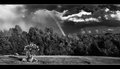 after I took it a few hours before rollover but originally had this one entered after I took it a few hours before rollover but originally had this one entered  I thought the sky was more dramatic with the rainbow shot so I ended up going with that. I didn't end up with a bad score just wondering what you all thought. I thought the sky was more dramatic with the rainbow shot so I ended up going with that. I didn't end up with a bad score just wondering what you all thought. |
|
|
|
05/04/2010 05:57:17 PM · #2 |
I gave your entry an 8. Cool idea to show a rainbow in B&W.
I do actually like your alternate a bit better, but would likely also have given that an 8. |
|
|
|
05/04/2010 05:59:46 PM · #3 |
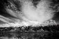
| The alternate is stronger IMO, not so busy, more serene |
|
|
|
05/04/2010 06:02:01 PM · #4 |
| This was the hardest challenge I have entered from a choosing standpoint. I had about 5 or6 to choose from then got the rainbow shot after I finally settled on one. The main reason I went with the rainbow was the sky and I was hoping the rainbow may grab the voters attention. I am not complaining about the score though, it did make my top 5 on my page. |
|
|
|
05/04/2010 06:06:31 PM · #5 |
In my opinion, while many people might have visually liked the second one better, it would have done worse score wise.
The reason for this is because while it is a beautiful picture, it is one that is similar to many other entries in the challenge whereas your rainbow picture was unique and interesting. Your second picture is visually pleasing, but it doesn't have any wow factors, and since so many landscape images are visually pleasing in some ways it becomes "average" would not prompt massively high scores. So I think some people who would have liked the second picture better would have actually given the first a higher score. Does that make sense?
Here is an example that has similar elements to your photo, mountain, water, trees and clouds that I find very visually pleasing that did worse than your rainbow entry
Message edited by author 2010-05-04 18:09:14. |
|
|
|
05/04/2010 06:10:28 PM · #6 |
Originally posted by Fiora:
In my opinion, while many people might have visually liked the second one better, it would have done worse score wise.
The reason for this is because while it is a beautiful picture, it is one that is similar to many other entries in the challenge whereas your rainbow picture was unique and interesting. Your second picture is visually pleasing, but it doesn't have any wow factors, and since so many landscape images are visually pleasing in some ways it becomes "average" would not prompt massively high scores. So I think some people who would have liked the second picture better would have actually given the first a higher score. Does that make sense? |
Yes it does. I think my originally entry would have scored between a 5-5.5. Now if There was a more dramatic sky for my mountain/lake shots that would probably have changed things but as it is the sky is quite dull and boring. Thank you all for your input. |
|
|
|
05/04/2010 06:11:16 PM · #7 |
| not a mistake, but a sure misconception to the voters for your original |
|
|
|
05/04/2010 06:11:59 PM · #8 |
| lol, yeah that is one of my teammates shots and was surprised to see it finish under mine. It seems I have to step up my game with this DPL as there are so many more entries and many similar entries. |
|
|
|
05/04/2010 06:18:18 PM · #9 |
To tell you the truth, I like your alternate entry better, as well.
While it is a neat thing to capture a good strong rainbow image, the thing about rainbows is that they are about color. Looking at the image, I could also mistake this for a spray of water from a pipe on the other side of the trees. (Were rainbow not in the title, I'm not sure that I would have known what it was, without a long look. Which is not what the voters tend to do.) The tree in the foreground competes with the rainbow as well. The composition of your second image is much stronger for me.
|
|
|
|
05/04/2010 06:27:42 PM · #10 |
Some people in the comments said they would like to see the color version so here it is. I also placed it in the description of my entry.

|
|
|
|
05/04/2010 08:28:30 PM · #11 |
Originally posted by Fiora:
Here is an example that has similar elements to your photo, mountain, water, trees and clouds that I find very visually pleasing that did worse than your rainbow entry
|
The two images are very different, the one you quote does not have that feeling of peace that jminso's alternate does. The clouds are too overpowering |
|
|
|
05/04/2010 08:41:34 PM · #12 |
| I like the alternate due to the strong composition. The triangular shape of the mountain adds strength to the image that is just not there in your entry. I gave you an 8 on the entry too, but I definitely like the altenate better. |
|
Home -
Challenges -
Community -
League -
Photos -
Cameras -
Lenses -
Learn -
Help -
Terms of Use -
Privacy -
Top ^
DPChallenge, and website content and design, Copyright © 2001-2026 Challenging Technologies, LLC.
All digital photo copyrights belong to the photographers and may not be used without permission.
Current Server Time: 04/16/2026 10:21:38 AM EDT.


