| Author | Thread |
|
|
04/08/2010 01:56:36 AM · #1 |
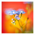
Okay, this must be my second attempt ever at doing a flower macro... and I wanna know how you think I did.
 |
|
|
|
04/08/2010 08:44:54 AM · #2 |
Hi, leaving my quick two cents for you.
I think this is a touch dark. But thats not the biggest issue to me. The crop here leaves me a little confused, I cant tell what this flower looks like from this angle/framing. Theres a little too much going on there.
Some of the petals look like they're dying so maybe choosing a "cleaner" flower would have helped.
The colors are very nice and vibrant. The most interesting part of the photo to me is that exotic looking tongue curvy thing. So perhaps if it were a little more in focus it would add to the image. Those are just my opinions! I hope you find them useful. |
|
|
|
04/08/2010 08:55:36 AM · #3 |
I agree with Tim's critique and I'll add that the orange in the background seems to clash with the other colors. This might look better with a black or a white background, maybe even a background just of green leaves.
As far as the crop goes, I think that a landscape oriented choice (but not so long) would have been better. I'd like to see less on top of this image and more to the right.
As for the darkness of the image: I agree that it seems a little dark. If you shot in RAW you could bump up the exposure. If not, then a levels adjustment would also help here. |
|
|
|
04/08/2010 10:18:16 AM · #4 |
Thank yous!
Re: exposure. I tried to just even out exposure by looking at a histogram and making it look "normal" (a nice hill in the middle)... obviously not the proper way to do exposure correction. The weird background is a painting with flowers, I figured the colors worked better than other stuff in the living room. I agree the composition could be better, but landscape didn't fit the whole thing in for me (remember I'm using a makeshift macro). |
|
|
|
04/08/2010 10:38:28 AM · #5 |
| I have a drying rack that I use with a black cape (remember I'm a hairdresser) and I use a tall bar stool to set up my "studio"...(oh, that's a stretch)...just some thoughts as to what you could use around the house for this |
|
|
|
04/08/2010 10:42:53 AM · #6 |
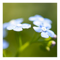
I'm no flower expert but compositionally, the image seems off balance. The focal point is kind of leaden at the bottom of the frame, too dark to really engage the eye. The background bokeh isn't connected with the flower and while the colors are what they are, they don't really compliment each other. It's also hard to tell but the whites seem to be a little warmer/yellower than they are naturally...I'm not sure about that, though.
 
Those are my latest two. The haloing/fringing is pretty much straight from shooting into nearly direct midday sunlight not the post processing.
eta:60mm Macro shot at f3.3 shutter:1/1600
Message edited by author 2010-04-08 11:15:39. |
|
|
|
04/08/2010 02:06:52 PM · #7 |
| My first impression is there's too much flower in the image. The focus is on the one stamen so maybe have that peaking out of the lower left corner. Increase the DOF just a touch to increase the definition of the background but not so much to make the background distracting. |
|
|
|
04/08/2010 02:32:22 PM · #8 |
Originally posted by cpanaioti:
Increase the DOF just a touch to increase the definition of the background but not so much to make the background distracting. |
He shot at f22 for 4 secs which I don't quite get but you can't increase the dof much from there...unless you move further away from the point of focus.
George- I don't think you needed a dof of f22. Images get really muddy looking and lose their vibrancy at that setting. I go super shallow but I wouldn't shoot above f11...or f8 for that matter and in fact, my images are shot close to f2.8 or as wide open as I can possibly get. Ursula, one of the best flower shooters I can think of also goes with a wide open aperture and she is quite well respected in the flower department. |
|
|
|
04/08/2010 02:38:23 PM · #9 |
Originally posted by pawdrix:
George- I don't think you needed a dof of f22. |
I'm familiar with diffraction... but I wanted to get both tongue-looking thingies in focus. Now that I see that wasn't really possible, I'm thinking I should've stuck with f/8 or so. |
|
|
|
04/09/2010 12:00:34 PM · #10 |
Originally posted by George:
Okay, this must be my second attempt ever at doing a flower macro... and I wanna know how you think I did.
 |
The bright, soft BG up top draws more viewer attention than the main subject. That is not good. A way to fix that would be to darken the BG and brighten and add more vibrance to the flower. That will focus viewer attention on the flower and take it away from the BG where it is now. Make that change and you might be very surprised how much it improves the image.
Regarding composition, a simple change would be to crop off more of the top so the main part of the flower forms a diagonal across the frame for compositional interest and will have the added benefit that it'll occupy more image real estate. Would have been nice to have a bug in there. ;)
Light Curve Note:
Always reference the light curve during post processing by starting with any needed exposure changes followed by global color temperature or hue changes that may be necessary. Everything else falls into footstep from there.
There is no such thing as a totally "correct" light curve because extreme conditions at shutter time might dictate a "non-standard" light curve for some images, but for most pictures a well behaved light curve unclipped across the full range will give the best tonal quality that will look the same across a wide range of monitors and prints more like you see it.
|
|
Home -
Challenges -
Community -
League -
Photos -
Cameras -
Lenses -
Learn -
Help -
Terms of Use -
Privacy -
Top ^
DPChallenge, and website content and design, Copyright © 2001-2026 Challenging Technologies, LLC.
All digital photo copyrights belong to the photographers and may not be used without permission.
Current Server Time: 04/26/2026 10:13:22 PM EDT.

