| Author | Thread |
|
|
01/08/2010 08:22:22 AM · #1 |
I have learned long ago not to EXPECT a 6 but I certainly was NOT expecting it to do WORSE than my shot 2 1/2 years ago.
Old Mill At Reems Creek Falls
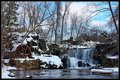
Avg (all users): 5.3167
Avg (commenters): 5.8000
Avg (participants): 5.3707
Avg (non-participants): 5.2188
is WORSE than ???????
The Flow Of Life - Looking Glass Falls
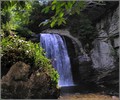
Avg (all users): 5.4394
Avg (commenters): 5.0000
Avg (participants): 5.3519
Avg (non-participants): 5.8333
I did get some nice feedback during the challenge so I have to ask would any of these have done any better:

It is cropped closer to balance the two main subjects better, has slightly different processing and less sharpening when I resized it down in three stops.
or

Same processing as challenge submission but is cropped closer to balance the two main subjects better and less sharpening when I resized it down in three stops.
So, thoughts? |
|
|
|
01/08/2010 08:28:44 AM · #2 |
| I don't think you can compare those two shots. What I can say is that your new shot is extremely oversharpened, more cluttered and less interesting than the old one. Honestly, if I had voted on the current one I had given a 4 while the old one actually got a 6 from me. |
|
|
|
01/08/2010 08:29:41 AM · #3 |
No, the new one is actually a lot better. Quality has, on average, gone up over the last few years. The percentiles are not very different (39% vs 34%), so your placement is about the same. That means your quality has gone up, but it's gone up roughly as much as others'.
Message edited by author 2010-01-08 08:30:28. |
|
|
|
01/08/2010 08:43:43 AM · #4 |
| It got a 6 from me, but I agree it may be slightly oversharpened, and that's probably what hurt it the most. |
|
|
|
01/08/2010 08:53:03 AM · #5 |
While I like both of them overall, I think your older shot was substantially stronger in comparison. The framing use of the overhead leaves is good along with the foreground bright greens. You have some strong diagonals and leading lines working (formation of near triangular shapes), the shot is simpler overall subject-wise, and then finding the person in the composition is a fun and pleasant surprise.
The newer photo is a nice scene but more static. Less thoughtful to me in a way - feels like a shot that someone could walk up to and take a good snap (a long exposure with blurred water motion would improve this scene tremendously IMO) - where the older one has more elements that had to be considered by the photographer. |
|
|
|
01/08/2010 08:58:42 AM · #6 |
There's a serious blue cast in the image that IMNSHO should have been taken down.....a lot....
|
|
|
|
01/08/2010 09:24:28 AM · #7 |
Originally posted by NikonJeb:
There's a serious blue cast in the image that IMNSHO should have been taken down.....a lot.... |
I agree even a lot of the snow is blue in places. Blue color cast really hurts it as well as the oversharpening.
Matt |
|
|
|
01/08/2010 09:27:26 AM · #8 |
Thanks for the brutally honest feedback. Seems my processing killed the appeal - I did not notice it until it was pointed out that there was a bluish cast. Now that is mentioned I cannot help but to see it now. Ugh!
Will have to go back and rework the picture for print purposes (removing it off the print list now) to get rid of that bluish cast, lessen the 'oversharped' processing, and perhaps zoom in a little more so that the waterwheel and waterfall are on opposite sides framing the shot.
Message edited by author 2010-01-08 09:29:51. |
|
|
|
01/08/2010 10:09:51 AM · #9 |
| Left you a comment on "image8.jpg" |
|
|
|
01/08/2010 10:15:02 AM · #10 |
| I think you already got your answers, but just to throw in my two cents, I agree that the more recent entry is very busy. What I think is interesting though is that your three examples of different treatment for the photo seem to me to be essentially the same. I'm not saying I can't see the differences, but they are subtle and probably wouldn't have made much difference to the average voter clicking through 300+ photos. |
|
|
|
01/08/2010 10:34:11 AM · #11 |
The earlier shot has interesting foreground which gives it a lot more feel of being there, and depth. I don't feel the urge to dive into the winter scene like I do with the summer scene. The emotional connection is much stronger with the summer scene. Both are good, but for different reasons. The winter shot is a literal depiction of a scene, the summer shot has a more "day dream" connection.
|
|
|
|
01/09/2010 10:44:42 AM · #12 |
O.K. went back to original file and started from scratch and lessened how much I used Topaz (I think I was overeager with the use - ala Charlie Brown putting on the ornament on the meek Christmas Tree: "Argh, I killed it!" :-):-) )
My Dec. 2009 Freestudy Entry
The Reworked Version

No overly bluish tones, cropped closer to showcase the mill wheel and the waterfall and also to lessen the bramblework of trees that made it a tad too busy.
Thoughts??? |
|
|
|
01/09/2010 10:56:11 AM · #13 |
| Better with respect to white balance and color. |
|
|
|
01/09/2010 11:37:51 AM · #14 |
Originally posted by CNovack:
O.K. went back to original file and started from scratch and lessened how much I used Topaz (I think I was overeager with the use - ala Charlie Brown putting on the ornament on the meek Christmas Tree: "Argh, I killed it!" :-):-) )
My Dec. 2009 Freestudy Entry
The Reworked Version
No overly bluish tones, cropped closer to showcase the mill wheel and the waterfall and also to lessen the bramblework of trees that made it a tad too busy.
Thoughts??? |
Still too much clutter. The scene has no impact as a whole and the items in it get lost in the clutter. It still looks very cold and blueish. Honestly, it simply isn't a good scene to photograph. Too much unimportant detail, no strong leading lines, no strong subjects that draw the eye, too flat, there is no 3D depth at work here.
|
|
|
|
01/09/2010 12:09:04 PM · #15 |
Originally posted by CNovack:
O.K. went back to original file and started from scratch and lessened how much I used Topaz (I think I was overeager with the use - ala Charlie Brown putting on the ornament on the meek Christmas Tree: "Argh, I killed it!" :-):-) )
My Dec. 2009 Freestudy Entry
The Reworked Version
No overly bluish tones, cropped closer to showcase the mill wheel and the waterfall and also to lessen the bramblework of trees that made it a tad too busy.
Thoughts??? |
Far too much sharpening makes it look untidy, especially the trees in the background. |
|
|
|
01/09/2010 12:15:07 PM · #16 |
I'm with Simms and Azrifel. You've been seduced by the detail (happens to me a lot) and are trying to make something unworkable work. It's a perfect example of "can't see the forest for the trees". In situations like this, less is almost always more; you needed to be right *in* on that wheel so it's a foreground object, for example; that might have worked.
I'm ALL the time taking nice broad landscape shots full of shimmering light that just mesmerize me, only to find out upon inspection in processing that they are just a mass of indiscriminate detail with nowhere for the eye to land. So I sympathize. Hell, I've even *entered* a few of them, and suffered in the voting for it.
R. |
|
|
|
01/09/2010 12:25:39 PM · #17 |
| Also, the shot that works at 700-800 pixels may be quite different than the shot that works from 4000-5000 pixels. There are some shots that would be great on the wall that absolutely suffer at DPC because of the small canvas. Lots of detail is a hallmark. |
|
|
|
01/11/2010 09:14:48 AM · #18 |
Originally posted by DrAchoo:
Also, the shot that works at 700-800 pixels may be quite different than the shot that works from 4000-5000 pixels. There are some shots that would be great on the wall that absolutely suffer at DPC because of the small canvas. Lots of detail is a hallmark. |
This is exactly what made me decide to go back to the original 'grand' scale version. Because that closer cropped one still had a lot of 'clutter' I decided to go back to the full view. The original photo is 4272 x 2848 resized down to 3600 x 2400 for print purposes. I do think that the grand scale with the detail is lost with smaller 780 pixel size.
My Dec. 2009 Freestudy Entry
The Final Reworked Version

No overly bluish tones, selected the wheel and brought up the reds to make it pop, less use of topaz that brought out extreme detail, and minor touch-ups of imperfections here & there that I had not noticed in previous versions. |
|
|
|
01/11/2010 09:15:01 AM · #19 |
Originally posted by Bear_Music:
I'm with Simms and Azrifel. You've been seduced by the detail (happens to me a lot) and are trying to make something unworkable work. It's a perfect example of "can't see the forest for the trees". In situations like this, less is almost always more; you needed to be right *in* on that wheel so it's a foreground object, for example; that might have worked.
I'm ALL the time taking nice broad landscape shots full of shimmering light that just mesmerize me, only to find out upon inspection in processing that they are just a mass of indiscriminate detail with nowhere for the eye to land. So I sympathize. Hell, I've even *entered* a few of them, and suffered in the voting for it.
R. |
Bear, yes, I think you are right that I was captivated by the grand scale. And I still love the grand scale in the photo but I think for small pixel size it just translates as too busy. For a large print it would work fine. I have a couple of shots from another angle the has the wheel more in the foreground but the waterfall is partially obscured (to get a better angle I would have had to stepped into the freezing cold water and I am crazy but not that crazy to get the shot:-) )As for the 'less is more' I kinda of wished that I maybe went with something more simple for the challenge like:
 or even or even 
Lastly, thank you everyone who gave me a wealth of feedback, I do appreciate it!
Message edited by author 2010-01-11 09:28:22. |
|
|
|
01/20/2010 10:49:02 AM · #20 |
I just went combing through my pictures again and came accross this angle that doesn't have the wheel obscureing the waterfall as much as others I took at that angle.
Mayhap this would have been better on the eyes:-)...will never know *shrug*
 |
|
|
|
01/20/2010 11:31:45 AM · #21 |
I think with a longer shutter speed to make the water flow more soft would work nicely with your entry.
Make it into a puzzle. Looks like it would be a tough one :p |
|
Home -
Challenges -
Community -
League -
Photos -
Cameras -
Lenses -
Learn -
Help -
Terms of Use -
Privacy -
Top ^
DPChallenge, and website content and design, Copyright © 2001-2026 Challenging Technologies, LLC.
All digital photo copyrights belong to the photographers and may not be used without permission.
Current Server Time: 04/27/2026 08:18:24 PM EDT.


