Okay......as a carryover from Joe's Dirt_Diver freaky processing thread, that he officially pronounced dead.......here's the proposition.
I have uploaded the original files from these two images, both of which I used Topaz on, amongst the usual gamut of stuff in CS2, and these are the kind of images that have provoked some.......discussion.....on various levels.
These images below are approximately 4&5 MB jpeg files, not cropped or anything other than resized down from roughly 14x20 to 8x12.
Download one or both, do 'em up how you would best meet the challenge descriptions, and how you feel that they look the most promising, to you, and tell us what you did, how, and why.
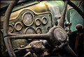
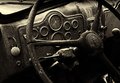
Image Grain III: Description-Use grain/noise in your photo to add to its impact.
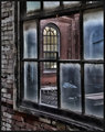
Window View II: Description-Find an interesting window view. The window glass or frame must be included in the photo to make it obvious it's been taken from a window.
I'm actually a delightful mix of curious and excited to see what you might do in your quest for that "Perfect" way of processing these images.
I'm surprised nobody else took you up on it yet. I did two edits with slightly different looks. Can anyone tell me if Topaz was used on either of them?
Here is my stab at it. All manual :), no photomatix or topaz. For the record, your version is a lot better and it was probably a few steps rather than several! I included my layers palette fyi. I ran luko sharpening after flattening the image to exaggerate the noise/grain. Fun exercise...thanks for posting.
ONe more thing...I got to the very end and realized that your tight crop was a vast improvement over my slight one. Good call!
I tried down loading the window shot, it opens a pix 1"x1" photo ? Don't know why.
Use the View full-sized image link...
Pardon my ignorance, but exactly how do you do this to download the full size photo?
click on the original image, then in the box for the image description there's an option to open the full size.. Click on that and then you can right click to save it and begin your work on it..
I'm surprised nobody else took you up on it yet. I did two edits with slightly different looks. Can anyone tell me if Topaz was used on either of them?
I think maybe....on the second one.
I like that one best.
My own inclination on that one would be to take the cyan down a little.
The blue cast that I had on mine was not wholly intentional, but I liked it somewhat so I rolled with it.
Here is my stab at it. All manual :), no photomatix or topaz. For the record, your version is a lot better and it was probably a few steps rather than several! I included my layers palette fyi. I ran luko sharpening after flattening the image to exaggerate the noise/grain. Fun exercise...thanks for posting.
ONe more thing...I got to the very end and realized that your tight crop was a vast improvement over my slight one. Good call!
Thanks, Mark! I had a lot of fun with that image, and even if it would have not gotten a Top 10, it's one of my all-time faves.
You're right, I didn't do very much to it.
The adaptive exposure, done with the regions slider, and minor tweaks brought out the color & grain nicely.
I think that's the two features of Topaz that appeal to me the most. The way it works with light and texture.
Which I think are the two reasons most people hate it! LOL!!!
I will have to say that I do feel that I have a knack for getting a decent look with gritty, grungy, dilapidated things......I know I enjoy the heck out of working with them.
I have learned here from viewing others' work that cropping is important. I definitely feel that I havbe much to learn there!
My own inclination on that one would be to take the cyan down a little.
Actually, I liked the cyan showing in the windows and I cranked it up a little. It's always interesting to see what different people do with the same scene, isn't it?
Originally posted by NikonJeb:
I think maybe....on the second one.
I think the point has been proven. That is the one that did not use any Topaz product. I did use PaintShop Pro's clarify adjustment on it, however. The first one used both Topaz Adjust and Topaz Detail
I didn't think of black and white until spiritualspatula tried it. I tried a couple of conversions from one of my earlier versions using virtual photographer plugin.
Sorry, was at class til 10:00pm last night, Ill take a stab after happy hour tonite.
*Edit: Not really sure what the goal is here. The whole conversation was about taking lackluster images, throwing a fresh coat of topaz on them, and passing them off as something good. So is the goal for me to try and make these look good or try to make them look topazed without actually topazzing them? Or what?
Nice. For me the b&w reveals the composition, which doesn't seem as important in the color version.
Thats the way I would go with it too. The colors are too bright for such a dreary scene. I don't think I would have gone this dark, but I think BW is definitely the way to go.
Nice. For me the b&w reveals the composition, which doesn't seem as important in the color version.
Originally posted by AJSullivan:
Thats the way I would go with it too. The colors are too bright for such a dreary scene. I don't think I would have gone this dark, but I think BW is definitely the way to go.
Sorry, was at class til 10:00pm last night, Ill take a stab after happy hour tonite.
*Edit: Not really sure what the goal is here. The whole conversation was about taking lackluster images, throwing a fresh coat of topaz on them, and passing them off as something good. So is the goal for me to try and make these look good or try to make them look topazed without actually topazzing them? Or what?
Do whatever you like.....just tell us what you're doing, and why.
If you think you can't make them look good on any level, then tell us what you would have done differently to make them interesting.
I didn't think of black and white until spiritualspatula tried it. I tried a couple of conversions from one of my earlier versions using virtual photographer plugin.
I'd love to see something about halfway between these two.
I didn't think of black and white until spiritualspatula tried it. I tried a couple of conversions from one of my earlier versions using virtual photographer plugin.
I'd love to see something about halfway between these two.
I like it.
Thanks. Once last try, light one added above dark one at opacity 25%:
Thats the ticket. I still don't like how in focus the bacground is. When I get home, I'll give it a shot, but definitely going to throw a blur layer on to make some false bokeh and drop that out a slight bit - help add some depth.