| Author | Thread |
|
|
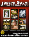
10/03/2009 10:05:04 PM · #1 |
REMOVED due to key-wording
Message edited by author 2010-04-02 23:12:27.
|
|
|
|
10/03/2009 10:36:31 PM · #2 |
I ike the background. My copy would say something like...Joseph Salmi Photography Capturing your important moments. Portraits, Weddings, etc, etc.
Keep it straight. Keep it clear. Keep it simple.
Message edited by author 2009-10-03 22:37:04. |
|
|
|
10/04/2009 06:13:46 AM · #3 |
| I'd change the wording of "call us about photographing other events". This sounds like 'this' is what I do but call me if you want something different. |
|
|
|
10/04/2009 10:17:02 AM · #4 |
Originally posted by dassilem:
I'd change the wording of "call us about photographing other events". This sounds like 'this' is what I do but call me if you want something different. |
The idea I had behind this was that if they have a sporting event I could shoot that. I could also shoot a business event or a birthday party and so on.
What do you think I should change it too? |
|
|
|
10/04/2009 10:34:17 AM · #5 |
I would change that line to something like "Call to book us at your next special event" or something to that extent. Because it doesn't limit you to a certain type of event. Drop the word "table" out of the "mention this" part. I like your choice of photos, as they cover a wide spectrum of events.
I'm not that great at copy though, so I don't really know what to say in there. Do you find it is awkward as hell to try and write about yourself? I know I do. |
|
|
|
10/04/2009 11:32:05 AM · #6 |
| Yep that's kinda what I was thinking. Because the reader is not at an event so you want to leave him with all kinds of thoughts. I also love the shots you have displayed. Shows alot of options! |
|
|
|
10/04/2009 11:39:02 AM · #7 |
Originally posted by AJSullivan:
I would change that line to something like "Call to book us at your next special event" or something to that extent. Because it doesn't limit you to a certain type of event. Drop the word "table" out of the "mention this" part. I like your choice of photos, as they cover a wide spectrum of events.
I'm not that great at copy though, so I don't really know what to say in there. Do you find it is awkward as hell to try and write about yourself? I know I do. |
Yes I do find it awkward to write about myself.
As the word "table", I think I might need to leave that in there just because it's going on a table ad and I want to know how much of my business is coming from the table ad vs the other 4-5 ads that I have out there. |
|
|
|
10/04/2009 11:39:40 AM · #8 |
Originally posted by dassilem:
Yep that's kinda what I was thinking. Because the reader is not at an event so you want to leave him with all kinds of thoughts. I also love the shots you have displayed. Shows alot of options! |
Awesome, I'm so glad you guys get the message I was trying to convey |
|
|
|
10/04/2009 11:49:00 AM · #9 |
Bullet the services you provide, insert a call to action and offer a guarantee. Surround your copy with the images so the images frame you message. Include more images in the flyer and make the name and number smaller (You are primarily selling image creation and not your name). Insert, FREE CONSULTATION, as a larger element because everyone likes free. Testimonials are golden, use them. Good idea to make geographic reference to the areas you cover.
Some points to consider.
It works. |
|
|
|
10/04/2009 11:50:15 AM · #10 |
Do you mind if I add something not related to your original post? I was looking at your ad and I don't feel like the starbursts at the top add anything to the whole layout. When I see starbursts, I think of things light and fanciful, and I look at your photos that you included and they show a more serious, higher quality of work. I guess for me, those starbursts are cluttering the top, rather than enhancing it.
Overall, it looks cool. Good luck! |
|
|
|
10/04/2009 12:46:52 PM · #11 |
| I thought th starbursts are part of his logo |
|
|
|
10/04/2009 01:09:19 PM · #12 |
Originally posted by colorcarnival:
Do you mind if I add something not related to your original post? I was looking at your ad and I don't feel like the starbursts at the top add anything to the whole layout. When I see starbursts, I think of things light and fanciful, and I look at your photos that you included and they show a more serious, higher quality of work. I guess for me, those starbursts are cluttering the top, rather than enhancing it.
Overall, it looks cool. Good luck! |
Okay I will reedit the ad some and then post a new one, thank you all soooo much for all this help I really do need it. I was supposed to have this ad in last Friday but I called them and told them to hold off a few days as I needed to make sure I was 100% satisfied with the ad. After all once it goes on the table I can't change it. |
|
|
|
10/04/2009 01:10:44 PM · #13 |
Originally posted by dassilem:
I thought th starbursts are part of his logo |
No I just thought it looked good because the name was made to look like glass and I just like the starbursts. But I will post a copy without them and see what you all think.
I have a smash cake photo session in less than 20 minutes so it will be a few hours before I can get to it but watch this thread for the update... |
|
|
|
10/04/2009 01:19:04 PM · #14 |
If it were me, I'd simplify things as much as humanly possible. People inherently know what a photographer does (or tries to do, in terms of "capturing special moments," blah blah blah), so I'd try to focus attention to a couple high-quality shots from your areas of specialty (a wedding shot, a sports portrait, etc.).
I'd have as few words in it as possible. Even though people are sitting at a table waiting for food, they're not likely to sit and read every word of ads -- people get easily overwhelmed by a load of information.
I'd go with what you have in the original post, enlarge a couple key photos, and ditch any of the proposed "fluff" wording (and delete the "call us about photographing other events" line... it's not necessary).
In the end, my goal would be to drive people to the web site where you can elaborate on anything and everything, and give them easy access to contacting you there. People nowadays are much more likely to want to see more examples of your work on the web and reach you through the site, rather than immediately picking up the phone. |
|
|
|
10/04/2009 05:25:51 PM · #15 |
Originally posted by alanfreed:
If it were me, I'd simplify things as much as humanly possible. People inherently know what a photographer does (or tries to do, in terms of "capturing special moments," blah blah blah), so I'd try to focus attention to a couple high-quality shots from your areas of specialty (a wedding shot, a sports portrait, etc.).
I'd have as few words in it as possible. Even though people are sitting at a table waiting for food, they're not likely to sit and read every word of ads -- people get easily overwhelmed by a load of information.
I'd go with what you have in the original post, enlarge a couple key photos, and ditch any of the proposed "fluff" wording (and delete the "call us about photographing other events" line... it's not necessary).
In the end, my goal would be to drive people to the web site where you can elaborate on anything and everything, and give them easy access to contacting you there. People nowadays are much more likely to want to see more examples of your work on the web and reach you through the site, rather than immediately picking up the phone. |
Okay I got it, let me revise my ad... |
|
|
|
10/04/2009 11:13:36 PM · #16 |
okay everyone, here is the new version of the ad. What do you think, BE HONEST!
|
|
|
|
10/04/2009 11:24:09 PM · #17 |
| Much better, the starbursts were making it look a bit 70's... |
|
|
|
10/04/2009 11:31:16 PM · #18 |
Originally posted by Dirt_Diver:
okay everyone, here is the new version of the ad. What do you think, BE HONEST!
|
Totally perfect IMHO.... I really don't think you need to add anything else.. I personally think that less is more and this looks great.. I also think it was a good idea to move the "mention this ad" decal off of the image it was hovering over on the original ad.. Looks good !!! |
|
|
|
10/04/2009 11:41:08 PM · #19 |
|
|
|
10/05/2009 12:42:08 AM · #20 |
My last consulting job was with a newspaper and the topic of effective display advertising/marketing campaigns was a large part of it.
Many advertisers miss the opportunity to get their message out because they get hung up on aesthetics. They lose sight of the fact that people are bombarded with advertising virtually everywhere and they have short attention spans. They also lose sight of the purpose of the ad.
The purpose is to trigger a consumer to take action. Nothing more and nothing less. That's all an ad can do. You have a few precious micro seconds to engage them and if you lose it, they're gone.
The most effective ads for small businesses are direct and to the point. They tell the consumer what you offer, what want them to do, why you are different and how you back up value. As a matter of fact, many large advertisers have made their contact information smaller because they think if you see value, you'll find the contact info within the ad.
The difference between the BIG advertisers and the small guy is the budget. Large companies can drip on you for a long time and create rapport through multiple subtle media exposures. Small advertisers will go broke trying to accomplish the same thing. They do not have the resources to compete and have to be clever with the little they can do.
Some of the most effective ads offer guarantees. Yes a guarantee. We all stand behind our work so why not guarantee it? The extent of the guarantee is up for discussion but will most likely encourage contact. As well, everybody loves FREE. Though its cliche, who cares, it works. Special offers and associations are great. "If Tony the restaurant owner tells you to call, get 10% off". Its somewhat like a referral and works like a charm as it implies credibility. Colors are a very powerful tool if used properly, and can really make a difference.
The worst thing small advertisers do is let their ego dictate the composition of an ad. Their need for a "sophisticated self portrayal" generates little revenue and costs dearly. Those who step out of the box and remember the purpose of an ad, profit the most. Their ads may be corny, gaudy, over the top and slippery but they are usually profitable. An ad can never say what you can as a business owner but it can start a conversation. The ad can start that conversation if done right.
Will this ad start a conversation? My experience would say likely not as often as you'd like because it looks like every other ad out there.
Its very purdy and neat but that's not enough to get them to call. Sorry, just hate to see you waste your money.
I sent you a link on your prior forum post, read through it as its a wealth of information.
Anyhow, enough said as I noticed you didn't respond to my last comment in this thread.
How's this, "Looks Great"!! ;-)
|
|
|
|
10/05/2009 07:10:25 AM · #21 |
Originally posted by Ivo:
My last consulting job was with a newspaper and the topic of effective display advertising/marketing campaigns was a large part of it.
Many advertisers miss the opportunity to get their message out because they get hung up on aesthetics. They lose sight of the fact that people are bombarded with advertising virtually everywhere and they have short attention spans. They also lose sight of the purpose of the ad.
The purpose is to trigger a consumer to take action. Nothing more and nothing less. That's all an ad can do. You have a few precious micro seconds to engage them and if you lose it, they're gone.
The most effective ads for small businesses are direct and to the point. They tell the consumer what you offer, what want them to do, why you are different and how you back up value. As a matter of fact, many large advertisers have made their contact information smaller because they think if you see value, you'll find the contact info within the ad.
The difference between the BIG advertisers and the small guy is the budget. Large companies can drip on you for a long time and create rapport through multiple subtle media exposures. Small advertisers will go broke trying to accomplish the same thing. They do not have the resources to compete and have to be clever with the little they can do.
Some of the most effective ads offer guarantees. Yes a guarantee. We all stand behind our work so why not guarantee it? The extent of the guarantee is up for discussion but will most likely encourage contact. As well, everybody loves FREE. Though its cliche, who cares, it works. Special offers and associations are great. "If Tony the restaurant owner tells you to call, get 10% off". Its somewhat like a referral and works like a charm as it implies credibility. Colors are a very powerful tool if used properly, and can really make a difference.
The worst thing small advertisers do is let their ego dictate the composition of an ad. Their need for a "sophisticated self portrayal" generates little revenue and costs dearly. Those who step out of the box and remember the purpose of an ad, profit the most. Their ads may be corny, gaudy, over the top and slippery but they are usually profitable. An ad can never say what you can as a business owner but it can start a conversation. The ad can start that conversation if done right.
Will this ad start a conversation? My experience would say likely not as often as you'd like because it looks like every other ad out there.
Its very purdy and neat but that's not enough to get them to call. Sorry, just hate to see you waste your money.
I sent you a link on your prior forum post, read through it as its a wealth of information.
Anyhow, enough said as I noticed you didn't respond to my last comment in this thread.
How's this, "Looks Great"!! ;-) |
Your information is very valuable to me and I'm taking in everything that everyone is saying. I'm sorry I didn't respond to your post on an individual level but I was talking to everyone when I said I would revise the ad. I know there is no way for you to know that because I responded with a quote from someone else but again I'm sorry.
I did forget to add the guarantee though. It was getting late last night and I was started to rush because the wife was telling me to come to bed.
I'll read over the links you gave me and post the new revision. Thank you so much for spending time to help me on this. It means a lot to me. |
|
|
|
10/05/2009 09:56:57 AM · #22 |
okay version 3, is this any better or too cluttered now?
 |
|
|
|
10/05/2009 01:21:38 PM · #23 |
| it doesn't seem to cluttered to me... one of the suggestions was to also include the areas you cover.. maybe reduce the size of your phone # and include that in there.. Just to see what it looks like.. |
|
|
|
10/05/2009 01:45:49 PM · #24 |
Hi Joe
I will add a few things for what its worth
I visited your website as well to have a bit of a look...............
I like that you are carrying the same colour scheme through between the ad and your website. However, I note you are not using the same text for your company name.......I feel consistancy is the key. You wish to generate work from this add, yoou also wish to build your name. Hence consistant colour, consistant logo/Company name font I always feel is important. You wish someone who has seen this add, and then maybe sees one somewhere else, puts them together, rather than thinks they are seperate companies. Tailor yoour add to the purpose, but always keep similar colours, and always keep your brand name the same.........People don't remember names, but they remember things that look similar.....
Someone else said 'put a guarentee'. This is the last thing I would do. 'Satisfaction Guarenteed' to me is overused, sounds fake, and almost amateur......sorry to those who like it, but just my opinion...........
I liked version 2 the best. It was simple, uncluttered......I would probably increase the size of the offer (it looks small and hard to read), and would change your company name to match your website...........
I also like your Senior add, but with similar comment regarding the company name font. It also probably needed and different title font colour to make it jump out.......and no phone number......
I say, a couple of changes, go with version 2, and most of all.................GOOD LUCK!!!!!!
|
|
|
|
10/05/2009 02:16:16 PM · #25 |
|
Home -
Challenges -
Community -
League -
Photos -
Cameras -
Lenses -
Learn -
Help -
Terms of Use -
Privacy -
Top ^
DPChallenge, and website content and design, Copyright © 2001-2026 Challenging Technologies, LLC.
All digital photo copyrights belong to the photographers and may not be used without permission.
Current Server Time: 04/27/2026 09:47:03 PM EDT.


