| Author | Thread |
|
|
07/15/2009 12:42:45 PM · #1 |
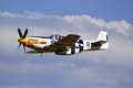
What would anybody edit on this picture to make it look better? I use CS2 and am trying to learn different ways of editing to enhance photos. |
|
|
|
07/15/2009 12:46:20 PM · #2 |
|
Hmmmmm...one thing I might do is reduce some of the reds in the blue sky. I might use my magic wand to select the sky/cloud areas and then do a layer to reduce the reds...make the blue a bit richer. I might possibly crop a bit off the right and bottom but I would have to see how it looks in comparison. |
|
|
|
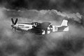
07/15/2009 12:52:17 PM · #3 |
Here's one I did that was similar, I just used an overlay to grunge it up a bit. Not sure what exactly you mean by look better. lol.
 |
|
|
|
07/15/2009 12:57:06 PM · #4 |
One thing I noticed was some noise grain in the sky. Perhaps some selective noise reduction on the background. Maybe a little burning on the brighter highlights of the fuselage to bring out some more detail. Overall it's a pretty good shot, IMO.
I don't see too many Mustangs with that style canopy.
Message edited by author 2009-07-15 12:58:56. |
|
|
|
07/15/2009 01:45:11 PM · #5 |
If you want steps just let me know and I can give you at least a rough version of what I did. |
|
|
|
07/15/2009 02:01:31 PM · #6 |
|
That would be great. I'm trying to learn as many techniques for editing as I can |
|
|
|
07/15/2009 02:14:38 PM · #7 |
I agree with the reds in the sky there. One thing that I used to do (and still do from time to time) is go to auto-color or auto-levels first thing. That's more helpful if you're not too skilled at seeing the red in the sky and things like that, because photoshop is generally good about adjusting white balance. HOWEVER, I always undo the auto-adjustments because I usually disagree in one way or another. The point is, when I go back to the original, the needed color changes are more obvious because you have another point of reference, having seen what PS assumes is the correct exposure / white balance / overall color. Sometimes it's hard to see the color corrections that are needed when everything else in the photo is also affected that way.
Also, play with layers, depending on what you're going for look-wise. |
|
|
|
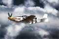
07/15/2009 02:18:58 PM · #8 |
Here's a more conventional, but "enhanced" approach, using Topaz to pull up crisper details on the plain and noise reduction in the sky, plus some color shift in the sky and some gradients from all 4 edges:
R. |
|
|
|
07/15/2009 02:20:30 PM · #9 |
Originally posted by sprite777:
I agree with the reds in the sky there. One thing that I used to do (and still do from time to time) is go to auto-color or auto-levels first thing. That's more helpful if you're not too skilled at seeing the red in the sky and things like that, because photoshop is generally good about adjusting white balance. HOWEVER, I always undo the auto-adjustments because I usually disagree in one way or another. The point is, when I go back to the original, the needed color changes are more obvious because you have another point of reference, having seen what PS assumes is the correct exposure / white balance / overall color. Sometimes it's hard to see the color corrections that are needed when everything else in the photo is also affected that way. |
I work that way also, often check autolevels and autocolors to see what Photoshop thinks is "neutral" and get an idea how I may want to shift fixed in my mind.
R.
|
|
|
|
07/15/2009 02:38:14 PM · #10 |
Originally posted by Bear_Music:
Originally posted by sprite777:
I agree with the reds in the sky there. One thing that I used to do (and still do from time to time) is go to auto-color or auto-levels first thing. That's more helpful if you're not too skilled at seeing the red in the sky and things like that, because photoshop is generally good about adjusting white balance. HOWEVER, I always undo the auto-adjustments because I usually disagree in one way or another. The point is, when I go back to the original, the needed color changes are more obvious because you have another point of reference, having seen what PS assumes is the correct exposure / white balance / overall color. Sometimes it's hard to see the color corrections that are needed when everything else in the photo is also affected that way. |
I work that way also, often check autolevels and autocolors to see what Photoshop thinks is "neutral" and get an idea how I may want to shift fixed in my mind.
R. |
Yeah, sometimes going back to the original blows my mind because it can tend to look extremely flat by comparison. |
|
|
|
07/15/2009 04:27:07 PM · #11 |
|
|
|
07/15/2009 04:40:58 PM · #12 |
[quote=Yo_Spiff] don't see too many Mustangs with that style canopy.
it's called a "malcome" canopy. It's a field mod that improved aft visability.It led to the final looks of the "D" model. |
|
Home -
Challenges -
Community -
League -
Photos -
Cameras -
Lenses -
Learn -
Help -
Terms of Use -
Privacy -
Top ^
DPChallenge, and website content and design, Copyright © 2001-2026 Challenging Technologies, LLC.
All digital photo copyrights belong to the photographers and may not be used without permission.
Current Server Time: 07/06/2026 11:11:21 PM EDT.


