| Author | Thread |
|
|
10/06/2008 04:47:29 AM · #1 |
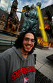
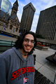
I've been playing around with this photo for a little while.. Please let me know what your thoughts are on the processing of it.. Any suggestions would be great:o)
 
Origional

|
|
|
|
10/06/2008 04:52:42 AM · #2 |
|
I do like what you've done with the image. I think that the Dave1 file is my favorite. It has the warmth that you added, as well as a little more punchiness in the contrast. I am not normally a tilt fan, but it works very well in this capture. It also works well centered, and probably only centered here, as the wide angle of you lens works to pull the eyes in and through the frame. Nicely lit, and well seen. Other than the dud needing a haircut, great image! Kidding about the haircut, great work! |
|
|
|
10/06/2008 04:54:12 AM · #3 |
Hi Jane,
Both the edits look too high on the yellows and reds to me, the original seems to have more of a correct colour tone to the skin (although it may be ever so slightly on the cold side).
Hope this helps.
|
|
|
|
10/06/2008 05:20:23 AM · #4 |
IMO, it was just missing something. Something... sinister.
 |
|
|
|
10/06/2008 06:01:17 AM · #5 |
Originally posted by Art Roflmao:
IMO, it was just missing something. Something... sinister.
|
Two words...NUT CASE ;) |
|
|
|
10/06/2008 08:13:27 AM · #6 |
First, you want to get your monitor color calibrated because without calibration your only guessing at what the true colors are. But even when you've done this (which means I'm allowing that you might have already done so), it is *still* very difficult to get skin tones correct. Part of the problem is that people have many different skin tones, some have much redder skin than others, some much more yellow, etc. And that completely ignores what you or the viewer find to be pleasing or even what the camera is set to capture (some cameras over emphasize reds, for example).
All that said... for my tastes, your edits had too much red in the face. Here is an edit with the reds toned down and also a little bit of dodging around the eyes to lighten them up, burning in the sky to darken it down. Hope this helps.
|
|
|
|
10/06/2008 07:28:52 PM · #7 |
Wow, thank you for all the great comments.
This in my hippy little brother :o)
Art.. what can I say? I love it! You are truly a brilliant visionary
In post processing I did add a slight overlay which was desaturated except for strong reds.. I liked that this gave the background a slightly cooler tone while making the face warmer.. My monitor is not callibrated and the effect might be too extreme on other monitors..
David I like your version and I tried to incorporate some of your ideas in the new version.. (bellow) I brought out the eyes a little and added another black and white layer set to lighten.. Please let me know what you think of the tones in this version.
New

Previous
Raw
Message edited by author 2008-10-06 19:29:09. |
|
|
|
10/06/2008 08:33:32 PM · #8 |
|
|
|
10/06/2008 09:32:48 PM · #9 |
I would just back the saturation down a little or play with it some. I think the original has the right tone, but the wrong light and your newer ones have better light, but somewhat un-natural tones.
|
|
Home -
Challenges -
Community -
League -
Photos -
Cameras -
Lenses -
Learn -
Help -
Terms of Use -
Privacy -
Top ^
DPChallenge, and website content and design, Copyright © 2001-2026 Challenging Technologies, LLC.
All digital photo copyrights belong to the photographers and may not be used without permission.
Current Server Time: 07/20/2026 07:45:02 AM EDT.


