| Author | Thread |
|
|
10/04/2008 05:30:21 PM · #1 |
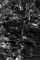
I spent a couple of hours working on this one trying to improve my b/w skills. I was trying to make the tree with the exposed roots stand out in a low contrast scene. Not sure if there is some other tip that might help, or if I did the best I could with a poor original image. Here's my result:

And here is the original as it came out of my RAW converter. Sized down to about 1500 pixels, if you click on "view full sized image". Plenty to work with if anyone is interested in playing with it and showing me what they can do on it.
[thumb]728252[/thumb]
My editing steps are in the notes for my final image.
Thanks. |
|
|
|
10/04/2008 05:37:42 PM · #2 |
Here's what I did. Just used the Black and White adjustment layer in CS3.
 |
|
|
|
10/04/2008 05:45:38 PM · #3 |
| Something in here might be useful |
|
|
|
10/04/2008 06:05:48 PM · #4 |
There's almost no large differences in tonality throughout the scene, so you're behind the 8 ball to begin with on this one. I also cropped it to isolate a less busy portion of the scene.
- make layers of the red and blue channels
- make a layer of the luminance channel (grabbed from a duplicate of the image in lab color mode)
- little masking on the blue and red channel, and the opacity sliders used to blend them
- selective color on top of the flattened image with +15 black pumped into neutrals
- some dodge and burn
- hue/sat, colorize, +3 sat, around 45 hue
- smart sharpen about 150%
- save
10 minute edit job. You could spend a couple hours doing precise work and get a better result. Again though, other than practice material it's just not the best capture to work with.
[thumb]728266[/thumb]
Message edited by author 2008-10-04 18:06:58. |
|
|
|
10/04/2008 06:21:35 PM · #5 |
Originally posted by violinist123:
other than practice material it's just not the best capture to work with. |
That's exactly what it was. Thanks, I have a few new concepts to experiment with and learn. |
|
|
|
10/04/2008 06:33:40 PM · #6 |
Originally posted by yospiff:
Originally posted by violinist123:
other than practice material it's just not the best capture to work with. |
That's exactly what it was. Thanks, I have a few new concepts to experiment with and learn. |
Figured. Have fun! |
|
|
|
10/04/2008 07:56:33 PM · #7 |
Originally posted by yospiff:
Originally posted by violinist123:
other than practice material it's just not the best capture to work with. |
That's exactly what it was. Thanks, I have a few new concepts to experiment with and learn. |
Your version is actually quite good. Try doing some corener burning with the lens correction/vignette sliders on a new layer set to multiply and "multiply neutral fill (white)" selected. I think you'll be real pleased with what that does.
I vehemently disagree witht he idea that an image that "doesn't have enough tonal variation" cannot make a good B/W image. Tell that to Edward Weston :-)
R. |
|
|
|
10/04/2008 08:07:32 PM · #8 |
Originally posted by Bear_Music:
I vehemently disagree witht he idea that an image that "doesn't have enough tonal variation" cannot make a good B/W image. Tell that to Edward Weston :-) |
I'm not sure what you mean. I'm a big fan of Weston's work, and I can't think of an image that doesn't show a considerable degree of contrast between subject and background, one which would have been present in the 'color' scene as well. Even trying to make an apples to apples comparison, Weston's photographs of trees contained hauntingly illuminated trees surrounded by muted background detail. No doubt there are exceptions to my recollection of this, and I am welcome to learn more in this matter. But in my (limited) experience and in viewing the work of the b/w artists I admire, I don't see a lot of shots where the inherent contrast offered by the scene is not critical to the appearance of the resulting print. |
|
|
|
10/04/2008 08:19:30 PM · #9 |
Originally posted by Bear_Music:
Your version is actually quite good. Try doing some corener burning with the lens correction/vignette sliders on a new layer set to multiply and "multiply neutral fill (white)" selected. I think you'll be real pleased with what that does. |
Thanks, I'm doing a lot of experimenting lately and that confirms I'm on the right track. I'll have to figure out how those concepts correspond to PSP's features. |
|
Home -
Challenges -
Community -
League -
Photos -
Cameras -
Lenses -
Learn -
Help -
Terms of Use -
Privacy -
Top ^
DPChallenge, and website content and design, Copyright © 2001-2026 Challenging Technologies, LLC.
All digital photo copyrights belong to the photographers and may not be used without permission.
Current Server Time: 05/01/2026 12:48:12 AM EDT.


