| Author | Thread |
|
|
09/08/2008 09:30:13 PM · #1 |
Recently entered this in the free study and it scored a 5.67. Just wondering what I could have done differently in PP to give it a little more impact.
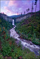
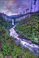
Also here's an HDR version but I'm really looking for feedback on the first one. Thanks
 |
|
|
|
09/08/2008 09:36:38 PM · #2 |
The flow of the water (in both shots) looks great--
Its just too purple for me-- it seems like the color is way off.. Its look very unatural.. |
|
|
|
09/08/2008 09:43:27 PM · #3 |
I scored it a 7 during the challenge. Beautiful image....a little bit saturated and purple... but I judged on overall quality. I actually like the HDR version better.
Message edited by author 2008-09-08 21:44:03.
|
|
|
|
09/08/2008 10:22:13 PM · #4 |
|
|
|
09/08/2008 10:25:09 PM · #5 |
Compositionally I think it's good. The stream is a good leading line to the mountain. The shutter speed chosen works really well with the water.
However, I'm in the 'too much purple' camp. The colour, at least the blues, seem a bit off.
|
|
|
|
09/08/2008 10:37:41 PM · #6 |
Left comments on both shots.
|
|
|
|
09/08/2008 10:38:13 PM · #7 |
Thanks everyone for some great feedback both here and on the picture itself. It's not that I was dissatisfied with the score- there were some great images in the FS. I'm just trying to improve cs3 skills, so the advise on what I can do really helps.
I agree that it seems a little too purple. |
|
Home -
Challenges -
Community -
League -
Photos -
Cameras -
Lenses -
Learn -
Help -
Terms of Use -
Privacy -
Top ^
DPChallenge, and website content and design, Copyright © 2001-2026 Challenging Technologies, LLC.
All digital photo copyrights belong to the photographers and may not be used without permission.
Current Server Time: 04/28/2026 10:01:51 PM EDT.


