|
| Author | Thread |
|
|
01/23/2009 05:29:30 PM · #51 |
Originally posted by posthumous:
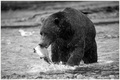
hmph... okay, well at least you have arguments, though I don't agree with them. The composition might not be tremendously inspired, but it puts the focus squarely on the bear, and leads the eye to the fish in his mouth.
As to missing the decisive moment... huh? The fish is perfectly poised (and posed), either to be sent into his mouth or by some slim chance to escape.
I have no clue what color would add to this image, except of course candy. |
Look, in many ways the two images are the *same*: they are both in a frozen wilderness, they both depict wild predators, they both have captured a frozen instant in the predator/prey relationship, that's WHY I compared them.
But the eagle shot has *impact* up the wazoo, and the bear shot has a lot less of that. And it's not all about the color, not at all. For example, let's look at the eagle shot: every aspect of the bird is dynamically drawn: you've got talons, beak, straining feathers, eagle glare, the tension in the arched neck, *it's all there!*
On the bear shot, on the other hand, the bear himself is a bit of a lump, all his pieces are in a single visual mass; no eyes, no claws, no fangs, not much of anything expressing the bear except *mass*. And to top it off, the *salmon* is the same way, arched away from us so we see no detail of the tail at all, though here we do at least see the desperately gaping mouth.
Granted, the eagle's prey, whatever it is, isn't very fully expressed either, but the rest of the image is, and that's what counts.
Finally, with the eagle shot there's an overall sense of luminosity that the relatively flat, drab bear shot is lacking. So combine all these elements, and the eagle scored nearly a point better than the bear. If the eagle had happened to have had a squirming, desperate salmon in its grasp it would have made it to top 10 and maybe even ribboned, I bet. It's just a much more impactful image.
We are, after all, a *photography* site, not a *gee whiz nature is awesome* site. I totally admire the bear shot for what it is, but at the same time I can see that it's not even CLOSE to the "best bear shot ever", know what I mean? The eagle shot, on the other hand, is much closer to that pinnacle, and the scores reflect this IMO.
R.
|
|
|
|
01/23/2009 06:03:54 PM · #52 |
Just a few:


|
|
|
|
01/23/2009 06:14:08 PM · #53 |
Originally posted by Bear_Music:
But the eagle shot has *impact* up the wazoo, and the bear shot has a lot less of that. And it's not all about the color, not at all. For example, let's look at the eagle shot: every aspect of the bird is dynamically drawn: you've got talons, beak, straining feathers, eagle glare, the tension in the arched neck, *it's all there!*
On the bear shot, on the other hand, the bear himself is a bit of a lump, all his pieces are in a single visual mass; no eyes, no claws, no fangs, not much of anything expressing the bear except *mass*. And to top it off, the *salmon* is the same way, arched away from us so we see no detail of the tail at all, though here we do at least see the desperately gaping mouth. |
That is sort of what I was getting at in regards to my post. The moment just isn't compelling in the bear shot for me. Obviously, I wasn't there but when I look at it I feel like there was a better moment to be had, a more telling moment, a grander moment or perhaps not. Either way I am left wanting more. I experience less of that with the eagle shot.
That said, I'm off-topic. I'd imagine the bear shot would also be good for a magazine. It's not a bad shot.
Message edited by author 2009-01-23 18:33:01.
|
|
|
|
01/23/2009 06:41:55 PM · #54 |
Originally posted by yanko:
That is sort of what I was getting at in regards to my post. The moment just isn't compelling in the bear shot for me. Obviously, I wasn't there but when I look at it I feel like there was a better moment to be had, a more telling moment, a grander moment or perhaps not. Either way I am left wanting more. I experience less of that with the eagle shot. |
I know, I'm off topic, but I would like to ask, since it was brought up here and purely for my own knowledge growth:
How would one score a studio shot? There is no decisive moment, no grander moment, etc. And with landscapes, other than waiting for the best light and finding the perfect composition, what pushes it over the edge? Except for the lighting, there is no decisive moment. I'm just curious, honestly, and looking for a way to balance my voting when dealing with a wide array of photography 'types.' |
|
|
|
01/23/2009 07:08:24 PM · #55 |
Originally posted by dahkota:
I know, I'm off topic, but I would like to ask, since it was brought up here and purely for my own knowledge growth:
How would one score a studio shot? There is no decisive moment, no grander moment, etc. And with landscapes, other than waiting for the best light and finding the perfect composition, what pushes it over the edge? Except for the lighting, there is no decisive moment. I'm just curious, honestly, and looking for a way to balance my voting when dealing with a wide array of photography 'types.' |
That's totally the problem, of course, with voting in general :-) That's one reason I've always advocated splitting free studies into several categories, since they are so large anyway. To a certain extent you CAN judge landscapes in "decisive moment" terms, though; it's just that the "moments" stretch a bit wider. The difference between an awesome view depicted at high noon on a cloudless day and the same prospect shown in the early-morning gloaming can, of course, be absolutely stupendous. And we are judging, or *ought* to be judging, photographers on their skills, not their good fortune. This means that a mediocre shot of, say, the valley overlook at Yosemite ought not score as well as the stunningly-rendered shot of a less exalted landscape in the Ansel Adams challenge. Of course, we'll see how that worked out, won't we? But in general, with landscape work, one can see that the light in the image either elevates the rendering or it does not,and we can judge the light.
By the same token, a beautifully-lit studio shot of a very plain-looking man *ought* to score better than a pedestrian image of a stunningly beautiful woman, right? But good luck with THAT on DPC... You can get away with beautiful, as far as subjects go, and we're pretty willing to accept ugly, but the mundane rarely fares well in our little world, no matter how lovingly rendered, except in places like the Posthumous Ribbons thread. That's too bad, but that's the way it will always be in a popular-vote site, where *most* of the votes are based on a generalized sense of "liking" the image or not.
At least in a lot of the themed challenges we tend to have images of a kind lumped together, so it's somewhat easier to score them relative to each other: few portraits in a landscape challenge, few landscapes in a portrait challenge, so to speak.
How do I deal with the dilemma? I try to reserve my top votes for exaltation and sublimity, wherever I find them. Exaltation is, loosely, the "wow" factor, and sublimity is, loosely, the "makes me ponder" for factor.
R.
|
|
|
|
01/24/2009 08:44:32 PM · #56 |
The mass of the bear is conveyed powerfully. One photo conveys flight, another conveys mass. One quality is no more valuable than the other. And it is no "lump," I can see all four legs distinctly, and, Bear, you should be able to spot better than anyone a good sculpting light that brings out every curve of his enormous form, leading to its most astounding sharpness and detail right at the moment of impact, teeth on fish. It's not a Posthumous Ribbon and it didn't get a Posthumous Ribbon. It is instead a photo that would look right at home in a good nature magazine. And it scored under 6 here. If art isn't the goal, and magazine photos aren't the goal, then what is the goal? Advertising? Well, that's a toughie, because it is fad-driven, and continually changes. I don't think DPC is keeping up with that, either. The aesthetic we end up with is a tack-sharp, smiley-faced soup of worn-out tropes.
As to studio shots, the burden is not on me to find value in them, the burden is on the photographer to put value into them: make them seem spontaneous, wild, alive, beautiful.
Message edited by author 2009-01-24 20:45:42. |
|
|
|
01/24/2009 10:12:31 PM · #57 |
Originally posted by posthumous:
The mass of the bear is conveyed powerfully. One photo conveys flight, another conveys mass. One quality is no more valuable than the other. And it is no "lump," I can see all four legs distinctly, and, Bear, you should be able to spot better than anyone a good sculpting light that brings out every curve of his enormous form, leading to its most astounding sharpness and detail right at the moment of impact, teeth on fish. It's not a Posthumous Ribbon and it didn't get a Posthumous Ribbon. It is instead a photo that would look right at home in a good nature magazine. And it scored under 6 here. If art isn't the goal, and magazine photos aren't the goal, then what is the goal? Advertising? Well, that's a toughie, because it is fad-driven, and continually changes. I don't think DPC is keeping up with that, either. The aesthetic we end up with is a tack-sharp, smiley-faced soup of worn-out tropes. |
Gotta throw in my vote of ordinary viewer here.....
The bear just doesn't do much for me......that eagle shot is breathtaking; I can get lost in the beauty of the wing with its pounding away to get air, the arc, the perfect spacing of the feathers, their arc matching the wing, the rich brown.....
Originally posted by posthumous:
As to studio shots, the burden is not on me to find value in them, the burden is on the photographer to put value into them: make them seem spontaneous, wild, alive, beautiful. |
You mean like one that isn't all tarted up to exhibit an almost antiseptic perfection?

|
|
|
|
01/24/2009 10:24:11 PM · #58 |
Props to NikonJeb for being the only person in this thread to post a proper thumbnail instead of a filename.
That's all I have to contribute. This site needs another thread about how the voting is completely fu*ked up about as much as it needs Challenge: The Color Red MMLXXXIV |
|
|
|
01/24/2009 11:15:21 PM · #59 |
Originally posted by posthumous:
Someone explain to me how this scores under a 6? What sort of mindset votes this less than 6? |
I totally agree with you on the bear shot. I think the reason the image did not score as highly was the editing. Not that it needed to be in color. With more contrast, S/H, levels, burning and sharpening, this could have been a stunning black and white. I didn't vote in this challenge, but if I had, I still would have scored this a 7 or 8 as it is well composed and also because it is very difficult to get ANY kind of a grizzly image, let alone one in the act of catching a salmon. The eagle shot is very nice, but I love that bear shot! |
|
|
|
01/25/2009 04:04:43 AM · #60 |
Originally posted by dahkota:
Originally posted by yanko:
That is sort of what I was getting at in regards to my post. The moment just isn't compelling in the bear shot for me. Obviously, I wasn't there but when I look at it I feel like there was a better moment to be had, a more telling moment, a grander moment or perhaps not. Either way I am left wanting more. I experience less of that with the eagle shot. |
I know, I'm off topic, but I would like to ask, since it was brought up here and purely for my own knowledge growth:
How would one score a studio shot? There is no decisive moment, no grander moment, etc. And with landscapes, other than waiting for the best light and finding the perfect composition, what pushes it over the edge? Except for the lighting, there is no decisive moment. I'm just curious, honestly, and looking for a way to balance my voting when dealing with a wide array of photography 'types.' |
I think it's possible. This studio shot by Irving Penn is an example that transcends the mere depiction of its subject and reveals something grander. The decisive moment for me was when the photographer took a step back from the reality of the moment and took a picture. Now that's compelling. It appeals to the mind. What's also compelling is when the subject behaves as if the camera was not there. That's when a sincere moment happens. That appeals to the heart. These are moments that I find compelling and when these moments can speak a word or two about life in general, the times we live in, then it has in its grasp the ever elusive decisive moment.
Just my opinion of course.
Message edited by author 2009-01-25 04:10:36.
|
|
|
|
01/25/2009 05:24:50 AM · #61 |
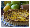
 coffee anyone? coffee anyone?
 my firend thought this looked like a skyy vodka ad but Ithink it could fit in with a few different magazine-type images my firend thought this looked like a skyy vodka ad but Ithink it could fit in with a few different magazine-type images
 Parent's magazine Parent's magazine |
|
|
|
01/25/2009 05:28:25 AM · #62 |
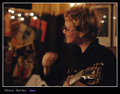
not mine this time, this one is good for fitness or an ad

Message edited by author 2009-01-25 05:28:37. |
|
|
|
01/25/2009 06:18:26 AM · #63 |
Originally posted by MattO:
Well I dont know about magazine quality, however my FS that just ended scored under 6. 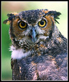
It looks pretty good in a large print and was suppose to be hung in my house. However I sold it this morning for some nice $$$$ and will be hanging in the office of a local businessman. :D
Printed at 11x14 and framed in a 16x20 frame.
BTW I'm proud to say this is the first one, that has been done from start to finish by me. Photo, printing, and mat all done by me, only store bought item was the frame.
Matt |
Matt
Great job! You just need to sign it. |
|
|
|
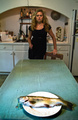
01/25/2009 06:57:52 AM · #64 |
Published
Here's a wine glasses shot in The New York Observer (at the top) that would have also been trashed in the voting but also made it into Wine Spectator and the New York Magazine.
Matt's image was voted down a bit because the breast feathers aren't sharp. It's not an issue, of course and it may have even been an artistic choice but people are trained to hold sharpness at a premium regardless of it's actual value to the image.
The above image was published in a few Jazz magazines. The only two sharp points are her earing and maybe the front edge of her glasses. I didn't enter it in anything but we all know it probably wouldn't have broken a 5. However it truly captures her essence...perfectly, in fact. Enough people that know and have worked with her can see it and from that image I'll be shooting her Hendrix Jazz Project CD recordings and the images of her signature guitar's release.
This shot has sole...er'm Trout...whatever. I could see it being published in a multitude of magazines for a funky ad or as a set-up shot for a performer doing a local show. Eyewaves comment are indicative of the sites mentality and no offense but he couldn't be further off mark in today's current market. People are choosing some way-out styles these days the avoid the sterile stock, appliance...car ad images. Even high fashion is trashing the perfect stuff for aggressive/funky approaches.
A lot of folks here are simply not up to date with current photographic trends. Too many people only study DPC....previous winners and don't actually look at the magazines that are out, these days. If they did they'd see many new styles that reach far beyond what they know.
Message edited by author 2009-01-30 08:57:32. |
|
|
|
01/25/2009 08:55:23 AM · #65 |
Originally posted by yanko:
I think it's possible. This studio shot by Irving Penn is an example that transcends the mere depiction of its subject and reveals something grander. The decisive moment for me was when the photographer took a step back from the reality of the moment and took a picture. Now that's compelling. It appeals to the mind. What's also compelling is when the subject behaves as if the camera was not there. That's when a sincere moment happens. That appeals to the heart. These are moments that I find compelling and when these moments can speak a word or two about life in general, the times we live in, then it has in its grasp the ever elusive decisive moment.
Just my opinion of course. |
Yes - I agree with you. The problem is that on DPC, this would have scored a 5+ but definitely not a 6. Mixed in the with 'great image' comments would be the 'you should have cropped out the sides so all we see is backdrop comments.' |
|
|
|
03/08/2009 01:02:08 PM · #66 |
another failure of DPC voters to recognize a good shot. This is a free study:
 |
|
|
|
03/08/2009 01:21:33 PM · #67 |
Two wonderful dreams...
Get something published.
Score over 6
Ah well... |
|

|
|
Current Server Time: 07/17/2026 03:17:34 AM  |
Home -
Challenges -
Community -
League -
Photos -
Cameras -
Lenses -
Learn -
Help -
Terms of Use -
Privacy -
Top ^
DPChallenge, and website content and design, Copyright © 2001-2026 Challenging Technologies, LLC.
All digital photo copyrights belong to the photographers and may not be used without permission.
Current Server Time: 07/17/2026 03:17:34 AM EDT.
|


