| Author | Thread |
|
|
09/04/2008 11:15:24 PM · #1 |
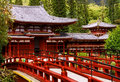
Hi everybody.
I've been trying to improve this picture, but I don't seem to get it righ, I would appreciate if you guys can give me your opinion and comments about it. thanks
[thumb]718257[/thumb]
|
|
|
|
09/04/2008 11:22:23 PM · #2 |
|
Nice looking image but it seems a lot of detail may have been lost during processing with noise reduction. Can you post the original resized without editing? |
|
|
|
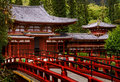
09/04/2008 11:26:00 PM · #3 |
thanks  SDW here is the original SDW here is the original
[thumb]718268[/thumb]
I don't mind if you are honest, and send me to take the picture again (LOL)
Message edited by author 2008-09-04 23:27:16. |
|
|
|
09/04/2008 11:42:09 PM · #4 |
I prefer your edited version. I think this is a matter of taste. Do you prefer it purely documentary, so it captures how it looks? Or are you trying to convey an emotion, an interpretation of how it should make you feel?
The original makes me think more of a fantasy temple, a realm of soft, brilliant light.
|
|
|
|
09/04/2008 11:47:26 PM · #5 |
Nothing fancy, but here's what I came up with and the steps I used:
Editing steps (all in Photoshop CS3):
1) I wanted deeper reds and to balance some of the other colors a little better, so I started out by adding a B&W Adjustment Layer. Then I changed the layer blend mode to Luminance so that the image remained in color.
My reason for using the B&W adjustment layer is the "fine grained" selection of colors in the sliders. I manipulated the colors in the image by using the following settings:
Reds = -16
Yellows = 83
Greens = 47
Cyans = 73
Blues = -36
Magentas = 80
2) Next I wanted to adjust the contrast in the image, so I used a Curves layer with two anchor points. One at the intersection of the button and first lines. The other just slightly above and to the left of the intersection of the top and right lines.
3) Next I wanted to add some depth to the image. So I created a new layer (I used Alt-Ctrl-Shift-E to merge all of the layers into one layer. Then I did a Gaussian Blur of that layer at 20 pixels (basically made a blurry mess of the thing!). And then I switched the blend mode to Soft Light and set the percentage at 67%.
4) I felt the greens were just "too green" and didn't want to return to step #1 to play with them. So instead, I added a Color Balance Layer and I set the middle number of the green slider for midtones to -12 and to -8 for highlights.
5) At this point I was happy with the colors and just wanted to add some "clarity" to the image (which would cancel out a little of the blurriness added in step #3). To do this, I used the Unsharp mask at 10% with a wide pixel range of 60 pixels and a
|
|
|
|
09/04/2008 11:47:41 PM · #6 |
Originally posted by levyj413:
I prefer your edited version. I think this is a matter of taste. Do you prefer it purely documentary, so it captures how it looks? Or are you trying to convey an emotion, an interpretation of how it should make you feel?
The original makes me think more of a fantasy temple, a realm of soft, brilliant light. |
I kind of like the edited version, but something doens't look right to me, but I cannot tell what it is. I want this picture for an assigment in my photography class, do you think I should go with something more realistic? |
|
|
|
09/04/2008 11:50:13 PM · #7 |
Originally posted by dwterry:
Nothing fancy, but here's what I came up with and the steps I used:
Editing steps (all in Photoshop CS3):
1) I wanted deeper reds and to balance some of the other colors a little better, so I started out by adding a B&W Adjustment Layer. Then I changed the layer blend mode to Luminance so that the image remained in color.
My reason for using the B&W adjustment layer is the "fine grained" selection of colors in the sliders. I manipulated the colors in the image by using the following settings:
Reds = -16
Yellows = 83
Greens = 47
Cyans = 73
Blues = -36
Magentas = 80
2) Next I wanted to adjust the contrast in the image, so I used a Curves layer with two anchor points. One at the intersection of the button and first lines. The other just slightly above and to the left of the intersection of the top and right lines.
3) Next I wanted to add some depth to the image. So I created a new layer (I used Alt-Ctrl-Shift-E to merge all of the layers into one layer. Then I did a Gaussian Blur of that layer at 20 pixels (basically made a blurry mess of the thing!). And then I switched the blend mode to Soft Light and set the percentage at 67%.
4) I felt the greens were just "too green" and didn't want to return to step #1 to play with them. So instead, I added a Color Balance Layer and I set the middle number of the green slider for midtones to -12 and to -8 for highlights.
5) At this point I was happy with the colors and just wanted to add some "clarity" to the image (which would cancel out a little of the blurriness added in step #3). To do this, I used the Unsharp mask at 10% with a wide pixel range of 60 pixels and a |
OMG, David.. thanks soooooooo much, this step by step explanation is amazing!! =) |
|
|
|
09/04/2008 11:54:16 PM · #8 |
you have a nice subject to work with and nice colors. My first impression was what are you trying to take a picture of. The bridge is the first thing you see. The building IMHO should be the subject but are partially blocked by the bridge. Moving to the right side of the bridge and having that as a lead in to the buildingwould be a better prespective. |
|
|
|
09/05/2008 12:02:33 AM · #9 |
Originally posted by eaglebeck:
you have a nice subject to work with and nice colors. My first impression was what are you trying to take a picture of. The bridge is the first thing you see. The building IMHO should be the subject but are partially blocked by the bridge. Moving to the right side of the bridge and having that as a lead in to the buildingwould be a better prespective. |
I'm planning on taking more pictures of this building on the weekend, I'll try the perspective you suggested.
Thank you guys, for taking the time to help me, I greatly appreciate it =) |
|
|
|
09/05/2008 12:17:45 AM · #10 |
Speaking of focusing on the subject, one thing you can do ... when perspective has not afforded you the "focus" on the subject that you want ... is to apply a bit of dodge and burn. Recognizing that your eyes are drawn towards the light, you can lighten the subject and darken other parts of the image.
Compare this edit to my previous edit. All I've done is lighten the building and darken the bridge and trees.
|
|
|
|
09/05/2008 12:47:59 PM · #11 |

A different take on it. I'm not sure I like this edit, because without the colors to separate building from trees, it gets a bit busy. I did it this way because I was trying to get less focus on the bridge (and more on the building) without doing any localized edits.
Basically, I used shadow/highlight to increase the midtone contrast, then did a B&W layer (CS3). I just played with the sliders until I had what I liked. Then I created a curves layer, set it in multiply mode, and did a circular gradient on the mask to darken everything except the building, and played with the opacity slider on the layer to get the look I wanted. |
|
|
|
09/08/2008 02:53:41 PM · #12 |
I went back to the temple, and tried to apply the suggestions I received here, and this is what I got! ( for the processing I used the same technique described by dwterry

What do you guys think? |
|
|
|
09/08/2008 03:10:19 PM · #13 |
The composition is much improved. Good contrast and saturation IMHO. If the colors look correct to you, then you have pegged the post processing.
Tim |
|
|
|
09/08/2008 03:19:48 PM · #14 |
|
Thanks Tim and David, for the observation on the colors, I'm looking at this from a different monitor, and the cyan is the only color that looks different, I might have done something wrong in pp, I'll go back and fix that ;). Thank you all for the suggestions, I'm still learning and the feed back I get here (DPC) is what's helping me improve. |
|
Home -
Challenges -
Community -
League -
Photos -
Cameras -
Lenses -
Learn -
Help -
Terms of Use -
Privacy -
Top ^
DPChallenge, and website content and design, Copyright © 2001-2026 Challenging Technologies, LLC.
All digital photo copyrights belong to the photographers and may not be used without permission.
Current Server Time: 06/27/2026 02:58:39 AM EDT.


