| Author | Thread |
|
|
06/09/2008 09:14:13 AM · #1 |
|
|
|
06/09/2008 09:19:56 AM · #2 |
| Enjoying this set. I would say a successful shoot. |
|
|
|
06/09/2008 10:36:31 AM · #3 |
| very nice overall. Some seem a bit "hot" and have some hard shadows in places. I dunno if that was intentional or not, but I found the shadows a bit distracting. |
|
|
|
06/09/2008 10:53:13 AM · #4 |
Originally posted by Spazmo99:
very nice overall. Some seem a bit "hot" and have some hard shadows in places. I dunno if that was intentional or not, but I found the shadows a bit distracting. |
which one seemed hot? None of them are blown out. The only one that is hot is the b/w one and it's only so because when I did the conversion I only kept the red channel. |
|
|
|
06/09/2008 10:59:58 AM · #5 |
Originally posted by KevinG:
Originally posted by Spazmo99:
very nice overall. Some seem a bit "hot" and have some hard shadows in places. I dunno if that was intentional or not, but I found the shadows a bit distracting. |
which one seemed hot? None of them are blown out. The only one that is hot is the b/w one and it's only so because when I did the conversion I only kept the red channel. |
I don't mean blown out. I mean that they look like they're lit by hard lights, which they are. I can't say it's a bad thing, aside from disliking the shadows. |
|
|
|
06/09/2008 11:00:46 AM · #6 |
Looks like the lights are working out fine for you.
Couple of observations on PP...
1) //farm4.static.flickr.com/3161/2564628578_a0687afbc7.jpg
- Did you do something with her right (the viewer's left) eye? Looks unnaturally dark.
2) //farm4.static.flickr.com/3086/2564627818_984a465b26.jpg
- The blur line on the brick wall is really an attention grabber...perhaps a little feathering on the selection would help?
The "farm" outfit is certainly fun. :-)
|
|
|
|
06/09/2008 01:47:02 PM · #7 |
Thanks for the comments. I think I'm going to use a gradient mask to fix the blur on the bricks.
I don't know why her right eye came out darker in that shot--I didn't do anything to it in PP. |
|
|
|
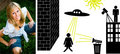
06/09/2008 02:54:24 PM · #8 |
I think they're great, Kevin. What would be cool for people here is if you showed some simple lighting diagram with each shot. Something like this (I used my best guess)...
 |
|
|
|
06/09/2008 02:56:15 PM · #9 |
Originally posted by Art Roflmao:
I think they're great, Kevin. What would be cool for people here is if you showed some simple lighting diagram with each shot. Something like this (I used my best guess)...
|
You hit the nail on the head Art. The spaceship was a little bigger though. |
|
|
|
06/09/2008 03:05:09 PM · #10 |
the only b&w image you offered had the worst shadowing.
In the industry that I represent, shadowing is pretty much a no no unless it is complimentary. In your b&w, the shadow from the bare Sunpack 383 is evident. A diffusion of either paper, spun, wire, silk, grid, or cloth would of taken the shadow away, but you would of needed to push in your flash to get the levels that you were after.
All of your color images are awesome.
|
|
|
|
06/09/2008 09:21:09 PM · #11 |
Originally posted by Man_Called_Horse:
the only b&w image you offered had the worst shadowing.
In the industry that I represent, shadowing is pretty much a no no unless it is complimentary. In your b&w, the shadow from the bare Sunpack 383 is evident. A diffusion of either paper, spun, wire, silk, grid, or cloth would of taken the shadow away, but you would of needed to push in your flash to get the levels that you were after.
All of your color images are awesome. |
I wanted the shadow in the B/W image. It fits the pose. |
|
|
|
06/09/2008 10:42:29 PM · #12 |
I like images 4 and 5, the others seem, as others have said, a bit "hot."
|
|
|
|
06/09/2008 10:57:07 PM · #13 |
| She is pretty and you have great lighting. I dont care much for the squating shots. Looks like she is peeing. |
|
Home -
Challenges -
Community -
League -
Photos -
Cameras -
Lenses -
Learn -
Help -
Terms of Use -
Privacy -
Top ^
DPChallenge, and website content and design, Copyright © 2001-2026 Challenging Technologies, LLC.
All digital photo copyrights belong to the photographers and may not be used without permission.
Current Server Time: 05/02/2026 03:59:32 PM EDT.


