| Author | Thread |
|
|
06/06/2008 11:58:38 PM · #1 |
Hi,
First time posting, and just started getting interested in Digital Photography. Hope to get some guidance from one of you magicians out there (cuz indeed that's what some of your photos looks like!).
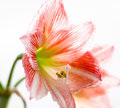
Anyways, I took this one picture I really liked and I wanted to print it and hang it up in the bathroom so I can quietly enjoy my first piece when in my zen mode ;) Problem was that when I picked up the print the colors didn't match. On my monitor the color of the flower looks almost orange, whereas on the print it is a lot more red. I have attached a quick photo of my monitor and the print (or I will attach it once I figure out how to). Any suggestions? I've read about calibration software, but I am trying to keep my hobby on the cheap end for now. Should that really be necessary? Could my monitor be that bad? I know the store didn't use the typical thermo printer so I though a step up from that would render colors better?
EDIT:
So just figured out I had to register to create a portfolio :) Guess it's for a good cause. Here is the link to the print and monitor picture:
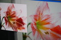
Just the image I sent to get printed:
Any suggestions welcome.
Thanks!
Message edited by author 2008-06-07 11:09:15. |
|
|
|
06/07/2008 12:04:59 AM · #2 |
|
Yes calibration is a must. Here is a pdf from Adobe explaining color work-flow and monitor calibrators like the "Huey" can be had for little money. |
|
|
|
06/07/2008 01:10:16 AM · #3 |
|
Very interesting document. Didn't know it would be this complicated to print :) |
|
|
|
06/07/2008 01:26:37 AM · #4 |
|
It can be tricky but once it is done it is worth the effort. And you can get it "close enough" pretty easy but a calibration unit is necessary equipment. |
|
|
|
06/07/2008 03:00:37 AM · #5 |
Originally posted by MMonsterDuc:
Hi,
First time posting, and just started getting interested in Digital Photography. Hope to get some guidance from one of you magicians out there (cuz indeed that's what some of your photos looks like!).
Anyways, I took this one picture I really liked and I wanted to print it and hang it up in the bathroom so I can quietly enjoy my first piece when in my zen mode ;) Problem was that when I picked up the print the colors didn't match. On my monitor the color of the flower looks almost orange, whereas on the print it is a lot more red. I have attached a quick photo of my monitor and the print (or I will attach it once I figure out how to). Any suggestions? I've read about calibration software, but I am trying to keep my hobby on the cheap end for now. Should that really be necessary? Could my monitor be that bad? I know the store didn't use the typical thermo printer so I though a step up from that would render colors better?
EDIT:
So just figured out I had to register to create a portfolio :) Guess it's for a good cause. Here is (I think) the link to the print and monitor picture: https://www.dpchallenge.com/image.php?IMAGE_ID=686389
Just the image I sent to get printed: https://www.dpchallenge.com/image.php?IMAGE_ID=686388
Any suggestions welcome.
Thanks! |
Just a little suggestion. When you're linking to one of your portfolio pics, just copy the number at the end of the address and, click the 'Insert Thumbnail' icon (second from right at the top of the field where you type your post) and paste the number in.
That looks a great pic, by the way.
|
|
|
|
06/07/2008 03:05:22 AM · #6 |
Welcome to DPChallenge! |
|
Home -
Challenges -
Community -
League -
Photos -
Cameras -
Lenses -
Learn -
Help -
Terms of Use -
Privacy -
Top ^
DPChallenge, and website content and design, Copyright © 2001-2026 Challenging Technologies, LLC.
All digital photo copyrights belong to the photographers and may not be used without permission.
Current Server Time: 07/15/2026 06:20:16 PM EDT.


