| Author | Thread |
|
|
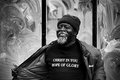
04/22/2008 07:37:49 PM · #1 |
First attempt, what do you think?
Also for the preacher, do you think the triptych doesn't work 'cos it cuts off his arms..?
    |
|
|
|
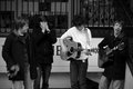
04/22/2008 07:39:15 PM · #2 |
I realise I have cut the feet of the band off... doh!
Is there a best place to slice a person if you want a closer shot? |
|
|
|
04/22/2008 07:52:46 PM · #3 |
Originally posted by rob_smith:
I realise I have cut the feet of the band off... doh!
Is there a best place to slice a person if you want a closer shot? |
The best place to slice is between joints; it looks better to cut someone off mid-shin or mid-thigh than it does to cut them off at the knees or the waist. Same for arms, etc.
Overall your shots look nice (and I think street photography always looks better in B&W, so good choice there!). My biggest critique is this: there is too much dead space above all their heads, and you've cut off feet. Leave only a little space between the top of the frame and the top of a head - after all, why waste space in a photo by leaving it empty and dead? This is something all photographers struggle with. I am constantly reminding my photo students about this same thing! |
|
|
|
04/22/2008 07:57:23 PM · #4 |
| Ah right, thanks for that! I think the rule of thirds takes over sometimes... |
|
|
|
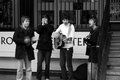
04/22/2008 10:18:58 PM · #5 |
Originally posted by rob_smith:
Ah right, thanks for that! I think the rule of thirds takes over sometimes... |
The Rule of Thirds is a good one. But consider this: take your first image, of the gentleman holding his coat open. Divide the frame into thirds in both dimensions (so you end up with 9 boxes, like a tic-tac-toe board). He's holding his coat out to the left, so if you had moved him to the right side, with the edge of his arm against the frame, and his head up near the top of the frame, then his face would fall where at the intersection of the top and right thirds. His extended left arm would lie along the bottom third line, and his hand on that side would be near enough the intersection of the bottom and left thirds. (Part of the trick here would be getting a little closer so he fills the frame more.)
So now he'd fill the frame well, different parts of the image would lie on different rule of thirds points, and he would no longer be so dead-centered. Since the background is interesting,you wouldn't have to worry about too much dead space being boring. Or to really kick down the amount of dead space, you could have rotated your camera to the vertical position and shot it that way.
Obviously this applies better to single subjects than group shots. And I'm not trying to be overly critical, since I do like the images - just offering some suggestions! :-)
|
|
|
|
04/22/2008 11:00:44 PM · #6 |
Something about horizontal images seems to be harder not to put too much space at the top. My trainees at work alway seem to keep the subject too far down in the portrait. :oP
Very nice pics, tho :o) I have to agree, I like the black and white! Good expressions on the multi, too. :o) |
|
|
|
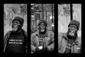
04/23/2008 12:44:06 AM · #7 |
| The triptych may work better if you put the image with the wording in the center. Gives it more symmetry. |
|
Home -
Challenges -
Community -
League -
Photos -
Cameras -
Lenses -
Learn -
Help -
Terms of Use -
Privacy -
Top ^
DPChallenge, and website content and design, Copyright © 2001-2026 Challenging Technologies, LLC.
All digital photo copyrights belong to the photographers and may not be used without permission.
Current Server Time: 05/01/2026 05:25:53 AM EDT.


