| Author | Thread |
|
|
02/25/2004 11:31:50 PM · #1 |
Disclaimer- this suggestion is coming from a bit of frustration & the ongoing problems I have been having with making my shots look good for light & dark screen monitors. No matter what I do I have found this impossible to do. I'm feeling kinda wretched about it all bc for the conflict challenge I spent three, yes three whole days submitting & unsubmitting my shot so I can change the contrast to find a nice medium between those who have calibrated their monitors & those who have not. I am still getting comments from both spectrums but mostly from those with dark monitors. So...at last...here is my suggestion.
I think we should have a survey or poll to find out the exact numbers of those who have calibrated their monitors & those who have not. I think this process is especially important for b&w shots, which i am seriously considering not doing any more for challenges. I think the bar on the bottom of each shot when voting for a challenge should be explained. Most recently in a thread I started to figure what most people's monitors were like (too dark or too light) I was told (i think by john setzler) that each shade on the bar should be distinguishable from the others, with the exception of the last two or three black bars (please correct me if I am wrong here).
So what does everyone think? Is it just me & I should get over it & deal (which I should do anyway) or are other people experiencing the same frustrations? I didn't submit for the black challenge or vote on it but how did others fare in it?
|
|
|
|
02/25/2004 11:45:32 PM · #2 |
Looking at your profile page I don't see any shots that are particularly too dark or too light. Do you have an example?
|
|
|
|
02/25/2004 11:48:48 PM · #3 |
Originally posted by justine:
Looking at your profile page I don't see any shots that are particularly too dark or too light. Do you have an example? |
Yes. If you look at the comments on my textures submission, ALL of 'em say it's too dark. Not sure if it is the greatest example but certainly the some of the comments (whihc I imagine are scoring me lower) have made comments that the image is dark & the contrast needs to be fixed.
|
|
|
|
02/25/2004 11:54:56 PM · #4 |
It's dark, but if you notice the majority thought so.
I assumed you shot it that way intentionally-- I like it. You could adjust the levels with Photoshop and maybe give it a bit more character.
Do you see it as really light? |
|
|
|
02/25/2004 11:56:59 PM · #5 |
Rooster, it is too dark. :) My monitor is perfectly calibrated too. I know it is because, your picture I can see the full range of white to black, beginning with the bright spots at the top of the picture down to the mostly dark area everwhere else.
Overall, for this challenge (Textures), I would agree that the picture is too dark.
But I do agree that the website should have something in "Help" maybe that shows a basic white-to-black grid (forget exactly what you call it) and say something like "You should be able to see all of the squares below...... If you can't please see our Tutorial on calibrating your monitor...". That would fix a lot of these problems.
|
|
|
|
02/25/2004 11:57:50 PM · #6 |
|
I thought it was dark because you want to use "low key" to make the images stand out from the lighting. I thought it was possibly done on purpose. Gave you a "7". |
|
|
|
02/26/2004 12:01:46 AM · #7 |
I looked at this on both LCD and CRT. The CRT, although not calibrated, is pretty much on the mark. Your textures entry was simply too dark. Have you looked at the image using different monitors?
Message edited by author 2004-02-26 00:02:21. |
|
|
|
02/26/2004 12:05:34 AM · #8 |
Thanks guys! That shot was a horrible example. Faidoi, do you remember the thread asking folks which side their monitors fell on, dark or light? I was trying in asking that question to figure out which way to lean towards when adjusting the contrast on my current shot. There are big differences int he subject to the BG & I wanted to avoid getting the too dark comments. I didnt do a good job for some reason.
Sorry about the crappy eaxample. I wasn't trying to say that everyone that said it was dark was wrong but that I wanted to take that into consideration when preparing my current shot. I hope no one took it that way bc that was not my intention. For the most part, I take comments seriously & as a novice I try to improve my fotography thru it. Still working on it obviously.
Chris, the suggestion in the help is a good idea. Justine, I don;t see at as terribly light but when I revert back to the way my monitor was calibrated I see what everyone was talking about. When calibrated properly, I can see the texture in the BG & can see the subject WAY better.
|
|
|
|
02/26/2004 12:19:09 AM · #9 |
Rooster, I think your texture shot suffered more due to lighting then due to monitor calibration, being that the majority of folks thought it was too dark. It was a very good subject and the lighting was interesting, just needed a little more. I wouldn't worry about the calibration aspect too much. I don't think too many people had problems in the Black challenge if you check out the comments. I think someones calibration would have to be waaayyy off to change a pictures brightness that much. And there are probably only a very small percentage that it shouldn't make that much of a difference I would think anyway... Just my opinion though. I could see if a mass amount of people were complaining of this problem, but doesn't seem to be the case. Just do your best and don't sweat the small stuff. :) You've got some great shots!
Message edited by author 2004-02-26 00:19:59. |
|
|
|
02/26/2004 12:19:58 AM · #10 |
This is an interesting topic though...since you brought it up...
My conflicts submission has a number of comments, ALL of which tell me its too dark/underexposed. I intentionally darkened and lowered contrast to set the mood. But in looking at it, it isn't THAT dark on my CRT so that the detail is still mostly there. But I am getting the impression that many are seeing this much, much darker than I had intended.
Chuck |
|
|
|
02/26/2004 12:34:22 AM · #11 |
I always thought that the bar on the bottom should always be 50% darker then the next graduation. The last three black squares should not be similar or it's going to be too dark.
I'm I wrong?
Lighting I use is a Daylight bulb.
Edit: I don't know if the antiglare coating on my glasses is affecting my perception of colors.
Message edited by author 2004-02-26 00:38:40. |
|
|
|
02/26/2004 12:37:27 AM · #12 |
|
The gray background is fooling our eyes too. |
|
|
|
02/26/2004 12:44:34 AM · #13 |
For some strange reason, if you calibrate incorrectly the winning photos still look good and others turn even worst. Try it.
I wonder if that's why some of these photos win? |
|
|
|
02/26/2004 03:52:39 AM · #14 |
I have made many of the 'too dark' comments. When i got many (unhappy to say the least) responses to my comments, i went and used adobe gamma to correct monitor. ya know what? it made things DARKER.
There is dark (underexposed, badly lit, etc) and then there is dark (artsy, moody). The first dark is a technical flaw, and needs to be corrected by the photographer. The second is more a matter of opinion or vision.
Not everyone will get every picture. Could be why we have old masters, modern art, the term abstract, etc. I prefer old masters and wouldn't display a picasso if you gave me one. I think it takes more talent and skill to paint a pic that looks like a photograph than to put 3 color blobs on a canvas and give it a name and call that art. That is me.
I like film noir, but generally don't like dark pictures. I am not likely to score them very high, unless i think it is an artsy moody dark AND it is done well.
chris
|
|
|
|
02/26/2004 07:55:36 AM · #15 |
Originally posted by Rooster:
I think the bar on the bottom of each shot when voting for a challenge should be explained. Most recently in a thread I started to figure what most people's monitors were like (too dark or too light) I was told (i think by john setzler) that each shade on the bar should be distinguishable from the others, with the exception of the last two or three black bars (please correct me if I am wrong here). |
On my (calibrated) monitor, I can discern the last 3 dark gray/black boxes. It isn't as apparent as the other shades at first glance, but if you take a second and look, you can definitely see delineations between the last 3.
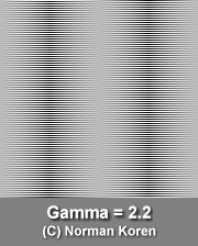
Although I personally can't recommend calibrating by eye using something like Adobe Gamma (I use a Gretag Macbeth EyeOne Display), it is probably better than nothing. This tutorial is worth reading, and his charts allow you to determine your gamma by simply stepping back from your monitor. My monitor is centered right around the 2.2 mark (as it should be) and this "2.2 Gamma" test square looks like a solid, smooth neutral gray when viewed from a couple feet away (there is no waviness, irregularity, or color banding):
Message edited by author 2004-02-26 07:58:06. |
|
|
|
02/26/2004 08:49:38 AM · #16 |
Originally posted by EddyG:
snip
On my (calibrated) monitor, I can discern the last 3 dark gray/black boxes. It isn't as apparent as the other shades at first glance, but if you take a second and look, you can definitely see delineations between the last 3.
Although I personally can't recommend calibrating by eye using something like Adobe Gamma (I use a Gretag Macbeth EyeOne Display), it is probably better than nothing. This tutorial is worth reading, and his charts allow you to determine your gamma by simply stepping back from your monitor. My monitor is centered right around the 2.2 mark (as it should be) and this "2.2 Gamma" test square looks like a solid, smooth neutral gray when viewed from a couple feet away (there is no waviness, irregularity, or color banding):
...snip... |
Eddy--I did the calibration on the tutorial the other day. But one thing that confused me: I can never get my monitors (Dell 1900 FP AKA Samsung 191T) such that I can't see this square as a nicely solid gray box with two yellow bands down the middle. Are you saying your monitor is adjusted so it looks uniformly gray, no yellow, or that the gray areas are uniform?
Message edited by author 2004-02-26 08:50:23. |
|
|
|
02/26/2004 10:59:35 AM · #17 |
Originally posted by nshapiro:
I can never get my monitors (Dell 1900 FP AKA Samsung 191T) such that I can't see this square as a nicely solid gray box with two yellow bands down the middle. Are you saying your monitor is adjusted so it looks uniformly gray, no yellow, or that the gray areas are uniform? |
I don't see any yellow or any kind of banding in the "Gamma = 2.2" square. When I step back from my monitor a few feet, it is a solid, uniform gray. Up close, it is still completely gray (no hint of coloration), but there are two darker vertical stripes where the "gray" is made up of alternating black and white lines. |
|
|
|
02/26/2004 11:13:08 AM · #18 |
It's also worth remembering that the images profile can make a difference, both the images are identical in PS:
  |
|
|
|
02/26/2004 12:07:50 PM · #19 |
[quote]
My monitor is centered right around the 2.2 mark (as it should be) and this "2.2 Gamma" test square looks like a solid, smooth neutral gray when viewed from a couple feet away (there is no waviness, irregularity, or color banding):
[/quote]
My monitor is also 2.2 froma couple of feet away. However, i don't normally sit that far back, so does that suggest i need some other setting?
chris |
|
|
|
02/26/2004 12:13:52 PM · #20 |
|
hey Rooster, I checked out your Textures II entry and it's almost completely black on this monitor..I know my work screen [this one] is really dark, so I don't use it to vote [not to mention I'm at work]..but the only reason I know it's my shite monitor, is that my monitor at home is new and callibrated. If someone doesn't have anything to compare it to then they probably don't even realize their screen is the problem. |
|
|
|
02/26/2004 01:10:58 PM · #21 |
Originally posted by bestagents:
My monitor is also 2.2 froma couple of feet away. However, i don't normally sit that far back, so does that suggest i need some other setting? |
No. Stepping back simply allows the alternating black-and-white lines to "blur together" and match the same shade of gray. If you get a nice, solid gray square without any coloration, waviness or other irregularity, your gamma is set correctly.
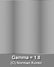
By way of comparison, this square is for Gamma = 1.8, and no matter how far back you get, it won't turn into a solid shade of gray if your monitor is properly calibrated to 2.2:
 |
|
|
|
02/26/2004 01:16:29 PM · #22 |
Originally posted by robsmith:
It's also worth remembering that the images profile can make a difference, both the images are identical in PS |
Embedded color profiles are completely ignored by almost all web browsers (and are actually stripped upon upload to DPC). That is why if your Photoshop "Working Space" is not sRGB, you need to choose Image > Mode > Convert to Profile... and set the Destination Space to "sRGB IEC61966-2.1" before doing a "Save for Web..." (With the "Preview" box checked, you can adjust the "Intent" and choose which one looks most like the original in the sRGB space.)
Message edited by author 2004-02-26 13:18:10. |
|
|
|
02/26/2004 01:27:16 PM · #23 |
The answer is simple. Just have Drew and Langdon write a program which automatically downloads itself onto the voter's computer and creates a DPC monitor profile within their operarting system that automatically calibrates their monitor to perfection. No problem! They're smart guys! They can do it! ;)
|
|
|
|
02/26/2004 01:33:28 PM · #24 |
Originally posted by EddyG:
Embedded color profiles are completely ignored by almost all web browsers (and are actually stripped upon upload to DPC). That is why if your Photoshop "Working Space" is not sRGB, you need to choose Image > Mode > Convert to Profile... and set the Destination Space to "sRGB IEC61966-2.1" before doing a "Save for Web..." (With the "Preview" box checked, you can adjust the "Intent" and choose which one looks most like the original in the sRGB space.) |
I got the workspace right, but never save for web...i suppose a few folks out there may have older browserw/video cards/os', but i have not in years seen a pic on a web site that is off-color so to speak (as far as i know..in pics with unsafe palettes i used to see obvious color shifts, or other 'effects'.
Checked my PS 7. In Image>Mode>convert to... SOURCE is the sRGB...2.1 but destination...does it matter? Mine is at "working CMYK - US Web coated SWOP v2". Whether this is default, or matters or I set it that way back when i was using 4.0 for catalog work (and CMYK output) I cannot say.
I occasionally see comments from entrants that state the uploaded pic has changed from their computer to the web...mine do not (on several different sites, but i rarely view on any computer other than mine).
Message edited by author 2004-02-26 13:37:37. |
|
Home -
Challenges -
Community -
League -
Photos -
Cameras -
Lenses -
Learn -
Help -
Terms of Use -
Privacy -
Top ^
DPChallenge, and website content and design, Copyright © 2001-2026 Challenging Technologies, LLC.
All digital photo copyrights belong to the photographers and may not be used without permission.
Current Server Time: 07/22/2026 07:10:22 PM EDT.


