| Author | Thread |
|
|
01/28/2008 08:55:18 PM · #1 |
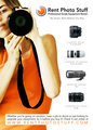
This is the ad that is running in April. A friend did the design, I think its pretty simple and neatly designed. Opinions???
 |
|
|
|
01/28/2008 09:09:53 PM · #2 |
I like it - plus you've got good hardware porn...the 85 1.2 is something that I think many Canonites would dearly love to rent and is an eye catcher to me. I also like the fact that she's cropped out and the camera and other hardware is the real focus. Delivering the nice toys simply with lots of white space in between is really effective, and the message is delivered cleanly and quickly (RENT THIS NICE STUFF HERE!). If it were in the UK I'd be on your website right now.
N |
|
|
|
01/28/2008 09:14:21 PM · #3 |
... what Quas said plus what goes better with black than orange ???
|
|
|
|
01/30/2008 01:16:43 PM · #4 |
|
|
|
01/30/2008 01:24:45 PM · #5 |
| Orange is my favourite colour. I think that is a clean, clear, wonderful ad! I hope it brings you lots of business. |
|
|
|
01/30/2008 01:26:43 PM · #6 |
so DCPers get discounts? eh? eh? eh?
-CW
|
|
|
|
01/30/2008 01:38:45 PM · #7 |
Very nice indeed - i would say that the banner at the bottom was a bit strange on the eye - the border is obvious when the orange top is in the background but when it is against the white it is just strange to read in and out of that "border"... Am i seeing things or is the bacground to that bit of writing a darker shade of white - because it might look nicer if it were so it comes away from the white background..
something to ponder and have a look at i suppose - i'm not an advert guru. The whole thing looks great anyway. |
|
|
|
01/30/2008 03:25:12 PM · #8 |
|
|
|
01/30/2008 03:28:56 PM · #9 |
| Looks good. My only thing is that I'd separate the Nikon and Canon lenses, instead of having them intermingled. |
|
|
|
01/30/2008 06:20:03 PM · #10 |
Originally posted by soup:
you're seeing things |
That might explain the little green man on my desk then... ;) |
|
|
|
01/31/2008 12:17:26 PM · #11 |
Yes there are discounts for DPC folk. I offered a few in the last couple months. Right now I would do 2 for 1 for DPC folks for 2week rentals. You need to PM me first so I know who you are.
The deal is you pay for whichever piece of equipment costs more and shipping charges for both.
You need to PM me first because you will need to pay the entire ammount and I will refund you back the 2 week rental charge for the less expensive lens/flash.
Enjoy. Thanks for the feedback on the ad. this is the 5x7 version we have for postcards, the ad for the magazine is a 8x10 and has a few more items of inventory shown. It will run on a right hand page.
JM |
|
|
|
02/01/2008 03:09:04 AM · #12 |
I really don't know if you're looking for constructive criticism or not and I hate to post negative things but I think this ad seems kinda amateur...
well only the photo really. The design is very clean and simple. easy to get the info I need but I might be worried with renting through you guys simply because I would think you weren't professional enough. -I mean I know you have been serious about this biz but from this ad I wouldn't know that!
I almost don't have the balls to post this but I know that real advice is important even if you've already gone to press maybe it will help for next time. And of course realize this is only one person's opinion. :0)
|
|
|
|
02/01/2008 04:29:03 AM · #13 |
| It's a good design, but the shot of the Nikkor lens doesn't matche the Canon lenses (from its angle). would make a new shot or put it at the bottom. The girls skin looks yellowish, hte shot looks overall too soft. I any case, i would fake a nice reflection on the lens she holds, it looks dull as it is. |
|
|
|
02/01/2008 05:04:50 AM · #14 |
Nice layout. I think the taglines and things are a bit clunky though and don't really roll of the tongue. Underneath the title it seems a bit laboured, maybe something simpler and shorter like "try before you buy" would be better?
The same applies for the bottom text too, it's a bit thick and slow, i'm thinking maybe something to the point where peopel don't have to stop and read it to get what it's about like "Got an important job? Need something extra? Drop us a line"
Then put the website address all along the bottom. Other than that, the picture is cool. Your logo is a bit simple and basic. Maybe if you put the initials behind the writing, so it would RPS behind where it says Rent Photo Stuff.
RPS is much more memorable... kinda like UPS.
Just my thoughts though :) But i've designed a few things in my time and less is always more and if you can put the same thing in an image, then do that. |
|
|
|
02/01/2008 04:22:26 PM · #15 |
Originally posted by oOWonderBreadOo:
I really don't know if you're looking for constructive criticism or not and I hate to post negative things but I think this ad seems kinda amateur...
well only the photo really. The design is very clean and simple. easy to get the info I need but I might be worried with renting through you guys simply because I would think you weren't professional enough. -I mean I know you have been serious about this biz but from this ad I wouldn't know that!
I almost don't have the balls to post this but I know that real advice is important even if you've already gone to press maybe it will help for next time. And of course realize this is only one person's opinion. :0) |
I appreciate the comments. As someone who is in advertising... my full time job is an ad rep for a daily newspaper, I wonder what makes this look amateur to you or unprofessional.
When we design newspaper ads, the main points we stress are simple, clean, easy to read ads. A newspaper ad needs to have a call to action like, "shop now" "super sale" etc... because the idea is to get someone in the door immediately. Magazine ads don't need a call to action because the goal is different. A mag ad is going to be racked for a month at a time so you don't offer sales and stuff like that. Really with a mag ad you want your logo, URL and what you do very visible and easy to remember. This ad is simple clean, shows what we do with minimal text, has images of inventory on the right hand side which this ad is running on a right hand page so the lens pics will be visible to someone flipping through the mag. the image is a stock photo.
I really am curious to find out what makes this scream unprofessional. Most of the comments are overwhelmingly possitive and you seemed to really dislike it. Maybe this falls under the category of you can't please all the people all the time....
|
|
|
|
02/01/2008 04:32:26 PM · #16 |
I have a few comments.
I dislike the kerning on the URL at the bottom of the page.
I dislike the box with the wording in it at the bottom of the page, may be better to section off the whole bottom in white and OR make a transparency on the white bottom bar of about 50% so the gal comes through a little also. Way to harsh right now.
Her arm and shoulder are weirding me out, looks like it was cut out using a photoshop eraser tool and it isn't exactly even. Maybe it's just because it's a small picture though, can't tell for certain.
I may also consider re-arranging the lenses so that it goes small to big. That way the nikon will be below and it will draw the readers eye to the bottom of the page (to the url)
Other than that, a nice flier.
|
|
|
|
02/06/2008 08:39:56 PM · #17 |
Originally posted by Jmnuggy:
I appreciate the comments. As someone who is in advertising... my full time job is an ad rep for a daily newspaper, I wonder what makes this look amateur to you or unprofessional.
When we design newspaper ads, the main points we stress are simple, clean, easy to read ads. A newspaper ad needs to have a call to action like, "shop now" "super sale" etc... because the idea is to get someone in the door immediately. Magazine ads don't need a call to action because the goal is different. A mag ad is going to be racked for a month at a time so you don't offer sales and stuff like that. Really with a mag ad you want your logo, URL and what you do very visible and easy to remember. This ad is simple clean, shows what we do with minimal text, has images of inventory on the right hand side which this ad is running on a right hand page so the lens pics will be visible to someone flipping through the mag. the image is a stock photo.
I really am curious to find out what makes this scream unprofessional. Most of the comments are overwhelmingly possitive and you seemed to really dislike it. Maybe this falls under the category of you can't please all the people all the time.... |
it's only the photo I think is not up to par. The ad itself is nicely done- clean and simple. but the image color is off, blown out in parts and the lens looks out of focus or cut out- something is off there. If you just replaced the photo I think it'd be perfection! But you're right, everyone has different opinions and if everyone else seems to like it I guess I'm in the minority :0)
|
|
Home -
Challenges -
Community -
League -
Photos -
Cameras -
Lenses -
Learn -
Help -
Terms of Use -
Privacy -
Top ^
DPChallenge, and website content and design, Copyright © 2001-2026 Challenging Technologies, LLC.
All digital photo copyrights belong to the photographers and may not be used without permission.
Current Server Time: 04/29/2026 03:29:20 PM EDT.


