| Author | Thread |
|
|
11/07/2007 10:54:00 AM · #1 |
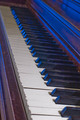
I thought that my entry for something old was my best yet, granted I have only entered 3 challenges so far, but instead it turned out to be my worst. I ended up getting a 4.3 on it, but I didn't really get much feedback as to why. So if you wouldn't mind, please tell me what I could have done to improve this shot. I realized after I had submitted it that I had done some playing with the sharpening, and I forgot to get rid of it, so that is my fault, I personally think the sharpening hurt the picture, but the only 2 comments I got complained about the blue light. What do you think hurt this one?
Thanks in advance for you comments.
|
|
|
|
11/07/2007 11:13:54 AM · #2 |
Piano shots are challenging to make interesting. You need a unique angle and lighting to really pull it off IMO. This photo is kind of static and "ho-hummish". Nothing to grab the viewer...next photo please.
The first thing that screams "fix me" is the blue cast. From your notes it appears you made some adjustment to the blue hue? Did you add or increase the blue? Personally I would have adjusted using color balance and warmed it up to remove the daylight blues (next to a window I take it).
Next is the haloing. Appears to be oversharpened.
Last couple of things is the overall lighting and POV. The lighting seems harsh and glaring. With the POV you've chosen it's impossible to get all of the keys in focus, so where do you focus? Seems that your focal point is shallow and the viewer has to hunt a little to find the spot to zero in on.
If this was the subject I was going to shoot, I would have gotten down lower and given more emphasis to the worn key edges. A very shallow DOF coming in tight on a few keys. JMO of course.
|
|
|
|
11/07/2007 11:20:03 AM · #3 |
| i personaly think the blue light doesnt look right it doesnt do any justice to your picture, a softer natural light would have shown it of better( this is just my opinion)the only thing you can do is learn from your comments. i am... and ive had some good and bad comments..like my cat looks like a puppy???? its hard to take pictures to suit everyones taste,so keep shooting and love your own work first. |
|
|
|
11/07/2007 11:37:48 AM · #4 |
Hi Travis,
Here are a couple reactions I had:
- I think the blue light gives it a jazz/club feel, which isn't bad, but isn't necessarily the "old" feeling.
- I agree with Barry - you'll need an interesting angle and lighting to make a piano keyboard interesting. I might have liked the keys to be horizontal, perhaps viewing from a lower angle.
- The colors seem a little flat, whereas they could have been more rich and full. Try a little more contrast, a very slight soft blur, and playing with the selective colors adjustment layer (if you have PS).
- There also appears to be some odd outlining (over sharpening? dust and speckles filter?) near the bottom right corner.
I also agree with nibbles. Keep shooting what you like first, and play with suggestions to improve. Cheers! |
|
|
|
11/07/2007 11:38:34 AM · #5 |
|
|
|
11/07/2007 11:38:46 AM · #6 |
I don't like the exposure. Looks cheap and needs a bit more oomph.
If i were to edit this, I'd use the levels command and move the left hand slider over by a bit to make the blacks black and not that horrible shade or blue/brown. It also looks very flat too, which can be sorted with a little boost in contrast, or even curves.
The 4.3 doesn't suprise me. I'd have given it a 3 for the reason that it could be easily fixed, but hasn't been. Also, the the white keys at the front are too harsh, they just don't look right for some reason... I don't mean they look fake, they just detract from the rest of the image.
The blue cast doesnt really bother me, it's different i'll admit that but maybe it's too blue, and not in a 'cold' way, but just in a blue way, again, something that can easily be sorted with about 1 minutes work. |
|
|
|
11/07/2007 01:11:24 PM · #7 |
Thanks so far for all the comments. I did notice after the voting had started that the sharpening ruined the picture. I was just playing with it, but I exported without changing it back, that is where the specs, and the weird edges on those keys is coming from. So that I already knew was a problem.
I have to admit I wasn't expecting the blue to come through, but it did and when I saw it I thought it looked pretty cool. I did adjust the blue hue a bit because on some of the keys in the middle of the blue was a nice blown out spot, so adjusting the hue got rid of some of that.
I shot the white balance at tungsten because I have a light on the piano that I was using to brighten up the part I was trying to focus on, while leaving the end of the piano darker, also I was hoping to cast some shadows from the black keys onto the white keys. Yes there is a window on the other side of the room, and I am guessing that is where the blue came in, but like I said, I kind of liked the blue.
I just thought I would give a little more of what I did so you can know why maybe something you didn't like about it came up. Again thanks for all the comments, they are really helpful. I wish I could get more of these during the voting though.
|
|
Home -
Challenges -
Community -
League -
Photos -
Cameras -
Lenses -
Learn -
Help -
Terms of Use -
Privacy -
Top ^
DPChallenge, and website content and design, Copyright © 2001-2026 Challenging Technologies, LLC.
All digital photo copyrights belong to the photographers and may not be used without permission.
Current Server Time: 04/30/2026 08:26:42 PM EDT.


