| Author | Thread |
|
|
10/21/2007 09:41:26 PM · #1 |
Thanks


Message edited by author 2007-10-21 21:42:51. |
|
|
|
10/21/2007 10:15:39 PM · #2 |
Very nice.
I like the first and last ones best. Do not care for the B&W at all. The one on the dock bothers me because of the brightness of the dock.
But all that to say, very good work. |
|
|
|
10/21/2007 10:16:58 PM · #3 |
I'll throw my opinion out there.
The first one:
I like it a lot, the colors are great but not overwhelming, the focus and DOF is perfect.
The second one:
Much of the dock she's sitting on is blown out, not sure if this was intentional or not but it's kind of distracting to me. Other than that, it's fantastic.
The third one:
My least favorite of the bunch. It looks too snapshotish to me. Maybe a color version might help?
The fourth one:
A great pose and a great location, but the framing makes her kind of get lost in the image. Maybe crop it down some to make the focus more on her and not the background.
The last one:
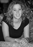
This one is about as sharp as an image gets, probably due to all those L lenses you own right? I like the pose and the background a lot.
All in all, I'd have to say the first one is my favorite of the series. Great job, I wish mine turned out this good. :)
|
|
|
|
10/21/2007 10:45:10 PM · #4 |
Thanks for the input. The 1st and last were my choices also. The rest are all the ones my daughter likes. Ultimately the choice is hers. Sam, no "L" glass was used. Just my 100mm 2.8 macro.
|
|
|
|
10/21/2007 11:05:43 PM · #5 |
Originally posted by NstiG8tr:
Sam, no "L" glass was used. Just my 100mm 2.8 macro. |
I need to get me one of those then...
|
|
|
|
10/21/2007 11:49:22 PM · #6 |
I like the image quality, but the thing that leaps out at me is that she appears to be slouching in all of the photos. I think her pictures would look better if you had asked her to hold her shoulders back or maybe to arch her back a little -- anything that would keep her shoulders from slumping forward like that.
|
|
|
|
10/21/2007 11:58:19 PM · #7 |
| She has some amaizing eyes, if you can use photoshop to bring out there color just a little. in the first picture the thing i dont like is her feet are cut off. the second color one, you might have been able to save some of the dock by using just a larger fstop or faster shutter speed, rather it being pure white from the sun. not to knock on your sister, c/c :) im getting personal here but i agree with philip on the shoulders thing, it makes her head look small when she has her shoulders flunged forward. i really like the last one because there is absolutly no shadows in the photo. makes her appear to be a pure person:) over all they are very nicce |
|
|
|
10/22/2007 12:10:38 AM · #8 |
|
|
|
10/23/2007 02:56:32 PM · #9 |
You did nice work on these, Dave. I hope you get a lot more business just like it!
|
|
|
|
10/23/2007 05:23:15 PM · #10 |
Overall pretty good. Things that could be better
From top to bottom in you list
- head is too centered. red bush is a bit distracting. try cropping and B&W.
Tilt her head, turn her body toward the camera more, straighten her back.
second:
much better composition, nice skin exposure.her hand should not be in her crotch. again, tilt the head a bit. some detail in the dock would be nice, and the pole behind her head bothers me.
third
a bit more room above her head, TILT THE HEAD.
fourth
good choice of aperture. side to side framing is fine, but too much room above her head - re-crop to put her head in a thirds point. nice lighting. she's slouching a bit - you need to give direction to the model to 'stand straight, roll your shoulder back' the arms need something to do - hold something, in a pocket, on a hip, hold the post Nice tones in the B&W conversion.
fifth one
more issues with this one - both arms need moved as neither look good - make traingles and leading lines (move her right arm back a bit, left arm(hand) on her knee). Again, have her sit up straight. The BG is an issue here - too many textures, dead leaves on the hosta, the rock is ok, but behind her is the ravine/dark spot - if you would ahve moved left a bit to show the rock and crop out the hosta it would be better.
|
|
Home -
Challenges -
Community -
League -
Photos -
Cameras -
Lenses -
Learn -
Help -
Terms of Use -
Privacy -
Top ^
DPChallenge, and website content and design, Copyright © 2001-2026 Challenging Technologies, LLC.
All digital photo copyrights belong to the photographers and may not be used without permission.
Current Server Time: 05/01/2026 02:28:12 PM EDT.


