| Author | Thread |
|
|
05/02/2006 06:39:31 PM · #26 |
I agree with Larus and others that this might be a good idea if we could only keep from turning it into a bull session where we say why an image should NOT get a ribbon. Quite franktly, I'm not proud of any of my 3 little ribbon winners. I'd agree with naysayers about mine. In truth of fact, I have. I'd like to know the secret.
But this being DPC I don't think that possible.
As an alternate I suggest we just ask the multiple ribbon winners that know: Kiwiness, Heida, Librodo, jjbeguin, Sonifo and the list goes on and on and on. They already know the secret.
Message edited by author 2006-05-02 18:43:02.
|
|
|
|
05/02/2006 06:40:38 PM · #27 |
Originally posted by Bear_Music:
It's not like we're out to assassinate the images, just to discuss them in depth.
Who wouldn't be happy with that?
R. |
Couldn't agree more. Title it "In-depth analysis of a ribbon-winner" and it sounds a lot different.
If it happened (not a chance, lol) to me, I would be flattered. No previous authorization needed. Go ahead. Be my guests. Take it apart. It would mean I had accomplished something, wouldn't it? |
|
|
|
05/02/2006 08:48:57 PM · #28 |
Originally posted by stdavidson:
I agree with Larus and others that this might be a good idea if we could only keep from turning it into a bull session where we say why an image should NOT get a ribbon. Quite franktly, I'm not proud of any of my 3 little ribbon winners. I'd agree with naysayers about mine. In truth of fact, I have. I'd like to know the secret.
But this being DPC I don't think that possible.
As an alternate I suggest we just ask the multiple ribbon winners that know: Kiwiness, Heida, Librodo, jjbeguin, Sonifo and the list goes on and on and on. They already know the secret. |
I agree. It seems that some photographers have a 'personality' in thier photography that greatly appeals to the members at large. For the rest of us, a win is just a fluke!
Not the case with you, Steve, your stuff is GOOD! |
|
|
|
05/02/2006 08:59:20 PM · #29 |
Originally posted by ElGordo:
I agree. It seems that some photographers have a 'personality' in thier photography that greatly appeals to the members at large. For the rest of us, a win is just a fluke!
Not the case with you, Steve, your stuff is GOOD! |
I'm not even close. Every 3rd submission kiwiness wins a ribbon. That is the guy we all need to do a Vulcan mind meld with. But it is hard telling how warped that would leave us. LOL!
|
|
|
|
05/02/2006 10:26:49 PM · #30 |
|
|
|
05/02/2006 11:16:55 PM · #31 |
There was quite a good discussion over my Broken ribbon winner. You are welcome to look it over. I certainly didn't mind the critical approach.
What makes a photo a 7+? |
|
|
|
03/03/2008 03:48:31 PM · #32 |
Originally posted by Bear_Music:
Originally posted by Konador:
Originally posted by Bear_Music:
I'm all for this. I think it would be very instructive. I see absolutely no reason to clear it with the photographer first. An image posted in DPC is fair game for any sort of commentary at any time. I'm always interested in seeing why people voted the way they did, what some people "see" in an image that I missed, for example.
Robt. |
I think it should be curtesy to ask the photographer. "Why did THAT ribbon?" sounds a bit insulting to the photographer who would no doubt be over the moon about his ribbon. A PM explaining the intended purpose of the thread and asking permission sounds like the polite thing to do. |
Well. I'd like to dream nobody would actually start their threads that way, LOL. If we had a "tradition" in place where the three ribbon-winners got analyzed/dissected after each challenge, and this was an ongoing thing, it would just be a commonplace, you know? I can't imagine anyone opting out, or even if they did, why we should pay any attention tot hat, frankly. It's not like we're out to assassinate the images, just to discuss them in depth.
Who wouldn't be happy with that?
R. |
I thought this was a worthy suggestion also, considering the premise of DPChallenge being a learning site in addition to the competition. |
|
|
|
03/03/2008 04:51:59 PM · #33 |
I'll volunteer my three highest-placing shots to start. I always enjoy good critiques. :)
Two third-place finishes:
One fourth-place finish:

|
|
|
|
03/03/2008 05:00:55 PM · #34 |
Just an observation - look at how similar the tones are in all of these photos. Watch out, Jeffrey, you may be developing a style ;-) |
|
|
|
03/03/2008 05:34:11 PM · #35 |
The following is just my opinion and is reflective of my own preference and style.
What this shot has going for it:
A) The best feature of this picture is the framing of the bridge echoed in the reflection. The resultant oval is bisected by the skyline (and reflection) and this is very pleasing to the eye overall.
B) Browns can do very well here on DPC. I bug  yanko about it all the time because he is a brown fiend. The gradient provided by the sky reflected in the water is nice. yanko about it all the time because he is a brown fiend. The gradient provided by the sky reflected in the water is nice.
C) The overall feel is one of serenity and stability. There is nothing disturbing the water (yes, I realize it's a trick of the exposure) and that makes us feel peaceful and safe. Even the buildings are kept at a nice distance where we are not exposed to any of the chaotic happenings of man. We merely see these edifices standing in solemn quiet. The bridge only strengthens this feel. It looks as if it cannot be touched by time or tide.
What the shot had to overcome to ribbon:
A) The left is dark and murky. Many voters, if their monitors have trouble, have trouble differentiating darks. My own laptop monitor, fully calibrated, cannot easily see the details of the rocks on the left. I only have mysterious highlights which don't quite seem to belong to anything until I look at the monitor at an angle.
B) I personally don't like the greenish cast of the light under the bridge. It suggests a green cast to the rest of the brown and I don't think that's a good direction to take brown. Browns like to be accented by rich, dark, reds. (see yanko again for the best browns in the site).
C) The title is weak. Not a biggie, but it doesn't suggest creativity and almost suggests a lack of self-confidence in meeting the challenge. My guess is Jeffrey was worried people might not think this was a river.
|
|
|
|
03/03/2008 06:12:40 PM · #36 |
Hey, thanks, Jason! Very thoughtful and thought-provoking. As to the title, no, I wasn't worried. I just didn't come up with anything particularly clever, so went with the obvious. My titles tend to describe the scene, which I know isn't all that exciting. Same reason the Washington Monument is titled "X." :)
Originally posted by noraneko:
Just an observation - look at how similar the tones are in all of these photos. Watch out, Jeffrey, you may be developing a style ;-) |
Actually, you've got a point. Many of my favorite shots of my own are pretty monochromatic.
Message edited by author 2008-03-03 18:15:59.
|
|
|
|
03/03/2008 06:27:36 PM · #37 |
I do not have too many ribbon shots to share with. But still eager to have it "bisected" :) again. So, just posting my only ribbon winner here.

|
|
|
|
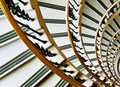
03/03/2008 08:34:05 PM · #38 |
- 3rd Place Ribbon, Rivers & Streams Challenge. By Jeffrey ( levyj413) in January 2008.
Jason ( DrAchoo) covered the bases pretty well in his earlier post regarding this photo.
I wonder if it's possible to consider the pro's & con's on a simpler scale? In the very short time period that the majority of voters look at an image while voting, what worked/didn't work?
Pro
1) It's unique. The only image in the top 10 of this challenge that isn't rural, and the only one taken at night.
2) Commenters during the challenge loved it. Of the top 10 it was the highest ranked by commenters. Most common remarks: beautiful, gorgeous, love the reflections, like the framing, colors are great.
Cons (hard to note many as it did ribbon!)
1) It's unique (didn't fit the country landscape mode).
2) It's dark overall (especially in comparison to others in the top 10).
IMO, I think it was the reflections and the framing by the bridge that sold this to the voters in that all important first glance.
|
|
|
|
03/03/2008 09:23:38 PM · #39 |
This thread is already working. Perhaps it should continue as a thread where ribbon winners can post their prize to be examined with the DPC microscope. That way the thread would become an open invite to the photog to have the first move.
|
|
|
|
03/03/2008 09:59:55 PM · #40 |
Originally posted by sekarmalathy:
I do not have too many ribbon shots to share with. But still eager to have it "bisected" :) again. So, just posting my only ribbon winner here.
|
Second place in Silhouettes IV in September 2007, by sekarmalathy.
Pro
Very strongly met the challenge
Immediate connection to childhood memory (at least for me)
Vibrant color to stand against the black silhouette
Interesting variable silhouettes of the bubbles
Caught one bubble as it was being blown, adding life to the shot
Simple composition with a strong diagonal
Con
Banding in the background (did you bump up the contrast a lot?)
Strong halo around the boy's silhouette from too much sharpening
Overall, an emotionally satisfying image that shows technical perfection isn't necessary.
Message edited by author 2008-03-03 22:09:54.
|
|
|
|
03/04/2008 11:43:03 AM · #41 |
Hi Jeffrey,
Thanks for your detailed critiques. Appreciate it!
Raj |
|
|
|
03/04/2008 11:48:42 AM · #42 |
My thought is, there should be similar thread for analyzing the non-ribbon Top 10(or just Top5) images to see why they missed a ribbon.
This would help to know what is missing in an image that prevents from being a winner.
Just my humble thoughts. Wanted to know what others think. Sorry for deviating from the topic.
Thanks
Raj
Message edited by author 2008-03-04 12:47:54. |
|
|
|
03/04/2008 01:02:24 PM · #43 |
Originally posted by DrAchoo:
I bug yanko about it all the time because he is a brown fiend. |
That must be why we get along so well, because I am a white devil! |
|
|
|
03/04/2008 01:09:59 PM · #44 |
Originally posted by sekarmalathy:
My thought is, there should be similar thread for analyzing the non-ribbon Top 10(or just Top5) images to see why they missed a ribbon.
This would help to know what is missing in an image that prevents from being a winner. ... |
Any photo that makes it to the Top 10 or Top 5 IS a winner in my book. I know what you're saying...they didn't get a ribbon, so they didn't "win" win. Still, given the number of entries in most challenges...
In the end, I think to be able to discuss/debate the pros & cons of the top challenge entries can be a good learning experience. It's hard to say what you didn't like in many cases with the top images. After all, there are reasons they rose to the top. Once in awhile I may be surprised and I'd like to be able to talk about that without worrying about being flamed in a forum. |
|
|
|
03/04/2008 01:30:22 PM · #45 |
|
I am more than willing to hear critiques on any of my top shots (bottom shots as well). Clean and simple with an immediate visual impact or grab is what does well here. With all of 2 seconds or so to grab someone, thats what the image has to be - usually. I know why my most of my higher scoring entries scored the way they did and I know why most of my lower scoring images scored the way they did. DPC is a fun game and you just need to learn how to play if you want the higher scores. |
|
|
|
03/04/2008 01:37:12 PM · #46 |
Originally posted by timfythetoo:
I am more than willing to hear critiques on any of my top shots (bottom shots as well). Clean and simple with an immediate visual impact or grab is what does well here. With all of 2 seconds or so to grab someone, thats what the image has to be - usually. I know why my most of my higher scoring entries scored the way they did and I know why most of my lower scoring images scored the way they did. DPC is a fun game and you just need to learn how to play if you want the higher scores. |
Yep. I'm probably flogging (sp?) the horse here. What you say makes perfect sense and after discussing ribbon winnters till you're blue in the face it still boils down (in most cases) to what you've just stated. |
|
|
|
03/04/2008 01:45:54 PM · #47 |
Originally posted by timfythetoo:
I am more than willing to hear critiques on any of my top shots (bottom shots as well). Clean and simple with an immediate visual impact or grab is what does well here. With all of 2 seconds or so to grab someone, thats what the image has to be - usually. I know why my most of my higher scoring entries scored the way they did and I know why most of my lower scoring images scored the way they did. DPC is a fun game and you just need to learn how to play if you want the higher scores. |
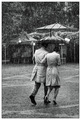
Except there are some of us who really can't get the "clean and simple with an immediate visual impact" to work and would love to know how to do it better. As an example, this is neither clean nor simple and in fact is really quite busy; yet it ribboned (and I was totally and utterly floored by that). Why?
Message edited by author 2008-03-04 13:47:48. |
|
|
|
03/04/2008 01:48:22 PM · #48 |
Originally posted by glad2badad:
Yep. I'm probably flogging (sp?) the horse here. What you say makes perfect sense and after discussing ribbon winnters till you're blue in the face it still boils down (in most cases) to what you've just stated. |
Its still cool to break down the images though. What one ribbon winning image has another may not. I find in many of my entries vivid color seems to be a theme, while in Yankos its brown. Many ribbon winners compostionally tend to follow rule of thirds while centered comp seems to work for me too. What the ribbon winning images tend to show is how these aspects of images - colors, composition, concept, editing - work well together. When I first came here my skills were very poor, but after playing here alot and looking at what makes a high scoring image I have been able to take that and work it into my own images - with varying success. I have learned a ton from the images on this site - ribbon winning or not. Its great to see the variety of ideas and techniques. |
|
|
|
03/04/2008 01:54:13 PM · #49 |
Originally posted by Melethia:
Except there are some of us who really can't get the "clean and simple with an immediate visual impact" to work and would love to know how to do it better. As an example, this is neither clean nor simple and in fact is really quite busy; yet it ribboned (and I was totally and utterly floored by that). Why?
|
This shot is simple though. It may be busy with all of the rain, but the concept itself is straightforward. A couple sharing an umbrella in the rain. There is nothing else to really distract the viewer from the primary focus of the image. Great timing getting them in step with each other, the rain works as a texture on the background yet really doesnt impact the two models as far as a distraction. The light and shadow play is very pleasing. This may not be considered eye candy as many ribbon winners tend to be, but it is a brilliant capture, edited perfectly that tells a story that is easily grabbed upon opening the image. And top it all off with the fact that it is not setup.  Pawdrix was asking for a longer shooting period for the last candid challenge I believe so that we had more time to catch a great candid shot. You did that here IMO. Pawdrix was asking for a longer shooting period for the last candid challenge I believe so that we had more time to catch a great candid shot. You did that here IMO. |
|
|
|
03/04/2008 01:59:29 PM · #50 |
Originally posted by timfythetoo:
Originally posted by Melethia:
Except there are some of us who really can't get the "clean and simple with an immediate visual impact" to work and would love to know how to do it better. As an example, this is neither clean nor simple and in fact is really quite busy; yet it ribboned (and I was totally and utterly floored by that). Why?
|
This shot is simple though. It may be busy with all of the rain, but the concept itself is straightforward. A couple sharing an umbrella in the rain. There is nothing else to really distract the viewer from the primary focus of the image. Great timing getting them in step with each other, the rain works as a texture on the background yet really doesnt impact the two models as far as a distraction. The light and shadow play is very pleasing. This may not be considered eye candy as many ribbon winners tend to be, but it is a brilliant capture, edited perfectly that tells a story that is easily grabbed upon opening the image. And top it all off with the fact that it is not setup. |
And the challenge relevance is absolutely spot-on. In that challenge were a lot of "contrived" images. This image is intensely human and folks related tot hat.
R.
|
|
Home -
Challenges -
Community -
League -
Photos -
Cameras -
Lenses -
Learn -
Help -
Terms of Use -
Privacy -
Top ^
DPChallenge, and website content and design, Copyright © 2001-2026 Challenging Technologies, LLC.
All digital photo copyrights belong to the photographers and may not be used without permission.
Current Server Time: 07/26/2026 10:13:00 AM EDT.


