| Author | Thread |
|
|
12/09/2005 11:12:05 AM · #1 |
Hello all,
I know this has happened to you, after you upload your image and right after the deadline you come up with a bunch of ideas that would have made it a better image. Well it happened to me but first I must say thanks to all who voted on my Industrial image:
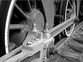
I got some ideas and made another and was wondering if you thought it might have scored even higher. This one.

I would like to know if you would consider it an improvement or just different. Thanks.
Mike
|
|
|
|
12/09/2005 11:37:55 AM · #2 |
MRPRO,
What "bothered" me about that basically very nice image is that the most interesting portion of it, detail-wise, is the area with bolts and all lower center, and that area seems de-emphasized by tonal values. The effect is even worse in your sepia version.
I took the liberty of working on the original a bit. I used some very careful curves adjustment, then a slight darkening and contrast bump with brightness/comntrast, then polished it off by adding a darker, more organic sepia to it. What do you think?

Robt. |
|
|
|
12/09/2005 12:17:39 PM · #3 |
Originally posted by bear_music:
MRPRO,
What "bothered" me about that basically very nice image is that the most interesting portion of it, detail-wise, is the area with bolts and all lower center, and that area seems de-emphasized by tonal values. The effect is even worse in your sepia version.
I took the liberty of working on the original a bit. I used some very careful curves adjustment, then a slight darkening and contrast bump with brightness/comntrast, then polished it off by adding a darker, more organic sepia to it. What do you think?
Robt. |
Hi Robt and thanks,
I don't quite understand the first part of your reply but I do like what you did with my image. If there is one thing I need to work on it's my post processing in CS2.
My gottcha item in this image was the relationship between the wheels and the track and the conveyence of power by all the steel linkage which makes it all work. Thus I tried to capture it all in this shot, which BTW was cropped from a larger shot. I cropped it the way i did to remove some liter that i didn't see when I shot it. I also felt I didn't have to get the entire wheel in the image to convey all that.
I have learned to wait a day or so before uploading my images. I had changed my entry in Free Study III 5 times or so before ending with the one I did and never noticed the blown out head of the eagle until people started to comment on it. I guess I get too emotional and not objective in my images. It's like they are my babies or something. I let my emotions cover up or hide little imperfections which I should have noticed. Scored pretty high with that one too considering there was over 500 entries, thanks all.

Doesn't this sound like a therapy session? I didn't mean for that to happen. Sorry. I am going to keep trying.
Thanks Robt,
Mike
Message edited by author 2005-12-09 12:19:24.
|
|
|
|
12/09/2005 12:27:59 PM · #4 |
In regards to our "Babies" (the pictures) I have this same problem. I did this in the collections entries. I focused on my favorites and took the sharpest picture i had and worked on that one. After entering I noticed that it wasnt all that sharp and the blurry ones in the background were really distracting, also there was a bright spot on one of the blurry ones that I really should have noticed. Ive had to learn to just flip through some pictures and rate each one as a voter would not as the owner of the picture, it helps some.
|
|
|
|
12/09/2005 01:15:51 PM · #5 |
Originally posted by MPRPRO:
I don't quite understand the first part of your reply but I do like what you did with my image. If there is one thing I need to work on it's my post processing in CS2. |
Mike,
Look at the lower left center where there are painted over bolts etc on the "connecting piece", that whole area there. Put up your sepia image and your entered image and toggle back and forth between them; see how the contrast in that area is noticeably flatter and the tonal values noticeably lighter in the sepia version? Now put up my edit and toggle that one with the others; see how the area of detail "pops" a little more? That's working with curves to adjust mid-range contrast in the image. Makes the whole thing look crisper and sharper.
Robt. |
|
|
|
12/09/2005 01:33:26 PM · #6 |
Originally posted by bear_music:
Mike,
Look at the lower left center where there are painted over bolts etc on the "connecting piece", that whole area there. Put up your sepia image and your entered image and toggle back and forth between them; see how the contrast in that area is noticeably flatter and the tonal values noticeably lighter in the sepia version? Now put up my edit and toggle that one with the others; see how the area of detail "pops" a little more? That's working with curves to adjust mid-range contrast in the image. Makes the whole thing look crisper and sharper.
Robt. |
I see it now, thanks Robt. I see by the bolts on top of the section the lack of contrast between them and the piece they are screwed into. I think I get it now. Did you do any burn there or just cruves?
Like I said in response to your first post I have to get the CS2 thing down a little better. I once thought that using Photoshop was like cheating, but i am starting to get how it can be used to improve my work. Thanks again.
Mike
|
|
|
|
12/09/2005 03:21:52 PM · #7 |
Originally posted by bear_music:
MRPRO,
What "bothered" me about that basically very nice image is that the most interesting portion of it, detail-wise, is the area with bolts and all lower center, and that area seems de-emphasized by tonal values. The effect is even worse in your sepia version.
I took the liberty of working on the original a bit. I used some very careful curves adjustment, then a slight darkening and contrast bump with brightness/comntrast, then polished it off by adding a darker, more organic sepia to it. What do you think?
Robt. |
This should be linked from the thread about "is post-processing necessary". Excellent work. You achieved exactly what you described above. In challenge terms, I think this treatment would have been good for maybe an extra .5 to 1 points in the final score. |
|
|
|
12/09/2005 10:26:45 PM · #8 |
Originally posted by MPRPRO:
I see it now, thanks Robt. I see by the bolts on top of the section the lack of contrast between them and the piece they are screwed into. I think I get it now. Did you do any burn there or just curves? |
Nope, no local selections at all, basic-legal. It was all done with curves, and then a brightness/contrast adjustment over that to get more pop; the curves adjustment, paradoxically, flattened most of the image while enhancing the area of concern.
R. |
|
Home -
Challenges -
Community -
League -
Photos -
Cameras -
Lenses -
Learn -
Help -
Terms of Use -
Privacy -
Top ^
DPChallenge, and website content and design, Copyright © 2001-2026 Challenging Technologies, LLC.
All digital photo copyrights belong to the photographers and may not be used without permission.
Current Server Time: 05/02/2026 04:21:43 AM EDT.


