| Author | Thread |
|
|
12/09/2005 08:57:41 AM · #1 |
...had to grab a few shots of this barn surrounded by snow.
What do you think? Comments appreciated. Thanks!!!
 | |  | | 
|
|
|
|
12/09/2005 09:07:05 AM · #2 |
| Very nice shots. I like most the first one because of the composition and the light. Well done. |
|
|
|
12/09/2005 09:16:38 AM · #3 |
might be my pishy knackered monitor at work, but GREEN SNOW??
Nice composition. |
|
|
|
12/09/2005 09:19:19 AM · #4 |
Thanks!
Originally posted by alexgarcia:
Very nice shots. I like most the first one because of the composition and the light. Well done. |
|
|
|
|
12/09/2005 09:20:56 AM · #5 |
Thanks for the comment. I'm partially colorblind...which one looks green? The snow in the shaded areas take on more of a blue tone - I thought anyway. ;^)
Originally posted by marklovell:
might be my pishy knackered monitor at work, but GREEN SNOW??
Nice composition. |
|
|
|
|
12/09/2005 09:45:18 AM · #6 |
| Your third shot - the panoramic is my fav. I like the selective desat, and it eliminates the gren/blue snow problem. |
|
|
|
12/09/2005 09:55:04 AM · #7 |
| Left you a comment on the first one. I really like the shot. Makes me wish we had more snow here (almost anyway) ! ...lol |
|
|
|
12/09/2005 02:23:04 PM · #8 |
Left you a comments on a couple. Okay, maybe one was more questions than comments.
The desat didn't impress me as much as the others, composition seemed a little busy or something! Never saw the green, and the blue didn't look out of whack or anything. |
|
|
|
12/09/2005 02:39:54 PM · #9 |
Originally posted by glad2badad:
...which one looks green? |
It could be my monitor, but the shaded snow in the 1st one is most evident.Unfortunately I use this monitor almost 80% of my browsing time, and it's a shared machine, so I can't even calibrate it and keep it there. Not to mention it's about 27 zillion decades old.... |
|
|
|
12/09/2005 02:50:31 PM · #10 |
I like snow pictures, they remind me of maine.
Cambece
|
|
|
|
12/09/2005 02:52:55 PM · #11 |
| My fav is the last one...however they are all beautiful. So picturesque...like a postcard :) |
|
|
|
12/09/2005 03:28:32 PM · #12 |
Wow - Take a couple hours off from monitoring DPC and BAM! ;^)
Thanks for the comments everyone. Much appreciated. As for the color cast I did cool the temp just a tad and dropped the blue a couple of notches. I exposed on the barn for these...the sun had some very strong yellow/red tones that was a bit too warm.
I miss having the 'Set Black/White Points' in PSP X (I upgraded from 9). They eliminated the pure B/W color adjustment and integrated it into the Color Balance area...can't get nearly as precise with the upgraded version. :(
Anyway - again many thanks.
|
|
|
|
12/10/2005 08:23:04 AM · #13 |
Hi - I've been thinking about this image and the comments on snow color. Wondering if anyone has an answer or thoughts as to the a different approach to take as this scenario isn't that uncommon with snow scenes.
In the foreground, where the snow is in shade, the snow has a blue cast to it. In the middleground, where the snow is in direct early sunlight, the snow is much warmer with red/yellow hues, in the background, around the barns, the snow is white to grey with some diffused sunlight reaching that area.
Would you process this differently to address the individual areas, or leave it as is with the natural color zones?
Thanks again.
Barry
|
|
|
|
12/10/2005 08:40:25 AM · #14 |
| try selective colour settings |
|
|
|
12/10/2005 10:00:22 AM · #15 |
Originally posted by di53:
try selective colour settings |
??? Do you mean to select the various regions (via magic wand, etc...) and adjust accordingly?
Does this mean you think the natural layout/colors would be better served by some PP manipulating rather than left as is?
Would you leave any of the three zones as is?
Questions, questions, more questions. ;^)
|
|
|
|
12/10/2005 07:06:18 PM · #16 |
|
|
|
12/10/2005 07:36:17 PM · #17 |
Originally posted by glad2badad:
Originally posted by di53:
try selective colour settings |
??? Do you mean to select the various regions (via magic wand, etc...) and adjust accordingly? |
I think it means to use the Selective Color adjustment tool -- it allows you to make adjustments based on the source color of the pixels.
I would consider making masks for the three zones and applying separate adjustments, but it can get tricky to keep it natural-looking. I did something like that with this photo of Mt. Rainier:
Original:  Processed: Processed: 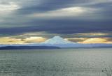 Print: Print: 
Message edited by author 2005-12-10 19:36:47. |
|
|
|
12/10/2005 07:40:36 PM · #18 |
I like the middle one best - here's my take on it with photoshop:

Does PSP have layer masks and hue/saturation for the different color channels? If so, practice using those and you can really improve photos of the sky (bear_music is excellent at those techniques, he might be able to help you out with them)
|
|
|
|
12/10/2005 08:07:47 PM · #19 |
Paul and Jon - Thanks for the feedback.
To answer the PSP question, yes - I'm pretty sure layer masks are available although I've not used them. Hue/Sat for color channels, yes - and that I use frequently.
Jon - I like what you've done (I think) in the foreground by adjusting the blue cast. Not crazy about the sky, but you were working with a small jpg sample I know. ;^)
So, it appears more are in favor of altering the natural blue cast in the shadows to a truer white? Hmmm...
Ok, well many thanks again - feedback much appreciated.
Barry
|
|
|
|
12/10/2005 08:23:42 PM · #20 |
I guess the sky is oversaturated in my version, sorry about that. It seems to me in scenes like that the sky is usually amazingly bright and colorful, but on camera it looks like crap, so I brighten it more and it seems more accurate.
I adjusted the blue cast on the bottom with a gradient on a layer mask, with the cyan tones desaturated quite a bit on that layer, and then reduced opacity and fill a little so it looked nicer.
|
|
|
|
12/10/2005 08:44:28 PM · #21 |
Originally posted by MadMan2k:
I guess the sky is oversaturated in my version, sorry about that. ... |
Please, don't apologize. I sincerely appreciate you taking the time to do what you've done and to lay out the steps so clearly.
Again, many thanks.
Barry
|
|
|
|
12/11/2005 01:22:52 PM · #22 |
Originally posted by glad2badad:
Paul and Jon - Thanks for the feedback.
To answer the PSP question, yes - I'm pretty sure layer masks are available although I've not used them. Hue/Sat for color channels, yes - and that I use frequently.
Barry |
Yup, PSP has masks, individual channel adjustments, etc... You really need to play with these tools. It can be tricky figuring them out at first, but once you do, it opens up a whole new world. Believe me, you want to know this stuff!!!
The images you posted aren't the easiest to learn masks with, but try this.....
1. Open the image (snow barn).
2. Duplicate the background layer, and make the new layer active.
3. right-click and choose 'create new mask layer | hide all' - This should move your new layer into a group with a mask layer above it (mask layers cannot be the background, or bottom of a group). Make this new layer mask the active layer.
4. Under the Layers menu, choose 'view overlay' - everything should have a red transparancy over it.
5. Use the paintbrush or airbrush tool and paint white the parts you want to change (in this case, the foreground trees/snow with the blue cast). As you do this, the red will be erased, and the original image will show through. This the whole point of the layer mask...only affect specific areas of the image (white the effect shows through, black blocks the effect - gray lets the effect partially show through). Using a soft edge brush and low opacity along the edges will help blend the effect rather than an abrupt change. Try an opacity of 1 to see how the mask can be gradually erased.
6. Under the Layers menu, select 'view overlay' again, this will turn off the overlay. At this point, everything will look normal again.
7. Select the duplicate of the background layer we created in step 2.
8. Right-click and choose 'new adjustment layer | Hue/Saturation/Lightness'. Make the adjustments you want (just for quick example Sat -100, lightness +30). You should now see that the foreground area has the blue cast gone, but the rest of the image is still normal. This is the mask doing it's job.
9. If you find some spots you missed, or hit that you didn't want to, you can simply go to the mask layer and paint them either white (to be affected) or black (so they aren't affected) or grey (low opacity to partially affect). Turning on the overlay can help you see exactly what's going on.
10. You may notice that the contrast isn't all that it could be now, so you might want to throw a curves adjustment layer in there. Again, this will only affect the area the mask allows.
You can repeat this process on other areas of the shot as well by following the same procedure. Just as an exercise, try making the barn sepia by using the menu 'effects | photo effects | sepia toning' (all the menu options/plugins, etc.. can be used and masked as well).
All of this can be made easier by using selection tools to at least get a rough mask built, and fine tuning with an air-brush, etc... One trick I've picked up on is 1) dupe layer. 2)make selection on the dupe layer. 3)create new mask layer | show/hide selection. 4) select none. Otherwise you will end up with the background layer in the layer group. And once you are working on the mask layer, you don't need the selection anymore.
Hopefully this helps a bit and isn't too confusing. Play with it a bit, and feel free to ask if you have any questions. |
|
Home -
Challenges -
Community -
League -
Photos -
Cameras -
Lenses -
Learn -
Help -
Terms of Use -
Privacy -
Top ^
DPChallenge, and website content and design, Copyright © 2001-2026 Challenging Technologies, LLC.
All digital photo copyrights belong to the photographers and may not be used without permission.
Current Server Time: 05/11/2026 06:57:51 AM EDT.


