| Author | Thread |
|
|
03/05/2005 04:40:15 PM · #1 |
I desperately need help for a school project. My class and me took about one thousand pictures of our school building. We need them to create a photomosaic for this artistic group project. We shall decorate the door to the arts class room.
Now, the rub is, I need at least 2400 pictures to create the mosaic in an acceptable quality. This means I have to duplicate pictures, without having them repeated over and over again.
How do I colourize mostly brown/gray pictures like the one below without just simply using the 'colourize' function? I tried the curves technique generalE used for his Dirty Windshield and some PSP filters such as charchoal, water colours, InfraRedCamera action etc, but none really matched my expectations.
Can anyone show me a technique that would create bright, joyful coloured pictured out of this brown mess?

I use Paint Shop Pro 9, Photoshop actions are no use to me, are they?
Message edited by author 2005-03-05 16:42:31.
|
|
|
|
03/05/2005 05:19:18 PM · #2 |
This was done (in photoshop) using only the saturation and contrast adjustments.

|
|
|
|
03/05/2005 05:40:49 PM · #3 |
Is this the kind of effect you have in mind? It was done in photoshop elements by adding a gradient map adjustment layer, then playing around with blending methods to find the best one.

|
|
|
|
03/05/2005 05:46:50 PM · #4 |
Or this one was done using the same method, but is a bit less extreme.

|
|
|
|
03/05/2005 06:08:09 PM · #5 |
i just solarized and then auto color. i think it's cool.
 |
|
|
|
03/05/2005 06:20:03 PM · #6 |
Gloda has only Paintshop Pro to work with, so filters and utilities unique to photoshop are of little use to him. However, Paintshop does many analogs of Photoshop filters that would bear investigating.
|
|
|
|
03/05/2005 06:21:09 PM · #7 |
I think he is looking for how to do something like this

There are some plug-ins or programs that automatically do this i believe though i cannot name one off of the top of my head. |
|
|
|
03/06/2005 07:10:06 AM · #8 |
Tranquil is right, I want to create a photomosaic which includes splashy colours. The problem is that there are only few pictures with that well defined colours.
GinaRothfels' method seems interesting, but PSP doesn't have GradientMap adjustment layer. Does anyone know the equivalent?
Solarizing is something I'll have to try, I didn't think of that. I have Eyecandy4k, the Animatter filter might be useful.
Any other suggestions?
|
|
|
|
03/06/2005 03:06:50 PM · #9 |
|
|
|
03/06/2005 03:34:26 PM · #10 |
I already have the program I need, Mosaic Creator.
I just need some more ideas to colourize my cell images.
|
|
|
|
03/06/2005 06:52:11 PM · #11 |
I would think "invert colors" and "hue/saturation" would provide all the options you need. PSP has to have analogues of both of these.
Robt.
Message edited by author 2005-03-06 18:52:33.
|
|
|
|
03/06/2005 08:23:51 PM · #12 |
Originally posted by gloda:
[/b] I tried the curves technique generalE used for his Dirty Windshield and some PSP filters such as charchoal, water colours, InfraRedCamera action etc, but none really matched my expectations.
Can anyone show me a technique that would create bright, joyful coloured pictured out of this brown mess? |
Maybe you didn't experiment enough ... the upper left image is the original -- the other versions come from sequentially applying different combinations of Curves until I had something interesting, saving a copy, then continuing on from there.
CD/Spiderplant
 |
|
|
|
03/06/2005 11:06:39 PM · #13 |
I had a program like this when they first came out. You have two things to contend with: the individual images you are entering, and the composit image (M. Monroe) that the program will make with the many individuals. A few things I came across: More contrast and saturation makes shapes and colors more clear to the program, giving it more ease of selection. Also the more simple your composit image, the larger the individual images tend to be and the more variety (but not too simple like a plain circle). Have you chosen the composit image, like your school symbol or mascot? Try entering a variety of versions, more or less complex or diff colors, to see how the program reacts. The program may also give the option to flip the individuals to make them more useable. You may not want it to do that. Hopefully you were able to take some portrait and macro shots and not just landscape (again, more variety for the program to work with.)
Good luck and have FUN! Sounds like a great project!
-bea |
|
|
|
03/07/2005 10:13:13 AM · #14 |
Yes, the source image has been chosen more or less exactly, it is this palette as a symbol for art.
Invert colours and hue shifts are two techniques that work incredibly well with abstract or macro pictures, as you don't immediately recognize what they are and what colour they should have.
Of course I could just flip all the images to have twice as many, but I try not to do that too much, as it reduces the overall quality. After all, this will be something many many students are going to walk past about 6 times a day.
I'll experiment a bit with the options all of you have suggested. I'll save the ones that work fine as PSP-Script (photoshop action equivalent) so that I can apply it to some dozens of images at once. (I'm so glad I have a pentium4!)
If anyone has some more ideas, I'll be glad to hear them!
|
|
|
|
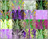
03/07/2005 04:00:40 PM · #15 |
In this gallery I put the best results I got from trying the different techniques and filters in Paint Shop Pro.
Which ones do you like? Which ones should I apply to the images to colourize them? Every picture has a name, just list the techniques you like best so I get an idea about which look good.
Here's an example:

Message edited by author 2005-03-07 16:04:46.
|
|
|
|
03/08/2005 02:01:34 PM · #16 |
Anyone? I just want to know which versions look acceptable. Thank you.
|
|
|
|
03/08/2005 02:07:54 PM · #17 |
I like the weave and the blue tone best. I do like the fire but think that could be taken the wrong way by certain people.
Glowing edges+negative is also good.
Hope this helps
Message edited by author 2005-03-08 14:08:36.
|
|
|
|
03/08/2005 04:35:56 PM · #18 |
Thanks Rex. The fire was just for fun :) I couldn't resist.
|
|
Home -
Challenges -
Community -
League -
Photos -
Cameras -
Lenses -
Learn -
Help -
Terms of Use -
Privacy -
Top ^
DPChallenge, and website content and design, Copyright © 2001-2026 Challenging Technologies, LLC.
All digital photo copyrights belong to the photographers and may not be used without permission.
Current Server Time: 05/07/2026 10:02:56 AM EDT.


