| Author | Thread |
|
|
07/02/2025 12:00:16 AM · #1 |
|
Post your outtakes from the Complementary Colors IX challenge here. |
|
|
|
07/02/2025 12:26:47 AM · #2 |
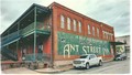
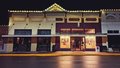
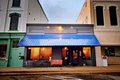
The town of Brenham had a couple other options I seriously considered--not that I think either was any stronger a contender than the Ant Street Inn photo I ultimately submitted. But thought people might enjoy seeing these, too:
Yellow/purple
Thought that one emphasized the yellow too much--the purple wasn't as pronounced without heavy-handed post-processing. Just looks more maroon, though I loved the glow of the window lights.
Blue/orange
This was actually my submission for a while. But then I looked back at past entries--had to go back a LONG way to find the last challenge! And it seemed likely that the non-blue/orange tones in the adjacent buildings were too distracting for this. Didn't want to get slammed for DNMC when I had the Ant Street Inn picture still available to me.
And I actually seriously considered another red/green option, but I just didn't love this one as much as I loved all the architectural details on the Inn, and I'm going to resist sharing it here because I think it's going to be the only outtake I can actually repurpose for my iStock collection, since it doesn't feature identifiable property requiring a commercial release there. :-) |
|
|
|
07/03/2025 11:43:08 PM · #3 |
|
Home -
Challenges -
Community -
League -
Photos -
Cameras -
Lenses -
Learn -
Help -
Terms of Use -
Privacy -
Top ^
DPChallenge, and website content and design, Copyright © 2001-2026 Challenging Technologies, LLC.
All digital photo copyrights belong to the photographers and may not be used without permission.
Current Server Time: 06/12/2026 08:31:47 AM EDT.