| Author | Thread |
|
|
09/14/2011 05:20:37 AM · #1 |
So, I think we've all felt things about photos that we've seen on here that we figure we ought not to say in order to not offend, that we thought may have been too harsh. Here's your chance!
Your task is to pick a challenge(because challenge entries were all taken with a certain degree of effort by the entrant to succeed) image from the person above you and single it out as your least favorite. You must post a comment describing why it doesn't work for you (you may even begin the comment "With All Due Respect...") and finish with an explanation of what the photographer did best.  bvy did something similar to this in this thread, so here's how I want this to differ- I want you to select your least favorite of your OWN images as well, and critique it in the same way. This isn't license to be an @#$hole, it's intended to help us grow and understand photography better. bvy did something similar to this in this thread, so here's how I want this to differ- I want you to select your least favorite of your OWN images as well, and critique it in the same way. This isn't license to be an @#$hole, it's intended to help us grow and understand photography better.
Me-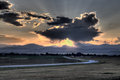
It's a lacking example of HDR, to me. It does not really express the full tonal and color range of the scene and looks somewhat flat. The colors are odd, to the extent that the sky looks a bit otherworldly particularly with the variation in orange to blue in different parts of the empty sky. I feel that the road is too bright, like a glowing vampire out of Twilight. Though the subject matter is well suited to HDR normally, it's also super cliche and unoriginal. It's also a location I had shot at before, and I try not to be a one trick pony. I do like the composition and the feel that the road gives me, pulling me into the distant repetition of the foothills, which is an effect I'm always fond of.
Message edited by author 2011-09-14 05:21:06. |
|
|
|
09/14/2011 09:35:28 AM · #2 |

I did this one when I was not planning on entering the challenge, but had my arm twisted to enter something for the "Beat your own average" side challenge. How it beat my average, I have NO idea. Moderately competent on lighting and details, but not outstanding either. The whole thing is just uninspired and boring. 7 coffee cups, meh. Evokes no reaction in me, either good or bad. If it at least made me crave a hot cup of coffee, then it would have been a success.
I'm finding it hard to single out specifics to either criticize or praise. Again, that all says it is one of the most meh entries I've ever done.
ETA a critique of one of Derek's shots that I don't care for. Had to really hunt though. Most of his stuff has at least some element that appeals to me.
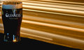
First thing that strikes me is the awkward composition, with the glass shoved all the way over to the side. The slightly OOF background (the bar perhaps?) is what grabs my eye instead of the beer. The whole thing comes off as rather flat looking. A shot like this is a success for me if it makes me thirsty, and this doesn't.
I can see from Derek's notes that he felt the same way about it.
Message edited by author 2011-09-14 13:13:48.
|
|
|
|
09/14/2011 11:41:28 AM · #3 |
|
It's been my experience that whenever someone prefaces their statement using "With all due respect..." it's an indicator that what comes next is going to lack any respect whatsoever. |
|
|
|
09/14/2011 11:50:53 AM · #4 |
Originally posted by Spork99:
It's been my experience that whenever someone prefaces their statement using "With all due respect..." it's an indicator that what comes next is going to lack any respect whatsoever. |
But in this case, we are critiquing our own images. I can disrespect myself as much as I like and not get offended.
|
|
|
|
09/14/2011 11:54:40 AM · #5 |
Originally posted by Yo_Spiff:
But in this case, we are critiquing our own images. I can disrespect myself as much as I like and not get offended. |
I Thought we were picking the image from the person above? |
|
|
|
09/14/2011 11:55:19 AM · #6 |
|
I think he wanted you to single out a challenge entry from the poster above you, too, though. |
|
|
|
09/14/2011 12:11:09 PM · #7 |
No worries, Spiff's a grown kid, he can take it.
First, Steve -- It's hard to find a shot you've taken that I don't like. Also, morning coffee hasn't kicked in, so this won't be terribly verbose.
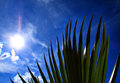
With all due respect – I'm just not able to connect with this photograph. There are several elements that as it sits now scream out "I'm a snapshot." For me, most noticeable is the very strange crop. It gives the impression that the plantlife is growing out of the sky or isn't grounded. I really like the sky, the deep blues and slight vignetting add a little drama, but then you get back to the foreground, and the drama feels less considered. The plant is a bit flat, in between silhouette and not. The lens flare in this seems a bit accidental, it would be lovely if you could have gotten it to trickle down into the plant.
own:
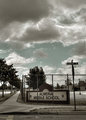
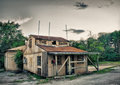
A shot that failed my own expectations. For a shot that's supposed to evoke the idea of prison, the colors seem a bit vibrant. The clouds could have been used to a greater effect if they had more low tones. Right now they're just sort of fluff, and since they take up the majority of the photograph – they should hold more emotional weight. There's some sloppy HDR ghosting in the sky, and that tells the viewer that you didn't care enough about the shot to fix that. The crop vertically feels okay, but the left side feels a bit harsh of a crop, especially since the viewer can tell that the corner is missing. The dodging of the sign looks well and the grungy nature of the shot work well. The fence needs to be pushed somehow, either through dodging & burning, or size (through a closer crop).
Message edited by author 2011-09-14 12:28:52. |
|
|
|
09/14/2011 12:12:32 PM · #8 |
Originally posted by mike_311:
I Thought we were picking the image from the person above? |
It kinda got hidden in the paragraph:
Originally posted by spiritualspatula:
so here's how I want this to differ- I want you to select your least favorite of your OWN images as well, and critique it in the same way. |
And then he proceeded to pick apart his own least favorite entry.
Oh, I made an error myself. He wanted us to pick apart TWO entries. From the guy above and from ourselves.
Message edited by author 2011-09-14 12:14:12.
|
|
|
|
09/14/2011 12:41:02 PM · #9 |
crap now it's a little out of order, as i spent the last 15 minutes browsing through spiff's portfolio looking for something i DIDN'T like the most...and it took a while, i like his style.
when i got to some 2007 entries i saw a few entries like mine to this day that are lacking, and it made me realize how much Steve has REALLY improved his work and makes me hopeful to improve mine.

With all due respect, this just doesn't work for me at all. i can't really tell how it met the challenge (granted i'm looking on a BAD laptop monitor) and it doesn't grab me at all. the bright colors with the white background almost hurts to look at.
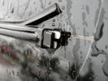
this is terrible. attempt at an artsy macro (but not close enough to capture real detail) of a wiper blade with nothing worth looking at in the reflection, taken during the rain in bad light, no thirds, bad crop. |
|
|
|
09/14/2011 12:44:57 PM · #10 |
Originally posted by Spork99:
It's been my experience that whenever someone prefaces their statement using "With all due respect..." it's an indicator that what comes next is going to lack any respect whatsoever. |
Like "promise me you won't get mad" |
|
|
|
09/14/2011 12:59:29 PM · #11 |
FourPointX,
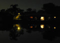
WADR, This doesn't grab me at all, and is one of your few images that don't have something going for it in terms of composition, interesting subject or something. It's not a unique enough POV for the darkness to work, and it's not long enough exposure for the subject to work. There isn't much to look at that a quick glance wouldn't suffice to cover.

If I could delete one image from my portfolio, it'd be this one. As you can see by it's utter lack of comments, it is not striking in any way. Not clear, sharp, interesting, cropped well, nothing. It's a bad picture of a cool paper umbrella. Could have been done way better.
Sorry to the next poster, I don't have a million challenges (yet) to choose from, but I'm sure there are still enough bad pictures in my port to choose from. :)
Message edited by author 2011-09-14 13:01:32. |
|
|
|
09/14/2011 01:14:29 PM · #12 |
Added to my earlier critique of my own shot with one of Derek's.
|
|
|
|
09/14/2011 09:49:24 PM · #13 |
Originally posted by Yo_Spiff:
Originally posted by Spork99:
It's been my experience that whenever someone prefaces their statement using "With all due respect..." it's an indicator that what comes next is going to lack any respect whatsoever. |
But in this case, we are critiquing our own images. I can disrespect myself as much as I like and not get offended. |
Indeed, and I agree about the usage of With All Due Respect- wanted it to be a joke in that it's a cliche but serious in that the intent of this was to be helpful for users. |
|
|
|
09/14/2011 09:57:45 PM · #14 |
Originally posted by sinistral_leo:
Originally posted by Spork99:
It's been my experience that whenever someone prefaces their statement using "With all due respect..." it's an indicator that what comes next is going to lack any respect whatsoever. |
Like "promise me you won't get mad" |
My favourite is "To be honest"
That implies that everything else the person says is a lie......
edit:
I don't feel qualified to give a proper critique of the above photog's profile.....I took a long look at all the photos on his front page and they are all amazing...
If someone wants to critique me, please go for it..... although, I would appreciate a critique of my top two finishes, as I have learned a lot since I started entering challenges, and my older shots are, well, yah..... let's just leave it at that... LOL
Message edited by author 2011-09-14 22:01:04. |
|
|
|
09/14/2011 10:21:46 PM · #15 |
Originally posted by glockguy:
I don't feel qualified to give a proper critique of the above photog's profile.....I took a long look at all the photos on his front page and they are all amazing...
If someone wants to critique me, please go for it..... |
There's no free ride here! S2R!
adigitalromance was last up to the plate, pony up!
Seriously though... I'm a firm believer that viewing your work along with others is one of the best ways to improve not only your own work, but the community at large. Don't invalidate yourself, learn through doing. |
|
|
|
09/14/2011 10:27:44 PM · #16 |
fair 'nuf.....
I really like this photo.... There is something HDR'ish about it, but for some reason it doesn't quite come through...
Reading through the description, I believe it is just processing, and not actual HDR that produced this effect.
Having said that, the photo leaves me wanting more of the tonal range that HDR would have provided. It's tough for me to pinpoint, but I hope everyone understands what I am getting at.
Perhaps going for a more natural look would have made this photo "pop" a little more.....
Don't get me wrong. I LOVE HDR.... just felt like this was off by a few degrees...
edit....
how do I get the thumbnails? I hit the "insert picture" and put in the URL, but no dice......
edit 2:
I also think a tighter crop around the building would have done wonders..... the eye is somewhat led to the sky, which is, for the most part, uninteresting.
edit 3:
Thanks for the info FourPointX......
edit 4:
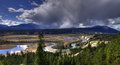
This was my very first try at HDR. I was (and still am) a noob at both CS5 as well as DPC. I think, no, I know I could have done this way better...
1) take the originals in RAW. This would have allowed me to compensate for some over/under exposure problems
2) I wish I would have known about the power of desat when doing HDR back then. That would have taken some of the "cartoony" out of this
3) A tripod!!!!!! now I own one. There is some noise in the photo which was a result of me hand holding the camera
4) I think I nailed the composition (correct me if I am wrong). This was more luck than planning, but it did teach me some valuable lessons (because of some amazing PM's I got regarding this.
5) Librido Sharpen.... Should have learned this action a LOOOOOOONNNNNGGGG time ago...
That's all I got, feel free to add....
Message edited by author 2011-09-14 22:49:17. |
|
|
|
09/14/2011 10:32:53 PM · #17 |
you want to select "insert thumbnail link" and paste the image ID in there:
|
|
|
|
09/14/2011 10:42:09 PM · #18 |
|
Make sure to do one for yourself, Al. |
|
Home -
Challenges -
Community -
League -
Photos -
Cameras -
Lenses -
Learn -
Help -
Terms of Use -
Privacy -
Top ^
DPChallenge, and website content and design, Copyright © 2001-2026 Challenging Technologies, LLC.
All digital photo copyrights belong to the photographers and may not be used without permission.
Current Server Time: 06/23/2026 04:20:41 AM EDT.


