| Author | Thread |
|
|
06/08/2011 04:12:22 PM · #1 |
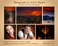
I am working on an ad for my photography which will be in a playbill for a summer theatre production (I am shooting for them and they gave me ad space).
I have to get the ad in soon, and I'm torn between just advertising landscapes or landscapes and headshots/portraits. The show runs nightly for 6 weeks (might be 4 this year due to cutbacks) so I will get a lot of exposure from it.
Anyway, I have some drafts here:
//nrshapiro.com/parkplayhousead
I'd love any opinions and ideas. The only restriction is I have to finish the ad by tomorrow night! (Well, they just offered it to me last weekend...so I didn't really procrastinate. :) )
|
|
|
|
06/08/2011 04:18:50 PM · #2 |
| Neil, I wish you the best. Your ideas are great. I do like the last one best. The flow seems to appeal the most and if you are advertising portraits, etc. it's good to show an example. Just my two cents. The last one is very simplistic and clean looking to me. |
|
|
|
06/08/2011 04:19:53 PM · #3 |
| I like the 2nd & 4th ones best. Advertising was never my thing, but as a consumer those two ads would grab me. |
|
|
|
06/08/2011 04:28:28 PM · #4 |
|
|
|
06/08/2011 04:38:21 PM · #5 |
| I like the fourth one best as well. You want to show the portraits which may get you some gigs, and the two portraits you show in this one is more traditional and straightforward. The landscapes are beautiful and show your capabilities and may well get someone to stop by your site and purchase, and the colors, layout, and text are quite good. In addition, having the information above and below works better than burying it in the middle of the ad. |
|
|
|
06/08/2011 04:39:51 PM · #6 |
Seems unanimous!
Thanks.
Message edited by author 2011-06-08 16:40:02. |
|
|
|
06/08/2011 04:58:28 PM · #7 |
| Sorry -- I like the first one best. The 4th one is nice, but the picture in the lower right is a so much heavier than the photos, it seems a little unbalanced. Though I like the idea of the 4th one, the first one seems better balanced. |
|
|
|
06/08/2011 05:02:22 PM · #8 |
I also prefer the 4th one. I do find the indentation on the final line a bit awkward, but that is just me, no doubt. The other text fields are centered with each other, but this one is not, almost looks like a mistake, if one (cough) overanalyzes (cough)
How big will the ad run? Is this a half page in the back of the program? |
|
|
|
06/08/2011 05:03:15 PM · #9 |
|
|
|
06/08/2011 05:05:25 PM · #10 |
Originally posted by vawendy:
Sorry -- I like the first one best. The 4th one is nice, but the picture in the lower right is a so much heavier than the photos, it seems a little unbalanced. Though I like the idea of the 4th one, the first one seems better balanced. |
A good point. I prefer the text layout of the 4th, except for that one indentation, but that dark lower right image might not even print/read well, depending on the materials used, print quality. |
|
|
|
06/08/2011 05:08:18 PM · #11 |
#4 is my favorite.
#3 is second choice. I belive the portraits in #4 help show a more rounded talent.
#1 & #2, the photography seems secondary to the ad copy. The words surrounding the iamges seem a little intrusive to me. |
|
|
|
06/08/2011 06:58:03 PM · #12 |
I like the type layout of #4 the best.
Since you are in a theater-based publication, I think you should emphasize the portraiture over the landscapes and maybe try placing them on the top row.
The landscapes all seem pretty dark -- I'd look at using the large waterfall in place of the large sunset in the middle.
Older eyes will appreciate it if you make the smaller type 1 or 2 points larger.
Since you're not listing a physical (studio) address or office hours, I'd think that the "by app't" text could be assumed (I know, more correctly-spelled ASS|U|ME) ... but if it's there why not go all the way and spell-out "appointment" ... :-) |
|
|
|
06/09/2011 02:24:07 AM · #13 |
| They're all good, but ditch the third one. People buy photos. Focus on the customer. |
|
|
|
06/09/2011 02:40:23 AM · #14 |
Thanks again for the additional input.
I'm going to go with #4 as most have suggested. I'll look at some final refinements in the morning.
|
|
|
|
06/09/2011 09:57:12 AM · #15 |
Here's a mod based on some of the feedback...
I need to get this finished, and it already looks better than many of the ads in the book last year IMHO (yes, this is a half page ad inside the book)
Hopefully I'm done...but I won't send it out yet in case anyone sees a blooper, or if I just made it worse with the changes. Please let me know.
|
|
|
|
06/09/2011 02:14:48 PM · #16 |
My son was out of town yesterday, and I just got his opinion...which is usually pretty good.
Interstingly, he didn't like the fact that all the photos were basically "orange"...and actually, that was intentional.
But I tried an alternate with him, which he likes, and may address a comment below about the NYC shot being dark (he also didn't like that one in there...looks wonderful on canvas but less so in a small version)
Not to sound like an EYE DOCTOR, but which one of these two do you like?
//nrshapiro.com/parkplayhousead
Were my font alignment changes per your liking (that was based on suggestions below).
Thanks again.
|
|
|
|
06/09/2011 02:21:10 PM · #17 |
| i like #1 better of those 2 |
|
|
|
06/09/2011 02:36:28 PM · #18 |
what you advertise depends on what you really want to sell.
what's the purpose of the ad in the first place? to get you portrait sessions? to sell fine art? to generate inquiries?
how big is the ad?
is it in color?
is it glossy?
how many are being printed?
how many people are going to attend the shows?
what one thing do you think they might be most interested in getting from you?
keep in mind the conditions your audience is going to be seeing your ad. are they really going to have time to study it and read the fine print?
there are really four elements that you have got to nail them with: a strong image, your name, your url, and a simple, accessible, and engaging message. much more than that will probably be lost.
granted, it's not costing you anything since you're doing it for trade, but you still want it to be as effective as possible.
when i've done this type of advertising in the past, i've trimmed things down to one or two images (depending on if i had a half-page or full page), and i've only had a single purpose: drive people to a specific landing page on my site. once i get them to my site, i can more easily direct them to the areas that they (that particular audience) might be most interested in.
good luck!
|
|
|
|
06/09/2011 02:38:47 PM · #19 |
If I can get in late on the game with my opinion. The color change is a big improvement (smart son). At first, I didn't like the emphasis on the landscape images because, to me, it doesn't seem to be a money maker like a headshot would be. Maybe you know differently. I can't imagine I'd run an ad selling landscapes when consumers can pick them up at the local art print store or other high volume on-line retailers. Maybe I just don't know this market though. Selling your portrait services in my mind is going to bankroll new lenses faster than the labor of love than landscapes are. Although I must admit your images are special when compared to other photographers who I've seen trying to sell landscape work in my region.
If I saw a salty lighthouse keeper in the foreground of that lighthouse shot I'd lose it and order a print right away.
ETA: I think you've captured that balance now with the high art landscapes and fee-making portraits. Very nice. I'd pay attention if I saw that ad in a Playbill
Message edited by author 2011-06-09 14:40:45. |
|
|
|
06/09/2011 05:03:12 PM · #20 |
Some more good advice! Thanks.
I was about done, picking the second of those two as voted.
Now, taking Skip's words into mind, I agree, it's best to give them a special landing page. So I wondered about not saying so much on the bottom...and just getting them to my website on a special page.
So I revised it...unfortunately, that leaves me a little unsure of the right text.
Here I'm being careful (using Fan) to avoid implying the page and specials being part of, or endorsed by, Park Playhouse. But I'm open to better wording (and even telling me to go back to the other more detailed text).
Last call for changes (really!) I need to send it in!
And thanks to all...more evidence of how DPC is such a great, collective mind, resource!
|
|
|
|
06/09/2011 09:09:23 PM · #21 |
I prefer the previous version.... You've lost the wording that shows you offer more than just portraits (headshots, model portfolio work)
I think you could put that back on the left side as before, then perhaps say " See more at" and put your website. Your site will tell them your email. Since some theatrical folks will likely see the ad, I'd sure want to let them know that you specifically do headshots. I do like the change up in images from the previously popular #4 :-) |
|
|
|
06/09/2011 09:38:28 PM · #22 |
Originally posted by chromeydome:
I prefer the previous version.... You've lost the wording that shows you offer more than just portraits (headshots, model portfolio work)
I think you could put that back on the left side as before, then perhaps say " See more at" and put your website. Your site will tell them your email. Since some theatrical folks will likely see the ad, I'd sure want to let them know that you specifically do headshots. I do like the change up in images from the previously popular #4 :-) |
While I agree with this, I decided I needed to get it in already and have already sent it in. I really got sidetracked on it, and it was beginning to possess my soul.
I hope the pictures will speak for the types of shots I take, and that they will be curious enough to go check out the site. At least with the landing page being specific to this ad, I'll be able to see how it works via site stats.
I will still have to do the work to customize that page though!
|
|
|
|
06/09/2011 10:13:40 PM · #23 |
Yes, i was going to suggest monitoring your site activity. Thats great that you'll be able to measure the response. Make sure that you dont link to that page from elsewhere in your site then you can guage the traffic just from the ad only. Is this an obvious sugfestion?
|
|
|
|
06/09/2011 10:54:53 PM · #24 |
Originally posted by Neil:
Originally posted by chromeydome:
I prefer the previous version.... You've lost the wording that shows you offer more than just portraits (headshots, model portfolio work)
I think you could put that back on the left side as before, then perhaps say " See more at" and put your website. Your site will tell them your email. Since some theatrical folks will likely see the ad, I'd sure want to let them know that you specifically do headshots. I do like the change up in images from the previously popular #4 :-) |
While I agree with this, I decided I needed to get it in already and have already sent it in. I really got sidetracked on it, and it was beginning to possess my soul.
I hope the pictures will speak for the types of shots I take, and that they will be curious enough to go check out the site. At least with the landing page being specific to this ad, I'll be able to see how it works via site stats.
I will still have to do the work to customize that page though! |
Well, no worries: the choices were nitpicks among perfectly acceptable alternatives :-) Let us know how it goes, please, I am interested. |
|
Home -
Challenges -
Community -
League -
Photos -
Cameras -
Lenses -
Learn -
Help -
Terms of Use -
Privacy -
Top ^
DPChallenge, and website content and design, Copyright © 2001-2026 Challenging Technologies, LLC.
All digital photo copyrights belong to the photographers and may not be used without permission.
Current Server Time: 04/27/2026 09:21:48 PM EDT.


