| Author | Thread |
|
|
05/02/2011 12:34:32 PM · #1 |
OK so I'm not the most decisive person in the world.
My wife is a teacher at a high school and now somehow I am dedicating an artwork / photo to their permanent collection. I didn't really think twice about it until I heard that there is a formal ceremony and that i am the only "dedication".
So now I'm scrambling to find the right piece. In lieue of doing something new, I'm looking for help in ideas of what to submit - perhaps a printed piece from my submissions to DPC … perhaps from my Flickr stuff, or perhaps something on my web page.
i want to find something that is apparent that it wasn't done by a high school student =D LOL!!!!
 This is one possibility right now but really I am not completely sold on it. This is one possibility right now but really I am not completely sold on it.
Any opinions are welcome. Thanks. |
|
|
|
05/02/2011 12:37:49 PM · #2 |
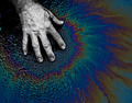
This was the first one that came to mind. It speaks volumes, I think young people could relate to it.
 |
|
|
|
05/02/2011 12:40:41 PM · #3 |
Man, you have tons of good stuff. I'd suggest narrowing the field by deciding what shots of yours are your own favorites. Which of them do you find yourself revisiting and each time saying "I can't believe I shot that!" I think using your own favorite makes it far more personal and meaningful.
|
|
|
|
05/02/2011 12:44:03 PM · #4 |
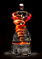
I also like:
  |
|
|
|
05/02/2011 12:44:54 PM · #5 |
totally agree with  karenNfld on the choice karenNfld on the choice |
|
|
|
05/02/2011 12:51:15 PM · #6 |
|
I also agree with KarenNfld on this, the image says a lot and is also very good. |
|
|
|
05/02/2011 12:51:32 PM · #7 |
You guys are awesome -
I didn't expect much response so I am psyched =))
Question on this …
Since I have this on Getty, is it legit for me to print and use it in a gallery?
I feel like it should be but I want to be sure.
It is in fact one of my favorites =))
Originally posted by KarenNfld:
This was the first one that came to mind. It speaks volumes, I think young people could relate to it.
|
|
|
|
|
05/02/2011 01:38:04 PM · #8 |
Originally posted by tate:
Question on this …
Since I have this on Getty, is it legit for me to print and use it in a gallery? |
If in your agreement with Getty you retain the copyright then sure, you can print and post it. It might get dicey if you let the school print it on a program, poster, catalog or coffee cup -- stuff for which they'd normally need a stock license, but an individual "Fine Art Print" should be no problem. |
|
|
|
05/02/2011 02:13:44 PM · #9 |
Thanks -
I have verified also with a friend that has worked at GEtty that that will be fine =)
Upon looking at this image again, I think this printed large on metallic would be amazing.
Thanks for the input everyone! =^}
Originally posted by GeneralE:
Originally posted by tate:
Question on this …
Since I have this on Getty, is it legit for me to print and use it in a gallery? |
If in your agreement with Getty you retain the copyright then sure, you can print and post it. It might get dicey if you let the school print it on a program, poster, catalog or coffee cup -- stuff for which they'd normally need a stock license, but an individual "Fine Art Print" should be no problem. |
|
|
|
|
05/02/2011 02:33:16 PM · #10 |
Originally posted by KarenNfld:
This was the first one that came to mind. It speaks volumes, I think young people could relate to it.
|
One of my all time favorites... How could you NOT use this? Very serious and deep image. |
|
|
|
05/02/2011 04:24:07 PM · #11 |
Originally posted by tate:
I think this printed large on metallic would be amazing. |
I agree -- this is just the type of picture the metallic would work for! |
|
|
|
05/05/2011 10:13:57 AM · #12 |
OK -
so I pumped up the saturation and made it look brighter and pretty much completely different.
It takes away a buit of the contrast but worked REALLY well on the metallic paper - (20x16 print)
So excited to put this in a nice frame - and maybe low reflective glass.

Originally posted by GeneralE:
Originally posted by tate:
I think this printed large on metallic would be amazing. |
I agree -- this is just the type of picture the metallic would work for! |
|
|
|
|
05/05/2011 10:49:57 AM · #13 |
Now that I look at it, perhaps some of the appeal of the original is lost in the tie-dye vibe now?
I was thinking all was cool until I compared the two images.
ugh - this thing is next thursday … |
|
|
|
05/05/2011 10:58:18 AM · #14 |
|
Just my opinion, but even with the bright colors, the message is still there -- maybe even more obvious, at least to me. i like the brighter one better. gives me the feeling that just because something has bright, pretty colors doesn't mean it is a good thing. |
|
|
|
05/05/2011 11:03:47 AM · #15 |
Tate,
I really like them both! I wonder if you took the colors down just a bit so that they are still colorful, but not so bright... does that make sense? Maybe an inbetween of the two?
Wonderful image and perfect for the submission!
|
|
|
|
05/05/2011 01:14:06 PM · #16 |
|
In my opinion I like the original better. My eyes get naturally drawn to the hand and allows me to then figure out what else is happening in the photo. The natural feeling of the original colors to me give it more meaning, were as the saturated colors give it a painted, i like the colors and I am not trying to figure out why they're there, feeling. |
|
|
|
05/05/2011 01:27:41 PM · #17 |
I like the original better, but I think it could be pumped up just a little. I agree with the "somewhere between" comment.
The original brings out the hand more. Somehow it was the hand that made the impression, not the oil slick. The desaturated hand gave it kind of a dead/sick feeling, like the oil slick was causing sickness. The brightness seems to take away that message and bring the focus to the "pretty" oil slick. |
|
|
|
05/05/2011 01:31:47 PM · #18 |
|
I prefer the orig also.... I like the subtle colours in contrast to the B&W hand... sort of like a pale fragile human aspect. The techni-colour one that subtly is gone even though the images is good it's not got the same impact to me. The orig I knew exactly what it was but not as quickly with the really colourful version. |
|
|
|
05/05/2011 02:32:38 PM · #19 |
|
you guys are great. Thanks for the input as always. |
|
|
|
05/05/2011 03:15:29 PM · #20 |
|
fantastic choice! and agreed - an in between of those two and you're set :) |
|
|
|
05/08/2011 09:49:22 PM · #21 |
|
|
|
09/26/2011 02:28:17 PM · #22 |
Originally posted by KarenNfld:
This was the first one that came to mind. It speaks volumes, I think young people could relate to it.
|
This printed on canvas would be sweet.
Message edited by author 2011-09-26 14:28:25. |
|
|
|
09/26/2011 03:49:05 PM · #23 |
Originally posted by KarenNfld:
This was the first one that came to mind. It speaks volumes, I think young people could relate to it.
|
i agree this one is pretty awesome kids would enjoy it. |
|
|
|
09/27/2011 01:20:03 AM · #24 |
Originally posted by Socom:
I also like:
|
This is it! A summary of our times. Edgy. Obscure. Young. |
|
|
|
09/27/2011 02:34:43 AM · #25 |
necro bumps!
But, oh fearless leader, do you have a photo of it on exhibit? |
|
Home -
Challenges -
Community -
League -
Photos -
Cameras -
Lenses -
Learn -
Help -
Terms of Use -
Privacy -
Top ^
DPChallenge, and website content and design, Copyright © 2001-2026 Challenging Technologies, LLC.
All digital photo copyrights belong to the photographers and may not be used without permission.
Current Server Time: 07/24/2026 12:48:26 AM EDT.


