| Author | Thread |
|
|
01/25/2011 10:52:29 PM · #26 |
Originally posted by timfythetoo:

That is a RAW conversion with no tweaks. To be honest this is actually a bit more high key from camera than I normally do. Here is a link to a thread I did on my recent ribbon winner. Between tweaks in RAW conversion and some minor curves in PS I get my whites right and then I tend to do most of the rest of the work with dodge and burn. I personally prefer my high key images with minimal but strong blacks and smooth shadows. I have no issues with skin getting blown out and unseeable as in the pic of Aidan. I think it just adds to the impact. I have been using a wacom tablet for years now and I love the control that the pen gives me when editing. It was always a frustration with a mouse - but the pen lets me edit as though I was drawing or painting. And with images like these it is wonderful. |
Tim, I'm a big fan of Black&White photos, and the High-Key look in general. That picture of Aiden is beautiful! A question regarding PP technique: why do you desaturate the blue channel before converting to B&W? Why that channel in particular? And wouldn't the conversion to B&W desaturare the blue automatically? |
|
|
|
01/26/2011 01:28:01 AM · #27 |
Originally posted by gcoulson:
A question regarding PP technique: why do you desaturate the blue channel before converting to B&W? Why that channel in particular? And wouldn't the conversion to B&W desaturare the blue automatically? |
I know why I would ... I'd actually just discard the Blue channel -- it is almost always the noisiest, in fact, I use it when I'm trying to achieve a grainy look.
As I understand it, most sensors are built with twice as many Green sensing sites as either Blue or Red, and so the Green channel usually has the smoothest shading, perhaps with a somewhat compressed tonal range. I often "convert" an image to B&W simply by copying the Green channel to a grayscale document, and adjusting (usually with Curves) from there.
Note that an easy way to "tone" or "tint" a B&W image is to take a file in Grayscale mode, change the mode to RGB, and then use a Curves adjustment layer on just one of the color channels; I usually start with the Blue channel. Pushing it towards the Blue gives an effect I liken to using a selenium toner when making a B&W print, while pushing it towards the Yellow (the complementary of Blue) can resemble a sepia effect.
For more control over the look, you can also convert a grayscale image to duotone mode, but you then need to convert back to RGB before you can save as JPEG.
Message edited by author 2011-01-26 01:34:29. |
|
|
|
01/26/2011 01:49:26 AM · #28 |
|
great post, general. never heard/read about that technique before. feels great to learn something new today. |
|
|
|
01/26/2011 02:06:33 AM · #29 |
Originally posted by Cyberlandz:
great post, general. never heard/read about that technique before. feels great to learn something new today. |
I never thought of it either, but doing dumb shots like this you learn a thing or two (below)
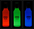
I dont believe i did ANY color filtering, all the bottles are single shots lit up by an LCD set to a color.
Green is the sharpest channel, why? Because most camera's have twice as many green pixels and when the rest of the image data is interpolated to each pixel there was twice as much info. Now I have noticed with working with LED's red always seems to be perceived as brighter.
Interestingly enough Red had the most noise in this pic and blue seemed to come out softer. As far as B&W editing I have always been interested in the little things when messing with color channels and filters.
Message edited by author 2011-01-26 02:07:50.
|
|
|
|
01/26/2011 04:46:22 AM · #30 |
Originally posted by timfythetoo:
I am not in the threads much and I have been a slacker with my details on most of my shots lately, but if anyone is interested in details, how to or viewing the original on any of my entries I am happy to oblige. I came to DPC not having a clue about my camera or photography and have learned an amazing amount from the people here. I have nothing to hide and I am glad to give back when I can. |
Ditto here for me! |
|
|
|
01/26/2011 01:30:33 PM · #31 |
 smardaz smardaz
This shot is a few years old, but I do like the overall tone that is in this image.  |
|
|
|
01/26/2011 05:39:06 PM · #32 |
Originally posted by gcoulson:
Originally posted by timfythetoo:
That is a RAW conversion with no tweaks. To be honest this is actually a bit more high key from camera than I normally do. Here is a link to a thread I did on my recent ribbon winner. Between tweaks in RAW conversion and some minor curves in PS I get my whites right and then I tend to do most of the rest of the work with dodge and burn. I personally prefer my high key images with minimal but strong blacks and smooth shadows. I have no issues with skin getting blown out and unseeable as in the pic of Aidan. I think it just adds to the impact. I have been using a wacom tablet for years now and I love the control that the pen gives me when editing. It was always a frustration with a mouse - but the pen lets me edit as though I was drawing or painting. And with images like these it is wonderful. |
Tim, I'm a big fan of Black&White photos, and the High-Key look in general. That picture of Aiden is beautiful! A question regarding PP technique: why do you desaturate the blue channel before converting to B&W? Why that channel in particular? And wouldn't the conversion to B&W desaturare the blue automatically? |
I actually tweak the luminosity on the blue channel to mellow out the gradient before b&w conversion. Like general was saying the blue channel is often the noisiest and tweaking the luminosity on the blue and cyan channels tends to give me a more pleasing result. |
|
|
|
01/26/2011 05:49:00 PM · #33 |
|
PP naïveté here..but do luminosity and saturation equate to the same thing? |
|
|
|
01/26/2011 05:57:01 PM · #34 |
Originally posted by gcoulson:
PP naïveté here..but do luminosity and saturation equate to the same thing? |
Nope. If I explain this wrong I am sure someone will help me out. But I believe luminosity speaks to the darkness of the channel. Bumping up the luminosity (and I do this in the raw conversion ) makes the blue channel lighter. It does desaturate it some as well but it deals more with the shading of it. |
|
|
|
01/26/2011 10:24:39 PM · #35 |
Originally posted by timfythetoo:
Originally posted by gcoulson:
PP naïveté here..but do luminosity and saturation equate to the same thing? |
Nope. If I explain this wrong I am sure someone will help me out. But I believe luminosity speaks to the darkness of the channel. Bumping up the luminosity (and I do this in the raw conversion ) makes the blue channel lighter. It does desaturate it some as well but it deals more with the shading of it. |
I would go with saying your explanation of luminosity is correct in applicable terms anyways. The blue channel isnt the only one affected and im not sure if maybe something is missing in your explanation but I can see plenty of situations where that channel would be more visibly affected. I can't explain it any better but I can differently.
Writing software as I do you run across certain things that put some unrelated things in you face. Pull the luminosity channel from a jpeg (Quick B&W thumbnail method) All you get is the "Shading" of the over all light and this is basically what luminosity operations affect. If you go negative with luminosity you end up with a dark image. If you change the saturuation negativley you end up with less or no color (basically to the end of what the luminosity data holds). Not sure how to explain saturation in the other direction but you end up with more vivid colors while losing contrast.
Message edited by author 2011-01-26 22:26:02.
|
|
Home -
Challenges -
Community -
League -
Photos -
Cameras -
Lenses -
Learn -
Help -
Terms of Use -
Privacy -
Top ^
DPChallenge, and website content and design, Copyright © 2001-2026 Challenging Technologies, LLC.
All digital photo copyrights belong to the photographers and may not be used without permission.
Current Server Time: 06/21/2026 08:47:10 AM EDT.


