| Author | Thread |
|
|
09/30/2010 08:34:46 PM · #1 |
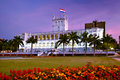
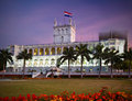
So I am still not good at processing images. I hear photographers often say that the midtones are to dark or something is too muddy or other things as such but I have a problem identifying these things on my images. This was shot in RAW and is already processed. Can someone evaluate this image and tell me what doesn't look right and what can be changed? Or show me how else you would process it?
Image
Thanks
Message edited by author 2010-09-30 20:50:20. |
|
|
|
09/30/2010 08:45:25 PM · #2 |
More "clarity" and "vibrance" in the RAW processing would go a long ways. Clarity, in particular, amps up the local area contrast and makes shadow textures more pronounced.
R. |
|
|
|
09/30/2010 08:47:01 PM · #3 |
Even though I think you want to emphasize the contrast of the band of light with the shadowed areas, those are too flat, lacking in contrast and color. I would lighten/heighten midtone contrast with Curves and High-Radius Unsharp Masking -- I'll post my edit in a while.
In the meantime, can you post a text ot thumnail link to the image here in the thread rather than the full-sized image? Images posted in the forums should be no wider than 500 pixels. Thanks. |
|
|
|
09/30/2010 09:05:19 PM · #4 |
The light isn't your biggest problem here. It's a boring picture. The building is in the exact center of the frame with equal amounts of grass and sky. It looks like a safe website or postcard picture for a hotel. It could even be a snapshot.
If it were me, I'd get right in front of the row of flowers in front of the steps and point up with a wide angle to emphasize the architecture and repeating patterns of the arches. You'd still have the flowers as a foreground piece and you'd be able to get the beautiful sky without needing to edit out that glass building in the background.
Don't worry too much about too dark midtones or muddy colors or whatever. Composition is far more important.
|
|
|
|
09/30/2010 09:28:44 PM · #5 |
 alohadave some good points, if the intent is to make a "fine art" print. However, the "faults" he points out can also make this suitable as a stock image -- the designer can make the compositional choice about where to crop, or can use the "empty" spaces for ad copy. alohadave some good points, if the intent is to make a "fine art" print. However, the "faults" he points out can also make this suitable as a stock image -- the designer can make the compositional choice about where to crop, or can use the "empty" spaces for ad copy.
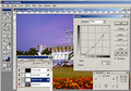
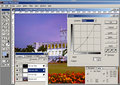
Anyway, here's my edit, with RGB and Blue Curves, plus some extra lightening of just the flag, then USM at 12%/48 dia/TH = 0 followed by USM at 88%/0.8 dia/TH = 5.
   |
|
|
|
09/30/2010 09:31:08 PM · #6 |
For a challenge the image may be a bit centered but for a scrap book for documenting a vaction, the composition is fine.
Here is my steps for Post Processing
1) Levels adjustment (Gamma set to 1.3)
2) USM Amount 250% and Radius 0.3
3) USM Amount 12% and Radius 50
4) Duplicate layer and change Blend Mode to Soft Light and Opacity to taste (85% for this image)
5) Merge all and resize
6) USM Amount 100% and Radius 1 or Amount 75% and Radius 0.75

Tim
Edit to correct: I wrote Threshold in my USM steps and it is supposed to be Amount - I use PSP X and I tried to use the correct Photoshop terms and missed badly.
Message edited by author 2010-09-30 22:39:27. |
|
|
|
09/30/2010 09:44:20 PM · #7 |
Originally posted by GeneralE:
alohadave some good points, if the intent is to make a "fine art" print. However, the "faults" he points out can also make this suitable as a stock image -- the designer can make the compositional choice about where to crop, or can use the "empty" spaces for ad copy. |
That is a fair point. I suppose that the intended usage is good to know.
|
|
|
|
09/30/2010 09:57:11 PM · #8 |
Originally posted by alohadave:
The light isn't your biggest problem here. It's a boring picture. The building is in the exact center of the frame with equal amounts of grass and sky. It looks like a safe website or postcard picture for a hotel. It could even be a snapshot.
If it were me, I'd get right in front of the row of flowers in front of the steps and point up with a wide angle to emphasize the architecture and repeating patterns of the arches. You'd still have the flowers as a foreground piece and you'd be able to get the beautiful sky without needing to edit out that glass building in the background.
Don't worry too much about too dark midtones or muddy colors or whatever. Composition is far more important. |
Points well taken and I would have definitely framed that differently if I could but that's not what I asked for.
What you don't know is that the military was walking around the building and there were signs "no trespassing"
I don't want to edit out the glass building. The image is to remind me of a place I visited.
Message edited by author 2010-09-30 22:06:29. |
|
|
|
09/30/2010 10:07:54 PM · #9 |
Thank you so much GeneralE. Love the edit. Now this is new to me, blue curves, what's that?
Also, how come the image got so much lighter with the curves you applied. When I apply your curves the image gets darker, what gives?
Message edited by author 2010-09-30 22:40:35. |
|
|
|
09/30/2010 10:09:24 PM · #10 |
Originally posted by atupdate:
For a challenge the image may be a bit centered but for a scrap book for documenting a vaction, the composition is fine.
Here is my steps for Post Processing
1) Levels adjustment (Gamma set to 1.3)
2) USM Threshold 250 and Radius 0.3
3) USM Threshold 12 and Radius 50
4) Duplicate layer and change Blend Mode to Soft Light and Opacity to taste (85% for this image)
5) Merge all and resize
6) USM Threshold 100 and Radius 1 or Threshold 75 and Radius 0.75
Tim |
Thank you very much. Your edit is very similar to GeneralE's. Very nice. Thanks for that. |
|
|
|
09/30/2010 10:18:16 PM · #11 |
| Additional question. How will all these edits affect printing the image? I am always afraid to over-process thinking that I am degrading the quality and that it won't reproduce well on paper. For example on GeneralE's edit it looks like the whites are blown out. |
|
|
|
09/30/2010 10:21:54 PM · #12 |

duplicate background, change blend to soft light 65%.
curves 177,155 & 56,73
select flowers
curves 211,149 & 73,55
select sky
curves 56,73 & 164, 163
Did some sharpening, but I oversharpened it -- so ignore that part.
|
|
|
|
09/30/2010 10:34:29 PM · #13 |
Posting values used in edits on a jpeg are not really that helpful as they would be different when working on the RAW file.
Basically, the photo has a bad color cast which creates a lot of the muddy look. By adjusting the white balance to where your whites look white etc. you will have less to do with the other sliders.
I like vibrant saturated colors so I boosted clarity, bumped up vibrancy and then also gave a little extra boost to the reds for the flowers. I also cropped it in a little to even out the height of the foreground flowers and bring the building closer. I adjust the exposure and recovery a little to place as much emphasis as I could on the lit up arches of the building.
Working on the RAW would yield better results obviously and I didn't spend a long time on it, but I like the result. I also DON'T think it's a boring shot. I like it very much.
Dave
 |
|
|
|
09/30/2010 10:37:04 PM · #14 |
Originally posted by maggieddd:
Additional question. How will all these edits affect printing the image? I am always afraid to over-process thinking that I am degrading the quality and that it won't reproduce well on paper. For example on GeneralE's edit it looks like the whites are blown out. |
The steps will look even better on a full size file and should print nicely. For my steps, you might need to use a different USM setting on the final step, as those two options are the ones I use after downsizing for the web.
The double USM treatment I wrote above is used quite often by  Benjikan and is described here in his blog (Benjikan's Blog). Please note: I used the wrong USM term (Threshold) in my first post and it is now changed. Benjikan and is described here in his blog (Benjikan's Blog). Please note: I used the wrong USM term (Threshold) in my first post and it is now changed.
Tim
ETA: Changing the blend mode of the duplicate layer is not legal in Basic editing for any newbie wanting to use Benjikan's method.
Message edited by author 2010-09-30 22:46:18. |
|
|
|
09/30/2010 10:57:17 PM · #15 |
Originally posted by vawendy:
duplicate background, change blend to soft light 65%.
curves 177,155 & 56,73
select flowers
curves 211,149 & 73,55
select sky
curves 56,73 & 164, 163
Did some sharpening, but I oversharpened it -- so ignore that part. |
Thanks Wendy. Here is a silly question, how did you select the flowers? Which tool did you use? I suck at selections. |
|
|
|
09/30/2010 10:59:29 PM · #16 |
1 sentence: Separation between the subject and the background.
|
|
|
|
09/30/2010 11:08:15 PM · #17 |
Originally posted by DCNUTTER:
Posting values used in edits on a jpeg are not really that helpful as they would be different when working on the RAW file.
Basically, the photo has a bad color cast which creates a lot of the muddy look. By adjusting the white balance to where your whites look white etc. you will have less to do with the other sliders.
I like vibrant saturated colors so I boosted clarity, bumped up vibrancy and then also gave a little extra boost to the reds for the flowers. I also cropped it in a little to even out the height of the foreground flowers and bring the building closer. I adjust the exposure and recovery a little to place as much emphasis as I could on the lit up arches of the building.
Working on the RAW would yield better results obviously and I didn't spend a long time on it, but I like the result. I also DON'T think it's a boring shot. I like it very much.
Dave
|
Dave,
Thanks a lot for your edit. I like saturated colors as well, but just a tiny bit less than you. I agree about the white balance. I always have a hard time with white balance when it comes to sunrise and sunset as I feel that if I adjust the whites to be white I lose the color of the sunset and the whites usually are not white at that time of the day. But yes, I agree it looks much better with the white balance adjusted. |
|
|
|
09/30/2010 11:09:37 PM · #18 |
Originally posted by ApertureJack:
1 sentence: Separation between the subject and the background. |
yes, I can see that now. Thanks |
|
|
|
09/30/2010 11:11:51 PM · #19 |
is there a website or a book that I can read about this? Something that would visually point out to me things that are wrong with images as far as processing goes?
Message edited by author 2010-09-30 23:14:06. |
|
|
|
10/01/2010 12:49:41 AM · #20 |
Originally posted by maggieddd:
Thank you so much GeneralE. Love the edit. Now this is new to me, blue curves, what's that?
Also, how come the image got so much lighter with the curves you applied. When I apply your curves the image gets darker, what gives? |
The Blue Curve is just a Curve adjustment applied to the Blue Channel only -- you select the Channel from the drop-down list at the top. I basically used it to add Yellow into the greens (grass) and make it a brighter green -- Yellow is the "opposite" of Blue on the graph.
If you look at the graphs you can see the gray scales along the axes -- I have mine set so that white (0% or 255 in 8-bit value) is at the lower left, with black (100% or zero in computerese) is at the upper-right; Photoshop's default is the opposite. Click the double-arrow on the bottom gray scale to switch orientations.
To me, the way I have it is more intuitive, dragging the graph down to lower the value/lighten the image. If you are used to the other way, just invert my curve graphs. Note you can also enter values into the boxes below the graph; these become like the "control points" you draw with the mouse, and let you replicate a curve exactly; they should work whichever way you have the graph oriented.
For the ones I used, enter these values (input=output):
RGB Curve: 14=0; 42=24; 77=65; 100=100
Blue Curve: 0=0; 53=51; 80=100 |
|
|
|
10/01/2010 01:34:48 AM · #21 |
To me the flowers were so overwhelming. The building at the rear was distracting. The crop needed some tuning and some color correction. and a bit of rotation and lens correction.
Message edited by author 2010-10-01 01:36:00. |
|
|
|
10/01/2010 05:50:55 AM · #22 |
RE: What is this image lacking?
Quite a few things obviously...
 |
|
|
|
10/01/2010 06:09:04 AM · #23 |
Originally posted by Art Roflmao:
RE: What is this image lacking?
Quite a few things obviously...
|
yeah that's more like it it would get my vote. |
|
|
|
10/01/2010 06:41:41 AM · #24 |
Originally posted by Art Roflmao:
RE: What is this image lacking?
Quite a few things obviously...
|
I knew that was coming, hahahaha
I wish you would teach me to do such a seamless photoshop job. Can I sign up for some tutorials with Art Roflmao?
Message edited by author 2010-10-01 06:43:39. |
|
|
|
10/01/2010 06:42:41 AM · #25 |
Originally posted by Art Roflmao:
RE: What is this image lacking?
Quite a few things obviously...
|
Nah, I miss some tail action. |
|
Home -
Challenges -
Community -
League -
Photos -
Cameras -
Lenses -
Learn -
Help -
Terms of Use -
Privacy -
Top ^
DPChallenge, and website content and design, Copyright © 2001-2026 Challenging Technologies, LLC.
All digital photo copyrights belong to the photographers and may not be used without permission.
Current Server Time: 04/29/2026 06:03:46 AM EDT.


