| Author | Thread |
|
|
10/01/2010 06:46:08 AM · #26 |
Originally posted by HighNooner:
To me the flowers were so overwhelming. The building at the rear was distracting. The crop needed some tuning and some color correction. and a bit of rotation and lens correction. |
Thank you for your edit |
|
|
|
10/01/2010 07:04:46 AM · #27 |
Originally posted by GeneralE:
Originally posted by maggieddd:
Thank you so much GeneralE. Love the edit. Now this is new to me, blue curves, what's that?
Also, how come the image got so much lighter with the curves you applied. When I apply your curves the image gets darker, what gives? |
The Blue Curve is just a Curve adjustment applied to the Blue Channel only -- you select the Channel from the drop-down list at the top. I basically used it to add Yellow into the greens (grass) and make it a brighter green -- Yellow is the "opposite" of Blue on the graph.
If you look at the graphs you can see the gray scales along the axes -- I have mine set so that white (0% or 255 in 8-bit value) is at the lower left, with black (100% or zero in computerese) is at the upper-right; Photoshop's default is the opposite. Click the double-arrow on the bottom gray scale to switch orientations.
To me, the way I have it is more intuitive, dragging the graph down to lower the value/lighten the image. If you are used to the other way, just invert my curve graphs. Note you can also enter values into the boxes below the graph; these become like the "control points" you draw with the mouse, and let you replicate a curve exactly; they should work whichever way you have the graph oriented.
For the ones I used, enter these values (input=output):
RGB Curve: 14=0; 42=24; 77=65; 100=100
Blue Curve: 0=0; 53=51; 80=100 |
GOT IT!
Thanks |
|
|
|
10/01/2010 07:27:37 AM · #28 |
for selecting the flowers, I just used the magic wand tool -- it actually selected them very well. (There was some cleanup that I should have done, but it's a pretty straight forward selection on this one.)
|
|
|
|
10/01/2010 07:28:34 AM · #29 |
Originally posted by vawendy:
for selecting the flowers, I just used the magic wand tool -- it actually selected them very well. (There was some cleanup that I should have done, but it's a pretty straight forward selection on this one.) |
Thanks vawendy! |
|
|
|
10/01/2010 07:29:03 AM · #30 |
Originally posted by maggieddd:
Originally posted by Art Roflmao:
RE: What is this image lacking?
Quite a few things obviously...
 |
I knew that was coming, hahahaha
I wish you would teach me to do such a seamless photoshop job. Can I sign up for some tutorials with Art Roflmao? |
I think Ken needs to hold a class. He'd probably make a fortune! I'd pay to go...
|
|
|
|
10/01/2010 08:15:17 AM · #31 |
Originally posted by maggieddd:
is there a website or a book that I can read about this? Something that would visually point out to me things that are wrong with images as far as processing goes? |
Here is a very good website for learning post processing.
Ron Bigelow
Tim |
|
|
|
10/01/2010 08:16:40 AM · #32 |
Originally posted by maggieddd:
Originally posted by Art Roflmao:
RE: What is this image lacking?
Quite a few things obviously...
|
I knew that was coming, hahahaha
I wish you would teach me to do such a seamless photoshop job. Can I sign up for some tutorials with Art Roflmao? |
I swear i love when people post these "help me fix this image" threads, just waiting for this to show up. |
|
|
|
10/01/2010 11:09:52 AM · #33 |
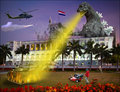
There's some overall Topaz (naturally); that's where the local-area contrast on the building comes from. There's selection for grass-and-flowers and blue channel adjustment like Paul's, plus some selection of flowers only and Topaz Detail to adjust the tonalities. There's selection of sky and a gradient run from top on a multiply layer. There's a foreground gradient, very faint. Used skew adjustment to square geometry up, used scale adjustment to remove a squatness that crept in with skew. That's what I remember right now.
R. |
|
|
|
10/01/2010 11:15:41 AM · #34 |
Originally posted by Bear_Music:
There's some overall Topaz (naturally); that's where the local-area contrast on the building comes from. There's selection for grass-and-flowers and blue channel adjustment like Paul's, plus some selection of flowers only and Topaz Detail to adjust the tonalities. There's selection of sky and a gradient run from top on a multiply layer. There's a foreground gradient, very faint. Used skew adjustment to square geometry up, used scale adjustment to remove a squatness that crept in with skew. That's what I remember right now.
R. |
Thanks Bear
I am looking at all the edits on a crappy non-calibrated monitor at work and I can't believe how different the images look. |
|
|
|
10/01/2010 11:56:27 AM · #35 |
Originally posted by atupdate:
Originally posted by maggieddd:
is there a website or a book that I can read about this? Something that would visually point out to me things that are wrong with images as far as processing goes? |
Here is a very good website for learning post processing.
Ron Bigelow
Tim |
Thanks, I will check it out |
|
|
|
10/01/2010 11:56:49 AM · #36 |
Originally posted by vawendy:
Originally posted by maggieddd:
Originally posted by Art Roflmao:
RE: What is this image lacking?
Quite a few things obviously...
|
I knew that was coming, hahahaha
I wish you would teach me to do such a seamless photoshop job. Can I sign up for some tutorials with Art Roflmao? |
I think Ken needs to hold a class. He'd probably make a fortune! I'd pay to go... |
KEN, I WANT TO GO TO YOUR CLASS |
|
|
|
10/01/2010 12:09:06 PM · #37 |
|
An observation DCNUTTER was the first to make, I would crop the tiniest bit closer to lose the sliver of extraneous buildings on both the left hand and right hand edges... if you keep aspect ratio this should also take a thin but acceptable slice off the bottom and top. It will give the subject building a tiny bit more "presence". |
|
|
|
10/01/2010 12:11:18 PM · #38 |
Originally posted by lawrysimm:
An observation DCNUTTER was the first to make, I would crop the tiniest bit closer to lose the sliver of extraneous buildings on both the left hand and right hand edges... if you keep aspect ratio this should also take a thin but acceptable slice off the bottom and top. It will give the subject building a tiny bit more "presence". |
yes, but I was concerned with processing not composition. |
|
|
|
10/01/2010 12:41:50 PM · #39 |
Originally posted by maggieddd:
Originally posted by atupdate:
Originally posted by maggieddd:
is there a website or a book that I can read about this? Something that would visually point out to me things that are wrong with images as far as processing goes? |
Here is a very good website for learning post processing.
Ron Bigelow
Tim |
Thanks, I will check it out |
Crap... I jut spent $30.00 on a book when I could have gotten most all or better information from the above website!!! Crap!!! |
|
|
|
10/01/2010 01:35:16 PM · #40 |
No fancy CS version of photoshop for me, so no curves. Basic Photoshop adjustments...
First I did the crop I mentioned above. Then, working on the jpg I felt there were a lot of artifacts in the sky so I ran a Topaz denoise on it. Then a slight levels adjustment bringing in the two ends of the histogram a tiny amount. For this I just ran an auto sharpen - tried USM and high pass sharpening, didn't come up with anything I liked (only had a few minutes to mess about really).
Then stuck on a brightness adjustment layer on as it looked pretty dark on my monitor, did +30 brightness and +6 contrast.
I didn't do any messing with the colours or any selective edits on this.. but I guess this would be my starting point.

Thing is, all this sort of stuff is subjective. Some people like more saturation, some like more sharpness. At the end of the day, you choose what feels right for you. My personal feeling is that at the very least, it lacks a bit of sharpening. Of course, sharpening for web and sharpening for print are 2 different ball games.
Oh and clearly I cannot compete with Art's edit.
Message edited by author 2010-10-01 13:39:54. |
|
|
|
10/01/2010 02:02:22 PM · #41 |
Originally posted by lawrysimm:
No fancy CS version of photoshop for me, so no curves. Basic Photoshop adjustments... |
RGB curves are available in all versions of Photoshop, I believe...
R. |
|
|
|
10/01/2010 02:31:41 PM · #42 |
Originally posted by lawrysimm:
No fancy CS version of photoshop for me, so no curves. Basic Photoshop adjustments...
First I did the crop I mentioned above. Then, working on the jpg I felt there were a lot of artifacts in the sky so I ran a Topaz denoise on it. Then a slight levels adjustment bringing in the two ends of the histogram a tiny amount. For this I just ran an auto sharpen - tried USM and high pass sharpening, didn't come up with anything I liked (only had a few minutes to mess about really).
Then stuck on a brightness adjustment layer on as it looked pretty dark on my monitor, did +30 brightness and +6 contrast.
I didn't do any messing with the colours or any selective edits on this.. but I guess this would be my starting point.
Thing is, all this sort of stuff is subjective. Some people like more saturation, some like more sharpness. At the end of the day, you choose what feels right for you. My personal feeling is that at the very least, it lacks a bit of sharpening. Of course, sharpening for web and sharpening for print are 2 different ball games.
Oh and clearly I cannot compete with Art's edit. |
This image was not sharpened at all simply because I don't sharpen my images until I know what I am going to do with them.
THanks |
|
|
|
10/01/2010 02:54:13 PM · #43 |
Originally posted by Bear_Music:
Originally posted by lawrysimm:
No fancy CS version of photoshop for me, so no curves. Basic Photoshop adjustments... |
RGB curves are available in all versions of Photoshop, I believe...
R. |
Yes, Curves adjustments (composite or by channel) should be in all versions back to 2.0 -- my edits were done in PS 5.0 (1998) ... Photoshop Elements lacks curves, at least without a third-party hack plug-in, one of the only good reasons for most photographers to upgrade to the full program. |
|
|
|
10/01/2010 04:00:04 PM · #44 |
Yes, sorry I ommitted the word "Elements" for that is what I use... although the new version 9 has things like layer masks coming and a few other CS features so could be a big improvement
Message edited by author 2010-10-01 18:20:43. |
|
Home -
Challenges -
Community -
League -
Photos -
Cameras -
Lenses -
Learn -
Help -
Terms of Use -
Privacy -
Top ^
DPChallenge, and website content and design, Copyright © 2001-2026 Challenging Technologies, LLC.
All digital photo copyrights belong to the photographers and may not be used without permission.
Current Server Time: 07/18/2026 01:13:17 AM EDT.


