| Author | Thread |
|
|
04/08/2015 12:04:32 AM · #1 |
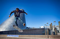
I'm usually pretty good at predicting my score and I had this shot pegged for about 6.1 to 6.2 Would welcome and comments as to what kept it from reaching that.
 |
|
|
|
04/08/2015 12:07:21 AM · #2 |
| I gave it a 6. Excellent focus, stop action, color, clarity. The merge of subject and background kept me from going higher. |
|
|
|
04/08/2015 12:11:42 AM · #3 |
| I gave it a five too much clutter in the way to the right, I prefer a more minimal approach, plus instantly put the word rebel in a title and I take a point off lol, don't like rebels! |
|
|
|
04/08/2015 12:15:26 AM · #4 |
Originally posted by Neat:
I gave it a five too much clutter in the way to the right, I prefer a more minimal approach, plus instantly put the word rebel in a title and I take a point off lol, don't like rebels! |
if you had a rebel you'd probably have twice as many ribbons as you do now |
|
|
|
04/08/2015 12:15:31 AM · #5 |
What's interesting to look at is all layered together lust to the left of center, so the image becomes more static than the subject wants to be. As Neat pointed out, the clutter on the right isn't helping at all. It's a pity he couldn't have been hung up mostly in the empty sky to the right of that amazing structure.
Exposure and processing are excellent. It just comes up a tad bit shy of a really excellent (and witty) skating shot. |
|
|
|
04/08/2015 12:17:32 AM · #6 |
good point on the comp thoughts, i don't take the lights as clutter but i do see the point you make with him being in bare sky next to it
By the way, here is a music video of that days shots
https://youtu.be/IxyKI-YX5EU
Message edited by author 2015-04-08 00:22:03. |
|
|
|
04/08/2015 12:28:18 AM · #7 |
I gave it a 6.. I really, liked this shot and love your action shots like this. The main background rocked and I liked what was behind the skater, the action part was no different, that rocked.
Two things stuck out as a distraction. 1. Like others said the tube thinggies coming out of the ground, and then the tip of that building looks like it is coming out of his shoulders. I wondered if that would have been cloned out or something if that would have made a difference in the look of the image?
Otherwise, I love the rest of the background and nice image
Message edited by author 2015-04-08 00:39:08. |
|
|
|
04/08/2015 01:28:11 AM · #8 |
|
|
|
04/08/2015 02:52:15 AM · #9 |
Originally posted by smardaz:
Originally posted by Neat:
I gave it a five too much clutter in the way to the right, I prefer a more minimal approach, plus instantly put the word rebel in a title and I take a point off lol, don't like rebels! |
if you had a rebel you'd probably have twice as many ribbons as you do now |
Wow I just realised you don't have any ;-) |
|
|
|
04/08/2015 03:07:42 AM · #10 |
I agree with Anita about then clutter to the right and prefering a more minimal approach with images like this. Although it is quite inetersting clutter which i quite like the shape of.
Message edited by author 2015-04-08 03:23:42. |
|
|
|
04/08/2015 03:21:26 AM · #11 |
not worth it.
Message edited by author 2015-04-08 03:21:48. |
|
|
|
04/08/2015 03:40:16 AM · #12 |
Originally posted by Neat:
Originally posted by smardaz:
Originally posted by Neat:
I gave it a five too much clutter in the way to the right, I prefer a more minimal approach, plus instantly put the word rebel in a title and I take a point off lol, don't like rebels! |
if you had a rebel you'd probably have twice as many ribbons as you do now |
Wow I just realised you don't have any ;-) |
Classy. |
|
|
|
04/08/2015 04:17:59 AM · #13 |
Originally posted by spiritualspatula:
Originally posted by Neat:
Originally posted by smardaz:
Originally posted by Neat:
I gave it a five too much clutter in the way to the right, I prefer a more minimal approach, plus instantly put the word rebel in a title and I take a point off lol, don't like rebels! |
if you had a rebel you'd probably have twice as many ribbons as you do now |
Wow I just realised you don't have any ;-) |
Classy. |
Ha |
|
|
|
04/08/2015 07:06:59 AM · #14 |
Sometimes less is more, maybe from a lower perspective with just that funky structure in the background would have been better.
I thought your shot was pretty cool but not great I gave it a 6. It kind of looked like you saw a no skateboarding sign and said "Hey go do a trick near that". |
|
|
|
04/08/2015 07:07:42 AM · #15 |
Originally posted by Tiny:
Originally posted by spiritualspatula:
Originally posted by Neat:
Originally posted by smardaz:
Originally posted by Neat:
I gave it a five too much clutter in the way to the right, I prefer a more minimal approach, plus instantly put the word rebel in a title and I take a point off lol, don't like rebels! |
if you had a rebel you'd probably have twice as many ribbons as you do now |
Wow I just realised you don't have any ;-) |
Classy. |
Ha |
Heartless |
|
|
|
04/08/2015 07:09:40 AM · #16 |
| maybe you should have cloned them out. |
|
|
|
04/08/2015 09:56:13 AM · #17 |
Originally posted by spiritualspatula:
Originally posted by Neat:
Originally posted by smardaz:
Originally posted by Neat:
I gave it a five too much clutter in the way to the right, I prefer a more minimal approach, plus instantly put the word rebel in a title and I take a point off lol, don't like rebels! |
if you had a rebel you'd probably have twice as many ribbons as you do now |
Wow I just realised you don't have any ;-) |
Classy. |
I guess you have to put a smiley face or "lol" after every joke, I just figure people know me by now or that with the amount of ribbons she has it would be really clear I was just being sarcastic. Oh just realized she put a smiley face.....it's all good. lol
Message edited by author 2015-04-08 09:57:32. |
|
|
|
04/08/2015 10:14:31 AM · #18 |
Originally posted by smardaz:
I'm usually pretty good at predicting my score and I had this shot pegged for about 6.1 to 6.2 Would welcome and comments as to what kept it from reaching that.
|
IMNSHO if this would have been in and met a themed challenge, it would definitely been a 6.+.
Free Studies seem to be voted more harshly. In a birds challenge, that owl would have walked past a 7.5 in my opinion.
ETA: I liked your image and would have given it 6 or 7.
Message edited by author 2015-04-08 10:15:13.
|
|
|
|
04/08/2015 10:42:47 AM · #19 |
My take is that all the elements of a really good photo are all there - and they're all in the wrong places. You've got that cool structure behind him, and a huge spot to the right of it. I don't know if I like or hate the sign, but it feels very cluttered on the left side with the sign immediately below both the structure and the subject. You've also got lines going in a LOT of directions and none of them either anchor or lead the image.
This is a 5 for me in a Free Study, which means you took a decent picture that doesn't give me much more than that. If there was a theme that tied in the sign then I might have given you one more.
Without reshooting and recomposing, which I'm guessing you could have done since it's your nephew, I would have done some perspective correction to anchor the image in the frame a little better. Something like this...

I used Free Transform in Photoshop to pull the bottom left corner down and bottom right down to give you a straight line across the bottom, and upper right up and right to straighten the pylons in the background.
Message edited by author 2015-04-08 10:45:55. |
|
|
|
04/08/2015 10:55:13 AM · #20 |
I gave it a 1 because of the aroma.
[lol wink smiley face here] |
|
|
|
04/08/2015 11:03:41 AM · #21 |

emphasis needed on FLIGHT and isolation of main subject would improve it. Not enough emphasis on said skater guy.
Note: this was a VERY quick edit to illustrate point. |
|
|
|
04/08/2015 11:12:28 AM · #22 |
Originally posted by bohemka:
I gave it a 1 because of the aroma.
[lol wink smiley face here] |
You gotta be a local to get that joke. Although for those who haven't been to Tacoma for years, the "aroma" left in the late 80's / early 90's |
|
|
|
04/08/2015 11:15:10 AM · #23 |
| Great stuff Jake and Tate! This is one of the few redeeming qualities left about this site....The pure, unflinching criticism you need to grow as a photographer. Thanks to everyone so far. Even Anita ;) |
|
|
|
04/08/2015 10:01:02 PM · #24 |
I found it was just too much competition for your subject. The building and the lights (I think) were just distractions. The leading foot looks a little blurry as well.
I am thinking that a shot from near the ground directly in front of the sign with the model outlined in the sky alone would have been awesome. Then again, considering my lack of ribbons, I probably shouldn't be giving advice ;-) |
|
|
|
04/08/2015 11:36:33 PM · #25 |
smells like teen spirit?
The tones seemed to be overwhelmingly blue without enough contrasting hues. But I felt that was unfair to hold against a good capture of action that even included humor. So I deliberately skipped it in voting. |
|
Home -
Challenges -
Community -
League -
Photos -
Cameras -
Lenses -
Learn -
Help -
Terms of Use -
Privacy -
Top ^
DPChallenge, and website content and design, Copyright © 2001-2026 Challenging Technologies, LLC.
All digital photo copyrights belong to the photographers and may not be used without permission.
Current Server Time: 01/15/2026 12:59:15 PM EST.


