| Author | Thread |
|
|
08/27/2014 08:19:44 AM · #1 |
For a while, this has been on my mind and certainly came to the fore again this recent challenge. We routinely have color challenges (Red, Green, Blue...Purple etc) with the goal to highlight that particular color as seen in everyday life.
Now folks can do this in one of two ways. They can actually photograph something that is naturally of that color, OR they can simply photograph anything they'd like regardless of color and then just photoshop in the correct color during processing.
Now, they're BOTH viable techniques as allowed by the rules, and you always see both types in every challenge... but is there a *spirit* to the rules or Challenge that in its purity is looking for the first form (ie. Natural, not processed)? Or is it just about achieving the desired end by whatever means possible?
Interested to hear the group collective thought on this one. |
|
|
|
08/27/2014 08:39:40 AM · #2 |
I think I've already expressed my opinion on that in the Outtake thread.
I don't mind enhancing colors a bit, but for me the spirit of the challenge has everything to do with capturing the color, not adding it artificially. As soon as I saw the 1st and 3rd place winner photos while voting I said to myself, "Bloody hell - all I needed was a great photo to tint. Guaranteed these win something." I even commented on the winner's photo that I'd wished I could believe the tint was real and not added, because you just don't get that consistent tint in nature, particularly on the week of the purple challenge, and if you do then you'd better buy a lottery ticket. But at least that one's slightly believable. 3rd place, while an amazing photo, just torques me - not that they did it, but that people here actually rank it that high in a color challenge. But I've given up trying to understand the voters here.
Now, I placed 5th, so it's going to sound like sour grapes. Honestly, I'm surprised (and grateful) mine placed that high. The rules here are a wonky thing, and while I understand how my selectively toning blocks like this...

...for a Mondrian challenge is a violation of the "creating a new image area" rule, I don't understand why it wouldn't be allowed but the selectively retinting of an entire image, or section of it, is allowable in a challenge like this. Because neither are truly within the spirit of the challenge. (And please, before you quote rules to me, I DO get why it's allowed - I just don't think it should be. Add a yellow flag to these challenges!!)
But like the voters, I've stopped trying to understand the committee as well.
So, yeah, I get why it's allowed, and I get why people do it. I don't get why voters stand for it (any artificial purples immediately got a 5 from me and could only go down from there - though I admit to giving the winner a 6 because it IS a lovely image).
Message edited by author 2014-08-27 08:41:32. |
|
|
|
08/27/2014 08:44:14 AM · #3 |
| sometimes this place gets taken way too seriously. |
|
|
|
08/27/2014 08:58:52 AM · #4 |
Originally posted by Mike:
sometimes this place gets taken way too seriously. |
ya, it's not like we "win any prize money or anything else"...oh, maybe a hat here or there???
On the subject. When a color challenge is chosen I seek out something that is of that "color". I will admit that with the purple challenge I found it exceptionally hard to capture the "purple" in my flower...I tried all kinds of settings to get what my eye was seeing. That being said I found that in this particular challenge to bring back the colors that I was seeing I had to play with it more than usual. I'm going to guess that it's because purple is a harder color to achieve in camera than say orange. Now Orange I can do....no alterations to the color at all but purple was much, much harder.
ETA: I have often seen and captured a purple haze on mountains like Margret did. Especially in the Carolina's and out West.
Message edited by author 2014-08-27 09:03:20. |
|
|
|
08/27/2014 09:28:22 AM · #5 |
Originally posted by Mike:
sometimes this place gets taken way too seriously. |
And sometimes not seriously enough - but I get your point. Know that I'm not angry about any of this. It's just often hard to strike a balance when part of these challenges are so bloody serious (nitpicky rule infractions and cutthroat comments and scores) while the rest often runs like the wild west. So when you bust your butt to stay within the spirit of a challenge only to see others work outside of it and get rewarded, it can be frustrating. I've personally shot and not used images for challenges that I don't think play to the spirit of it. That's my choice, certainly, but I think it's the proper thing to do. Do I expect others to do it? No. At least not as much as I did when I first got here. I wouldn't have said anything this time had Garry not asked.
And Ja-9, I know what you're saying about the purple haze, and as I said if it happened just that way just this week, go out and buy a lottery ticket, because someone is looking down on you with extreme kindness. |
|
|
|
08/27/2014 09:38:08 AM · #6 |
Personally I prefer natural color situations, but it really doesn't matter. This was the red ribbon winner in early 2003:
There's no harm in diversity.
Message edited by author 2014-08-27 09:38:18. |
|
|
|
08/27/2014 09:51:28 AM · #7 |
This is another topic similar to the conversation regarding the feather / marble image. Sometimes voters insert a shoehorn on their own.
I remember thinking when I saw this challenge topic: "it will be a landscape shoehorned to be purple".
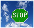
I like the clever take on the stop sign as referenced by  scalvert and IMHO I'm more a fan of the clever thinking than the shoehorned landscapes. But Voters will be voters. scalvert and IMHO I'm more a fan of the clever thinking than the shoehorned landscapes. But Voters will be voters. |
|
|
|
08/27/2014 09:52:44 AM · #8 |
*I am not questioning what the rules are, I am just noting that it seems a bit silly to have a rule that will not let you "blacken" or burn out a background to black, even when half the audience can't even tell there was anything there to begin with, coinciding with rules that allow changing the color of Stop sign to something alien.
It is similar to using an "hdr filter" instead of true hdr multiple exposures, if you are ok with that - why not a bit of manipulation? We all see colors differently anyway, no? |
|
|
|
08/27/2014 10:21:15 AM · #9 |
Originally posted by backdoorhippie:
I think I've already expressed my opinion on that in the Outtake thread.
I don't mind enhancing colors a bit, but for me the spirit of the challenge has everything to do with capturing the color, not adding it artificially. As soon as I saw the 1st and 3rd place winner photos while voting I said to myself, "Bloody hell - all I needed was a great photo to tint. Guaranteed these win something." I even commented on the winner's photo that I'd wished I could believe the tint was real and not added, because you just don't get that consistent tint in nature, particularly on the week of the purple challenge, and if you do then you'd better buy a lottery ticket. But at least that one's slightly believable. 3rd place, while an amazing photo, just torques me - not that they did it, but that people here actually rank it that high in a color challenge. But I've given up trying to understand the voters here.
Now, I placed 5th, so it's going to sound like sour grapes. Honestly, I'm surprised (and grateful) mine placed that high. The rules here are a wonky thing, and while I understand how my selectively toning blocks like this...
...for a Mondrian challenge is a violation of the "creating a new image area" rule, I don't understand why it wouldn't be allowed but the selectively retinting of an entire image, or section of it, is allowable in a challenge like this. Because neither are truly within the spirit of the challenge. (And please, before you quote rules to me, I DO get why it's allowed - I just don't think it should be. Add a yellow flag to these challenges!!)
But like the voters, I've stopped trying to understand the committee as well.
So, yeah, I get why it's allowed, and I get why people do it. I don't get why voters stand for it (any artificial purples immediately got a 5 from me and could only go down from there - though I admit to giving the winner a 6 because it IS a lovely image). |
See that was the thing with me and why I did not submit to this challenge. I had no clue we could filter colors with photoshop or add a mask color over it...in otherwise I would have used my Yellowstone pictures for that! LOL! Too bad now, but I guess we were looking for natural colors lolol |
|
|
|
08/27/2014 10:24:01 AM · #10 |
With a little masking and a simple hue shift, anything is possible.

The red one was a DPC challenge entry of mine.
Tim
Message edited by author 2014-08-27 10:24:52. |
|
|
|
08/27/2014 10:39:22 AM · #11 |
Personally, I find it annoying that this happens with such monotonous predictability. But I "blame" the voters more than the shooters. If ribbons are your *reason* for entering every challenge (for many of us, they are not) then why WOULDN'T you do extreme color-shifting since it's so consistently rewarded? And of course, it's worth remembering that a LOT of images in a LOT of challenges are color-shifted to extremes, mine as much as anybody's really.
It's just that when the CHALLENGE is "shoot purple" or "shoot pink" or whatever, the radical color-shifting seems particularly egregious. But, to be fair, "flagging" it ("Your original subject must be purple, or your image will be DQ'd") is not an option either. Can you imagine the enforcement nightmare of determining what really IS purple? Where do you draw the line? Especially with RAW originals? And what about shooting JPG with custom WB to make things MORE purple? So the skyscape LOOKS purple in the JPG, and who's to say WHAT color that black sky actually was? Cuz every time I do a night shot I get this deep blue sky, but I'm danged if I SEE any blue when I shoot it...
And that, in a nutshell, is why you won't ever see a flag like this on a color challenge. It's up to the voters to keep us "real", if they choose to. |
|
|
|
08/27/2014 10:56:26 AM · #12 |
| I have to say that I'm with Jake on this one. When I see a color challenge, to me that means that we are to conceive/create an image whose subject is already primarily "purple". I could even accept a "creative" shift of a specific part of the image (as in the Stop sign below or one of Cory's bugs). Just not purple as the result of simply adding a color layer in post-processing. |
|
|
|
08/27/2014 11:34:51 AM · #13 |
Maybe we should consider changing "color" topic definitions to make it more of a 'challenge' - and make it more clear for voters and photographers?
|
|
|
|
08/27/2014 11:37:47 AM · #14 |
Originally posted by tate:
Maybe we should consider changing "color" topic definitions to make it more of a 'challenge' - and make it more clear for voters and photographers? |
The actual Challenge Description: "Your submission should show or suggest to the viewer the color purple." No question about it, this description leaves it wide open for color shifting work.
How about something more like: "Find something purple and photograph it!" ? |
|
|
|
08/27/2014 12:28:27 PM · #15 |
| Read my comments on the 3rd place image for insight into my position on the matter. |
|
|
|
08/27/2014 12:50:19 PM · #16 |
Originally posted by tate:
Maybe we should consider changing "color" topic definitions to make it more of a 'challenge' - and make it more clear for voters and photographers? |
Or make color challenges minimal. All we can do there is a straight conversion to grayscale, right? I've definitely been wondering lately why the color challenges aren't minimal. |
|
|
|
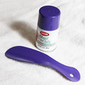
08/27/2014 01:19:53 PM · #17 |
I agree that the "spirit" of the challenge calls for shooting something already the designated color, but as one of about 10% of males with some form of color-blindness, most of the time I just can't tell if somemthing is purple or blue (or green or brown), until I analyze it in Photoshop or ask someone with "normal" vision.
My solution in this case was to find a box of gloves labelled "Purple Nitrile" ...
 |
|
|
|
08/27/2014 01:28:31 PM · #18 |
Originally posted by nam:
Or make color challenges minimal. All we can do there is a straight conversion to grayscale, right? I've definitely been wondering lately why the color challenges aren't minimal. |
That's actually a very good idea.
Originally posted by GeneralE:
My solution in this case was to find a box of gloves labelled "Purple Nitrile"... |
There's a chance I might have designed the package for your gloves. I developed quite a few for Kimberly-Clark (that's my photo, too). |
|
|
|
08/27/2014 01:29:58 PM · #19 |
Originally posted by Cory:
Read my comments on the 3rd place image for insight into my position on the matter. |
i.e. you're shocked that it ribboned and you thank the voters?
Message edited by author 2014-08-27 13:30:40. |
|
|
|
08/27/2014 01:31:38 PM · #20 |
Originally posted by scalvert:
Originally posted by nam:
Or make color challenges minimal. All we can do there is a straight conversion to grayscale, right? I've definitely been wondering lately why the color challenges aren't minimal. |
That's actually a very good idea. |
No Kidding! If ever a challenge was right for minimal, a color challenge would be :-) |
|
|
|
08/27/2014 01:35:04 PM · #21 |
Originally posted by Bear_Music:
Originally posted by Cory:
Read my comments on the 3rd place image for insight into my position on the matter. |
i.e. you're shocked that it ribboned and you thank the voters? |
The very KIND voters.
Bless their hearts.
--
For those who aren't so fast at picking things up, I don't think that shot should have ribboned.. Of course, this leaves me feeling a little guilty, for to criticize the voters for giving me an undeserved ribbon seems a bit like biting the hand that feeds me....
*shrug*
Message edited by author 2014-08-27 13:37:01. |
|
|
|
08/27/2014 01:52:43 PM · #22 |
I can't believe no one has mentioned Art's literal shoe-horn in this one 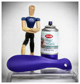 |
|
|
|
08/27/2014 01:53:38 PM · #23 |
Originally posted by tate:
I can't believe no one has mentioned Art's literal shoe-horn in this one |
Amazingly underrated, even if he did use blue spray paint instead of purple.
:D |
|
|
|
08/28/2014 04:23:52 PM · #24 |
Originally posted by scalvert:
Originally posted by GeneralE:
My solution in this case was to find a box of gloves labelled "Purple Nitrile"... |
There's a chance I might have designed the package for your gloves. I developed quite a few for Kimberly-Clark (that's my photo, too). |
Small world, eh ...  |
|
|
|
08/28/2014 04:47:44 PM · #25 |
Just skimmed this thread and saw this, which sums up my feelings on the subject:
Originally posted by Bear_Music:
I "blame" the voters more than the shooters. |
It's up to the voters and that's the way I like it. Personally, I hate the color challenges altogether and I have always spurned them with mockery and will continue to, but I won't do it with processing - too easy.
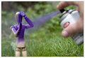 (same paint, btw) (same paint, btw) 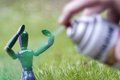 (Shot for "Green II" before I read the description that it was not an actual color challenge) (Shot for "Green II" before I read the description that it was not an actual color challenge)
Originally posted by Cory:
Amazingly underrated, even if he did use blue spray paint instead of purple. |
Oh, it's purple...
My processing made it look bluer than it should. |
|
Home -
Challenges -
Community -
League -
Photos -
Cameras -
Lenses -
Learn -
Help -
Terms of Use -
Privacy -
Top ^
DPChallenge, and website content and design, Copyright © 2001-2025 Challenging Technologies, LLC.
All digital photo copyrights belong to the photographers and may not be used without permission.
Current Server Time: 12/19/2025 02:46:40 PM EST.


