| Author | Thread |
|
|
03/21/2012 03:55:28 AM · #1 |
This was my entry in the All Alone II.
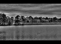
After comments and multiple edits through out the week of voting, I ended up with this version.
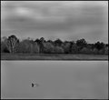
Which do you feel is more in-line with the challenge, coveys the challenge topic, and is the overall better photograph.?
Thanks for your input in advance as I learn as I go through your critiques and comments.
Scott
Message edited by author 2012-03-21 03:56:16.
|
|
|
|
03/21/2012 04:18:03 AM · #2 |
My two pennies worth: As far as challenge relevance, they are both equal - and equally unrelatable to me - I don't really feel any "Alone" emotions. Maybe cuz I'm not waterfowl. ;-) As far as processing, your entry is a bit overprocessed with a little excessive grain/noise and halos around the trees - this all distracts me from the already unrelatable lonely bird. The alternate is also bit overprocessed - the sky and water have been obliterated into a murky gray blur. I actually like the entry better. You need to find a happy medium in the processing, IMO.
Sorry if that was harsh. Take it with a grain of salt - what do I know anyway. :) |
|
|
|
03/21/2012 04:29:28 AM · #3 |
Originally posted by Art Roflmao:
My two pennies worth: As far as challenge relevance, they are both equal - and equally unrelatable to me - I don't really feel any "Alone" emotions. Maybe cuz I'm not waterfowl. ;-) As far as processing, your entry is a bit overprocessed with a little excessive grain/noise and halos around the trees - this all distracts me from the already unrelatable lonely bird. The alternate is also bit overprocessed - the sky and water have been obliterated into a murky gray blur. I actually like the entry better. You need to find a happy medium in the processing, IMO.
Sorry if that was harsh. Take it with a grain of salt - what do I know anyway. :) |
Thanks, very helpful
|
|
|
|
03/21/2012 04:43:20 AM · #4 |
I liked your entry Scott and prefer it to the alternative, though I found it a little soft, if it was sharper it may have done better. What was the processing behind this, what did you use?
|
|
|
|
03/21/2012 04:55:30 AM · #5 |
I was going to write a deep and meaningful critique. Then I read Ken's post, so now it is pretty much down to: "Ditto what Ken said".
It's a duck. The post processing does NOT blow me away. What more can I say?
Originally posted by Art Roflmao:
My two pennies worth: As far as challenge relevance, they are both equal - and equally unrelatable to me - I don't really feel any "Alone" emotions. Maybe cuz I'm not waterfowl. ;-) As far as processing, your entry is a bit overprocessed with a little excessive grain/noise and halos around the trees - this all distracts me from the already unrelatable lonely bird. The alternate is also bit overprocessed - the sky and water have been obliterated into a murky gray blur. I actually like the entry better. You need to find a happy medium in the processing, IMO.
Sorry if that was harsh. Take it with a grain of salt - what do I know anyway. :) |
|
|
|
|
03/21/2012 05:01:16 AM · #6 |
Originally posted by Sevlow:
I liked your entry Scott and prefer it to the alternative, though I found it a little soft, if it was sharper it may have done better. What was the processing behind this, what did you use? |
Off to the right (out of frame) were a group of ducks far away from this lonely mallard; he was swimming away from them. I liked the clouds which to me gave the photo a somber feel. The sycamore tree in the background (white) against the dark pines added contrast and lines. No person or fowl was in frame except this mallard. The grain was my fault or at least the heavy grain. I had to bump the ISO because the lens is not IS or USM and I tend to shake a lot. And always I forgot my tripod.
I like the longer version but feel the duck was overlooked and I understand that. I agree with ART, I have to find a medium. I'm learning the proper steps to start with so that the final result has the best possible out come. My dedication to black and white offers challenges, but I feel this is a way to learn along with input from fellow users.
Thanks
|
|
|
|
03/21/2012 05:07:14 AM · #7 |
Originally posted by Beetle:
I was going to write a deep and meaningful critique. Then I read Ken's post, so now it is pretty much down to: "Ditto what Ken said".
It's a duck. The post processing does NOT blow me away. What more can I say?
Originally posted by Art Roflmao:
My two pennies worth: As far as challenge relevance, they are both equal - and equally unrelatable to me - I don't really feel any "Alone" emotions. Maybe cuz I'm not waterfowl. ;-) As far as processing, your entry is a bit overprocessed with a little excessive grain/noise and halos around the trees - this all distracts me from the already unrelatable lonely bird. The alternate is also bit overprocessed - the sky and water have been obliterated into a murky gray blur. I actually like the entry better. You need to find a happy medium in the processing, IMO.
Sorry if that was harsh. Take it with a grain of salt - what do I know anyway. :) |
|
I agree! The subject has to be stronger and the processing has to fit the feel. I felt like I did not accomplish both.
I think the biggest lesson I learned during this challenge is, don't wait to the last minute, don't settle on a shot or two and hope one of them will fly, take time to meditate on what the challenge means to you. Then and only then go out and try to put what mentally/emotionally you see and feel in your artistic mind on the sensor. Take many shots of many things but stick with what you see and feel within.
Message edited by author 2012-03-21 05:09:56.
|
|
|
|
03/21/2012 07:47:03 AM · #8 |
I really think Art has it all covered that is exactly the way I feel about both shots.
I gave it 4 in the challnge which I would stick with today.
I often do what you are saying and rush at the last minute to get a shot onto a challenge which is a big mistake.
I have loads of images in my portfolio that I really hate.
But I hope that in a way it makes me get better.
Yer never know. |
|
|
|
03/21/2012 08:07:55 AM · #9 |
| +1 to Arts comment too. i prefer the first, the second is just way over smoothed. of course they are both way over processed. |
|
|
|
03/21/2012 09:09:11 AM · #10 |
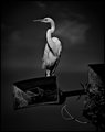
Flipping to another B&W image (sorry) taken yesterday. Would you consider this type of processing more photogenic, not under or over processed?
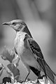
Thank everyone for your help, comments, critiques. Let me know how you feel, I need to learn by my mistakes.
Scott
|
|
|
|
03/21/2012 09:41:37 AM · #11 |
| I left a comment on your bird image. |
|
|
|
03/21/2012 09:46:54 AM · #12 |
Originally posted by SDW:
Flipping to another B&W image (sorry) taken yesterday. Would you consider this type of processing more photogenic, not under or over processed?
Thank everyone for your help, comments, critiques. Let me know how you feel, I need to learn by my mistakes.
Scott |
that is very nice, the processing inst overdone at all. |
|
|
|
03/21/2012 01:01:43 PM · #13 |
Originally posted by markwiley:
I left a comment on your bird image. |
Thanks for the comment.
You mentioned you don't have a problem with the blue tone. Something maybe be wrong with my monitor calibration but on my screen I see no blue tone. Just B&W with grey between.
Does anyone else see a blue tone to the image.
Thanks.
|
|
|
|
03/21/2012 01:59:30 PM · #14 |
Originally posted by SDW:
Does anyone else see a blue tone to the image. |
Yup. Every grey is either warmed by adding yellow or cooled by adding blue, a perfectly neutral grey is very rare and this one is certainly on the cool side. |
|
|
|
03/21/2012 02:18:09 PM · #15 |
Originally posted by BrennanOB:
Originally posted by SDW:
Does anyone else see a blue tone to the image. |
Yup. Every grey is either warmed by adding yellow or cooled by adding blue, a perfectly neutral grey is very rare and this one is certainly on the cool side. |
Thanks. When you say the above (in bold) do you mean by the sensor or during processing? I'm sorry I sound dumb to the fact but I'm learning something new.
|
|
|
|
03/21/2012 02:18:10 PM · #16 |
duplicated
Message edited by author 2012-03-21 14:23:39.
|
|
|
|
03/21/2012 02:26:27 PM · #17 |
| I think he means in post if you converted from a color shot. The cool/warm can be discerned with a practiced eye (of which I'm trying to develop myself). You can play around with your black and whites and cool or warm using a color tool that messes with temperature. |
|
|
|
03/21/2012 02:42:29 PM · #18 |
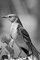
Maybe I'm doing something wrong, but here how I check my white balance.
1. I create an adjustment layer.
2. I go to Image > Adjustment > levels.
3. Using the eye dropper set at 5x5 pixels, I click on the black eye dropper and find what should be the closest to true black and click.
4. Using the eye dropper set at 5x5 pixels, I do the same with the white eye dropper.
Above is the same image. I copy/pasted from the forum into Photoshop and done the above. I see no change. I used the dark part of his beak for black and the very white leaf (bottom right) for white to set the white balance.
My histogram, under RGB all are the same # (i.e. R:73/G:73/B:73), but changes in value throughout the photo as I move my eye dropper. But R,G, and B are always the same value.
ETA:
Here is a screen print of the photo in PS-CS3 with the layer values. If you see anything I should be doing differently please let me know. Thanks.
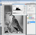
Message edited by author 2012-03-21 14:53:42.
|
|
|
|
03/21/2012 03:25:51 PM · #19 |
| There is nothing wrong with having a cold blueish grey, as long as that was what you wanted, IMHO it looks good. However if you wanted the balance neutral grey look at the PS image you posted, in info you have your CMYK numbers Cyan is a 31% while magenta and Yellow are at 25%, so given a 6% shift towards cyan, it will be a cool grey. move cyan down to 25% and it will be neutral. |
|
|
|
03/21/2012 03:33:55 PM · #20 |
Another way to shift a color cast that I use all the time is faking a lens filter.
Pick the area with the color cast you dont like with the color picker.
Make a new layer and flood fill that layer with the picked color.
Set the new layer to overlay and invert the color (Control I) and drop opacity to around 15%
you have created a filter that filters out that color cast. |
|
|
|
03/21/2012 03:56:44 PM · #21 |
Originally posted by BrennanOB:
There is nothing wrong with having a cold blueish grey, as long as that was what you wanted, IMHO it looks good. However if you wanted the balance neutral grey look at the PS image you posted, in info you have your CMYK numbers Cyan is a 31% while magenta and Yellow are at 25%, so given a 6% shift towards cyan, it will be a cool grey. move cyan down to 25% and it will be neutral. |
Originally posted by BrennanOB:
Another way to shift a color cast that I use all the time is faking a lens filter.
Pick the area with the color cast you dont like with the color picker.
Make a new layer and flood fill that layer with the picked color.
Set the new layer to overlay and invert the color (Control I) and drop opacity to around 15%
you have created a filter that filters out that color cast. |
Thank you so much for your input.
I was looking at a website a few minutes ago that offered several ways to accomplish good black and white images. Here is the link.
|
|
|
|
03/21/2012 04:09:08 PM · #22 |
Im a fan of the Brown technique though I skip the second curves in favor of a copy used in multiply mode and lowered opacity to punch up the blacks. You get a nice rich dark tone that way.
If you don;t know Russel Brown's stuff, he is one of the masters of all things Photoshop. Well worth a bit of study, and his tutorials are clear and on the point. |
|
|
|
03/21/2012 06:26:56 PM · #23 |
Originally posted by BrennanOB:
Im a fan of the Brown technique though I skip the second curves in favor of a copy used in multiply mode and lowered opacity to punch up the blacks. You get a nice rich dark tone that way.
If you don;t know Russel Brown's stuff, he is one of the masters of all things Photoshop. Well worth a bit of study, and his tutorials are clear and on the point. |
Thanks I will take a look at the link.
I thank everyone for you input, comments, and help. All of you have been helpful.
Scott
|
|
Home -
Challenges -
Community -
League -
Photos -
Cameras -
Lenses -
Learn -
Help -
Terms of Use -
Privacy -
Top ^
DPChallenge, and website content and design, Copyright © 2001-2026 Challenging Technologies, LLC.
All digital photo copyrights belong to the photographers and may not be used without permission.
Current Server Time: 04/30/2026 04:42:25 PM EDT.


