| Author | Thread |
|
|
02/23/2011 01:32:39 PM · #1 |
History – Average (participants) vs. Average (non participants)
Introduction:
Another issue that seems to create angst is that the average (participants) consistently runs lower than the overall average and the average (non-participants). Some have even theorized that the top images in a challenge are targeted with low votes by participants trying to improve their own score.
Comparing the averages:
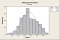
Average statistics for approximately 246000 images submitted between 2002 and 2010 were used for this analysis:
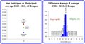
You can see in the first chart above that participants do in deed typically score approximately 0.1600 points lower than the overall average and the non participants score 0.1215 points above it. However, the second chart shows that the participants don't always score lower; in fact ~12% of the time the average (participants) value is actually higher than the overall average. The data also shows that difference between overall average and average (participants) is very rarely greater than or less than 0.4.
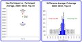
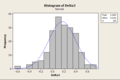
A factor for consideration is that participants usually make up a smaller percentage of the total number of voters in any challenge. The fact that the overall average is closer to the average (non-participants) is a good indicator that the number of non-participant voters is higher. The following chart demonstrates this effect:
The bars at the bottom of the chart show the number of votes from each category (P vs. NP). Note that the total remains at 150 but the percentage of participants votes drops as you move to the right. The top of the chart shows the average of the votes. The first sequence shows the overall average is equidistant from the average (participants) and average (non participants). As you move to the right you can see the average (participants) and average (non participants) remain constant but the overall average draws closer to the average (non participants). We've already discussed in other sections that as the number of votes drops in a population the average is more susceptible to impact from a single vote so the average (participants) may impacted more by extreme votes. Would you put more weight in an average of 25 votes or an average of 125 votes?
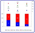
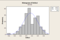
To test the theory that top images are especially targeted by unfair participants I took a look at the ~13000 images that have placed in the top ten:
Other than the fact that the averages are of course higher, the data doesn't look substantially different. Typically the average (participants) value is 0.1971 lower than the overall average and average (non-participants) is 0.1062 higher. As above the average (participants) is not always lower though, ~15% of the time it's higher. The distribution of the differences between average (participants) and average is also quite similar. The overall average is even closer to the average (non participants) with this data, possibly indicating that the non participants actually have greater impact on the top 10 than the rest of the images.
A few points to consider:
If we don't know the number of participants that make-up the average (participants) statistic we should be very careful in putting much weight into any theories based on that number. The farther the average (participants) is away from the overall average the more you should question how many participants voted before getting alarmed.
We don't have the correct data here to assign any causal relationships. There could be many reasons for the difference. The conspiracy theorists may think that participants can't vote fairly. However, it's just as plausible that some number of the typically larger non-participants population are not as discerning and more easily impressed with the quality of work at DPC.
Top images don't appear to be affected by this phenomenon any more than the rest of the finishing positions.
Link to Voting Stats site
|
|
|
|
02/23/2011 01:43:48 PM · #2 |
Very interesting.
Comparing both Participants and Non-Participants to the overall average, the differences aren't so impressive. However, if you directly compare the Participants average vs the Non-Participants average, then the difference is bigger...up to 0.3 points which is a nice swing in the overall average. Of course, this should happen equally across the board (theoretically), and no-one should be favored. This is thankfully shown in your last figure in which the top images don't appear to be affected any more than the rest of the finishing positions.
Does this mean there is no significant effect on the "strategic voters" who mark lower on other entries to make their's score better??
Message edited by author 2011-02-23 13:49:25. |
|
|
|
02/23/2011 02:14:23 PM · #3 |
Originally posted by gcoulson:
Does this mean there is no significant effect on the "strategic voters" who mark lower on other entries to make their score better?? |
I don't have the specific evidence to support it but I truly believe that strategic voting is a futile effort. A single vote has minimal affect on a final average. Even if you succeed in lowering other's averages you have absolutely no control on improving your own.
I think the chances that this kind of voting could really help an individual are extremely low.
|
|
|
|
02/23/2011 02:27:32 PM · #4 |
I plotted today the average participants' votes against the average non-participants' votes of all votes cast to date on your other thread.

Read the image comments to figure out how to read it.
There isn't any temperature map or density of votes here, so you can't see where the most concentrated votes occur (I'll try to do that tomorrow). But the black line is the line of unity which means the votes of the participants are the same as those of the non-participants.
Blue dots under the line implies that the participants were kinder.
Blue dots above implies they were less kind.
You can think of this plot in two ways. It's either skewed to the left or skewed upwardly which means either the participants are voting too stringently or the non-participants are voting too liberally. I'd be interested in seeing what people have to say about that.
Message edited by author 2011-02-23 14:36:46.
|
|
|
|
02/23/2011 03:10:05 PM · #5 |
Originally posted by NiallOTuama:
You can think of this plot in two ways. It's either skewed to the left or skewed upwardly which means either the participants are voting too stringently or the non-participants are voting too liberally. I'd be interested in seeing what people have to say about that. |
In some respects that's a matter of semantics... in fact all we can really say is that the two groups tend to vote a little differently. If one group is skewed a little high, the other by definition will be skewed a little low; the average *must* lie between the two, or it's not the average!
Now, looking at your scatter plot, I would conclude that there is a relatively good correlation between participant and non-participant scores across a very large sample set of images. Further, the variance for the difference between participants and non-participants looks relatively constant across a wide range of image scores (the width of the scatter is relatively constant). The hypothesis that non-participants tend to be a little more easily impressed than participants has some face validity. The fraction of photos for which the difference skews the other direction (participant score is higher) may be explained by sampling statistics. I don't know if my last statement is supportable, but it could be tested through modeling. |
|
|
|
02/23/2011 04:13:06 PM · #6 |
I just did a quick simulation. I created twenty distributions seeded with a standard deviation of 1.5 and the average final score and average number of votes for each of the top 20 positions in the 2010 challenges. The chart on the left of the image below shows the statistics for the distributions.
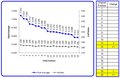
Then I played the role of a “strategic voter” and replaced one random vote from each distribution with a vote of 1. Of course this assumes that as the strategic voter I have the ability to identify the top 20 images to attack and that I can get away with voting a 1 on each of them.
The table to the right of the chart shows the positions that changed because of my strategic voting. I ran the simulation about a half dozen times and never saw more than a few positions swap, never saw any change more than one position and never saw any position above 8th change.
The point I’m trying to make is that if you’re sitting in the middle of the pack with a score of 5.5 and you think that strategic voting is going to help push you to the top 10 you’re wasting your time. Even if you’re already in the top 10, I doubt that strategic voting is going to help you much.
|
|
|
|
02/23/2011 04:17:26 PM · #7 |
Originally posted by DJWoodward:
I just did a quick simulation. I created twenty distributions seeded with a standard deviation of 1.5 and the average final score and average number of votes for each of the top 20 positions in the 2010 challenges. The chart on the left of the image below shows the statistics for the distributions.
Then I played the role of a “strategic voter” and replaced one random vote from each distribution with a vote of 1. Of course this assumes that as the strategic voter I have the ability to identify the top 20 images to attack and that I can get away with voting a 1 on each of them.
The table to the right of the chart shows the positions that changed because of my strategic voting. I ran the simulation about a half dozen times and never saw more than a few positions swap, never saw any change more than one position and never saw any position above 8th change.
The point I’m trying to make is that if you’re sitting in the middle of the pack with a score of 5.5 and you think that strategic voting is going to help push you to the top 10 you’re wasting your time. Even if you’re already in the top 10, I doubt that strategic voting is going to help you much. |
What do you think accounts for the steps from position 3-4 and 9-10? |
|
|
|
02/23/2011 04:52:48 PM · #8 |
Originally posted by gcoulson:
What do you think accounts for the steps from position 3-4 and 9-10? |
This is simulation data only. The target average, and number of votes generated is different for each position (based on 2010 averages) while the standard deviation is constant. Running the simulation repeatedly will give slightly different trends each time with steps in different places.
By the way...
That's why I would never make any strong conclusions like saying no position above 8th would ever change. I'm just trying to show that a strategic voter's effect is probably less than the worst case scenario that is often suggested by the conspiracy theorists.
|
|
|
|
02/23/2011 09:09:38 PM · #9 |
Question: If, on average, non-participants score images 0.16 points higher across multiple challenges, how often will we find images where participants actually scored an image higher than non-participants?
Answer: Let's model this. We'll model four challenges where 225 voters have all voted 100% on 200 entries per challenge. Fifty of the voters were participants, while 175 were non-participants. The non-participants always, on average, voted 0.16 points higher than the participants.
In order to do this, I set up Microsoft Excel to calculate fifty random, normally-distributed numbers, at µ-0.08, where µ is an imaginary average for the image. I also calculated 175 random, normally-distributed numbers at µ+0.08, representing the non-participant votes.
I then calculated the actual average of the participant and non-participant votes. I repeated this exercise 200 times, once for each hypothetical image in the challenge. I then repeated this whole procedure four times, once for each hypothetical challenge.
For each of the 200 images in each of the four challenges, I subtracted the participant average from the non-participant average for that image. In a perfect world, the result would always be 0.16... but because our samples are not infinitely large, there is variability!
Now the interesting part. Look at the four histograms below:
   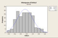
These are the distributions of Deltas (differences) between the participant average and non-participant average for of the hypothetical individual images. One plot per hypothetical challenge.
Lots of those deltas are negative! In fact, The results were as follows:
Challenge 1: 53 negative, 147 positive
Challenge 2: 62 negative, 138 positive
Challenge 3: 43 negative, 157 positive
Challenge 4: 61 negative, 139 positive
On average, just over one fourth of the images actually wound up with higher averages for participant voters!
Now, bear in mind, I did this "blind." I did not go through any challenges and calculate how many images actually had a "negative Delta." Anyone game? ;-) |
|
|
|
02/23/2011 09:16:48 PM · #10 |
Originally posted by kirbic:
We'll model four challenges where 225 voters have all voted 100% on 200 entries per challenge. Fifty of the voters were participants, while 175 were non-participants. |
Only one-fourth of the people who entered voted? I'm really surprised by this stat/assumption ... I would have figured that in most challenges (especially member challenges where the voting pool is more limited) there would typically be far more participant voters than non- ... |
|
|
|
02/23/2011 09:53:34 PM · #11 |
Originally posted by kirbic:
Let's model this…. |
Neat stuff Kirbic!
Originally posted by GeneralE:
Only one-fourth of the people who entered voted? I'm really surprised by this stat/assumption ... |
Actually I think the one-fourth assumption is pretty reasonable. We often see that the participant average is further away from the over-all average than the non-participant average which is a potential indicator that the number of participants is smaller. Maybe I’ll take a look at the member challenge vs. open challenge data to see if there is a significant difference in the p / np stats.
|
|
|
|
02/23/2011 10:08:47 PM · #12 |
Originally posted by GeneralE:
Only one-fourth of the people who entered voted? I'm really surprised by this stat/assumption ... I would have figured that in most challenges (especially member challenges where the voting pool is more limited) there would typically be far more participant voters than non- ... |
The names have been changed to protect the innocent... in a recent challenge, there were 102 entries. For the top-scoring entry in that challenge, there were either 48 or 49 participant votes out of 218 total, and the remaining 169 or 170 votes were from non-participants. I increased the number of "entries" in my model, but the relative sizes of the voter pools should not depend strongly on the number of entries.
In fact, the pool of non-participants is *much* larger than the pool of participants, so if the probability of a non-participant casting votes is anywhere close to that of a participant, the number of participant votes will always be much lower.
We are not specifically given the number of participant and non-participant votes, but it is possible in most cases to "back out" these numbers with some degree of accuracy.
|
|
|
|
02/23/2011 11:35:08 PM · #13 |
| I'm not saying you're wrong, just that I'm surprised. |
|
|
|
02/24/2011 12:08:24 AM · #14 |
I'm simply fascinated by all this, reading it and not understanding but a smidgin. And of course, the part where strategic voting has a snowball's chance in hell to sway the vote in that voter's favor.
But I am especially fascinated by how much time you all put into all this plotting. |
|
|
|
02/24/2011 01:35:19 AM · #15 |
| These stats are always interesting. Although there is always the black swan occurence. I can't remember the challenge, but I lost a ribbon by the fact I gave the entry above me a 8-10 (can't remember the exact vote). Had I not voted at all, I would have ribboned. Doh! |
|
|
|
02/24/2011 01:53:21 AM · #16 |
Originally posted by DrAchoo:
These stats are always interesting. Although there is always the black swan occurence. I can't remember the challenge, but I lost a ribbon by the fact I gave the entry above me a 8-10 (can't remember the exact vote). Had I not voted at all, I would have ribboned. Doh! |
This is hilarious. It's like one of those moral conundrums you see in a Made for TV or Kid's movie.
I've taken statistics as a class, and I find these threads infinitely interesting to follow along. I agree with Johanna; all the effort put forth by folks really is pretty phenomenal. I don't recall so many technical and specific statistics threads being created in the past, and these have been awesome. |
|
|
|
02/24/2011 02:50:02 AM · #17 |
all the impressive chart making aside, i wonder if the fact that participants vote a little lower could simply be the fact that participants are more discriminating?
What I mean to say is that there tends to be a core of photogs that enter on a regular basis, these people are generally the very talented ones and/or the ones trying to improve their art. So perhaps they spend more time and look more critically, rather than just downvoting for the sake of improving their placement. |
|
|
|
02/24/2011 03:06:50 AM · #18 |
double post...whoops.
Message edited by author 2011-02-24 03:11:32. |
|
|
|
02/24/2011 03:11:17 AM · #19 |
Originally posted by smardaz:
all the impressive chart making aside, i wonder if the fact that participants vote a little lower could simply be the fact that participants are more discriminating?
What I mean to say is that there tends to be a core of photogs that enter on a regular basis, these people are generally the very talented ones and/or the ones trying to improve their art. So perhaps they spend more time and look more critically, rather than just downvoting for the sake of improving their placement. |
Yeah, somebody up above made essentially the same claim, pointing out that participants likely have a more accurate idea of what went into capturing the photos for the challenge. Personally, I'd say it's that, perhaps with a pinch of having a more constrained interpretation of the challenge in mind. After all, they likely pursued what they thought was a fitting photo, and have solidified how the challenge prompt was interpreted to them.
Actually the somebody up above was in the other thread this sorta spun off from-other thread
Originally posted by vawendy:
Originally posted by gcoulson:
The numbers are available for every challenge. For those who do the stats on this site, it would be interesting to look at the past challenges and calculate the average vote for participants and non-participants. Just eyeballing a bunch of challenges, it seems to appear that participants vote lower than non-participants.
I'd like to see how much so on a larger data set, and whether there is a statistical difference between the two. |
Most definitely right. Participants score lower than non-participants. But I actually think that's understandable. Participants know more what goes into the shots. They've probably thought through the challenges more than the non-participants. I think they're more critical because they're more involved. If it was a huge gap, then I think it would be an issue. Also, there are fewer participants than non-participants, so the stats are a little more skewed. |
Message edited by author 2011-02-24 03:12:03. |
|
|
|
02/24/2011 06:19:21 AM · #20 |
Originally posted by tanguera:
But I am especially fascinated by how much time you all put into all this plotting. |
It's an affliction actually. It all started with an mild addiction to the update button, then a score tracker and then... :-) |
|
|
|
02/24/2011 08:39:50 AM · #21 |
Originally posted by GeneralE:
I'm not saying you're wrong, just that I'm surprised. |
I'm mot surprised that you're surprised! The process that's necessary to "back out" the participant vs. non-participant vote counts is iterative, and when I started, I guessed *way* high of the actual value. Now, after considering the actual value, it does make sense. But it is not intuitive. |
|
|
|
02/24/2011 08:47:59 AM · #22 |
Originally posted by DJWoodward:
Originally posted by tanguera:
But I am especially fascinated by how much time you all put into all this plotting. |
It's an affliction actually. It all started with an mild addiction to the update button, then a score tracker and then... :-) |
LOL, I feel your pain!
I do have to say to those who look at the statistical plots and wonder how long it took, "not that long." look at my post above with the four histograms. Generating all the data, creating the plots, uploading them and writing the post probably took about an hour. About 40 minutes of that was writing a little VBA code to automate the repetitive tasks in Excel and generating the data. About 5 minutes was porting the data over to Minitab, doing the analysis and plotting. The remaining 15 minutes was exporting the resulting plots, saving as PNGs and uploading, then writing the post.
|
|
|
|
02/24/2011 09:14:17 AM · #23 |
Originally posted by kirbic:
Originally posted by DJWoodward:
Originally posted by tanguera:
But I am especially fascinated by how much time you all put into all this plotting. |
It's an affliction actually. It all started with an mild addiction to the update button, then a score tracker and then... :-) |
LOL, I feel your pain!
I do have to say to those who look at the statistical plots and wonder how long it took, "not that long." look at my post above with the four histograms. Generating all the data, creating the plots, uploading them and writing the post probably took about an hour. About 40 minutes of that was writing a little VBA code to automate the repetitive tasks in Excel and generating the data. About 5 minutes was porting the data over to Minitab, doing the analysis and plotting. The remaining 15 minutes was exporting the resulting plots, saving as PNGs and uploading, then writing the post. |
My one took a little longer. I have all the entries saved in csv files named after the competition id. I had to write a script to get all the data from these files (over 1300) and put them into one 18MB csv file. Import that to matlab. The plotting took no time. In total maybe half an hour or so. Probably less.
Getting all the entries took quite a while. Maybe 6 hours of programming and three days of scraping the website. But it resulted in a very full data set (unfortunately it didn't scrape the number of favourites so I have to do it all again this weekend, d'oh!)
Message edited by author 2011-02-24 09:14:38.
|
|
|
|
02/24/2011 09:46:22 AM · #24 |
Originally posted by NiallOTuama:
...Maybe 6 hours of programming and three days of scraping the website.... |
Ah, that's why my 'pooter was making that scraping sound every time I logged in! |
|
|
|
02/24/2011 09:47:07 AM · #25 |
Some real histograms

(the semi-log plot is to allow reading of low numbers)
Looks like the average difference is 0.25 lower for participants than non-participants.
Originally posted by kirbic:
Originally posted by NiallOTuama:
...Maybe 6 hours of programming and three days of scraping the website.... |
Ah, that's why my 'pooter was making that scraping sound every time I logged in! |
Might want to get the doc to check that out :)
Naw. It was very background-ey so wasn't affecting performance at all.
Message edited by author 2011-02-24 09:48:18.
|
|


