| Author | Thread |
|
|
09/01/2010 06:10:30 PM · #1 |
I have been getting a lot of comment's telling me that I need more contrast. I'm beginning to think that I don't know what contrast is. Can someone please enlighten me and give me some pointers as to what can be done to create more contrast. I think I know kind of what people are talking about but am not sure how to achieve the look. I am using photoshop CS2 and have photomatix and topaz adjust if that helps.
|
|
|
|
09/01/2010 06:15:00 PM · #2 |
| Got an example of one that received such comments? |
|
|
|
09/01/2010 06:15:30 PM · #3 |
| can you post some of the "needs contrast" picture...in looking at your portfolio I guess I'm missing it or haven't looked far enough. That would be a good place to start... |
|
|
|
09/01/2010 06:34:09 PM · #4 |
Found two
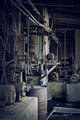 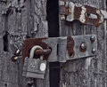
I think the subtle colours style is what puts people off.. You're obviously editing this way deliberately but people don't see that |
|
|
|
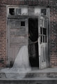
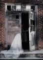
09/01/2010 06:40:28 PM · #5 |
I noticed some of your images have quite low contrast, but like Urfa it looks deliberate for the mood of the shot, however I took one of yours and did an increased contrast version just to show you what I think people are expecting, hope you don't mind:
Original:
Increased Contrast Version:
Remember, here at DPC people like contrasty saturated images, it doesn't necessarily mean they're right :) |
|
|
|
09/01/2010 06:45:16 PM · #6 |
Originally posted by Covert_Oddity:
I noticed some of your images have quite low contrast, but like Urfa it looks deliberate for the mood of the shot, however I took one of yours and did an increased contrast version just to show you what I think people are expecting, hope you don't mind:
Original:
Increased Contrast Version:
Remember, here at DPC people like contrasty saturated images, it doesn't necessarily mean they're right :) |
totally agree that the one above has a flat tone to it...and the one below has more "pop", and I don't think that Iain over did this at all...it is just enough to really define your elements better...JMO |
|
|
|
09/01/2010 07:11:30 PM · #7 |
I looked at the histograms of a couple of your images, and my interpretation is that they seem OK at the bottom (dark) end, but there is a full stop of room at the top in some cases. This makes the photo look dull and lacking in contrast.
|
|
|
|
09/01/2010 07:57:05 PM · #8 |
Originally posted by Covert_Oddity:
I noticed some of your images have quite low contrast, but like Urfa it looks deliberate for the mood of the shot, however I took one of yours and did an increased contrast version just to show you what I think people are expecting, hope you don't mind:
Original:
Increased Contrast Version:
Remember, here at DPC people like contrasty saturated images, it doesn't necessarily mean they're right :) |
Thanks for the advice and help. I actually edited the "Follow me" image with higher contrast but did not like it and went with the flat look. I love how you made the door look better with the increased contrast but hate the ways the bricks look. Makes them seem too saturated and fake for my taste. Thanks for the advice and edit.
Originally posted by kirbic:
I looked at the histograms of a couple of your images, and my interpretation is that they seem OK at the bottom (dark) end, but there is a full stop of room at the top in some cases. This makes the photo look dull and lacking in contrast. |
I am a novice at reading histograms. What do you mean by a full stop? Your talking about apeture right? Is this something I am doing wrong when taking the picture or when processing?
I've always thought that a good photographs histogram should look like a bell but to be honest I haven't really looked at the histograms when editing. I just edit to what my eye likes.
|
|
|
|
09/01/2010 08:00:29 PM · #9 |
Also, I personally like darker images. I'm having trouble getting the image dark but yet defined and thought that was also a contrast issue. 
|
|
|
|
09/01/2010 08:04:32 PM · #10 |
Originally posted by SEG:
...I just edit to what my eye likes. |
The issue may be that you are editing on an LCD monitor that is set too bright. If so, you are compensating by making the image darker so it looks natural on your monitor.
When looking at the histogram, don't look ass much at the shape of the histogram, but make sure it fills most of the width of the graph, without a big "clipping spike" at either end. A small spike is not bad; particularly at the dark end, you may want some pure blacks in the image. At the bright end, there are also cases where some clipping is to be expected (e.g. sun-in-frame). There are no inviolable rules, but in general, bring the black and white points in until the histogram just fills the plot. |
|
|
|
09/01/2010 08:10:09 PM · #11 |
Originally posted by kirbic:
Originally posted by SEG:
...I just edit to what my eye likes. |
The issue may be that you are editing on an LCD monitor that is set too bright. If so, you are compensating by making the image darker so it looks natural on your monitor.
When looking at the histogram, don't look ass much at the shape of the histogram, but make sure it fills most of the width of the graph, without a big "clipping spike" at either end. A small spike is not bad; particularly at the dark end, you may want some pure blacks in the image. At the bright end, there are also cases where some clipping is to be expected (e.g. sun-in-frame). There are no inviolable rules, but in general, bring the black and white points in until the histogram just fills the plot. |
I would agree with this.
I have just recently learned that I have to edit lighter than what I think is correct, because my monitor is too bright, and thus all of my images come out slightly too dark
In the same way it is possible that what looks like good contrast to you on your monitor is flat to others (and if you saw the image on their monitors you might find it flat as well) |
|
|
|
09/01/2010 08:17:31 PM · #12 |
Contrast has to do with the number of different tones represented, and by the difference between the darkest and lightest tones. Many/most shots can use increased variation in the midtones. One easy way to do this is apply a tone Curve with an S-shaped slope* along this line (usually applied to all channels, not just blue as in this example)
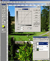
"Steepening" the slope in the midtones means that a narrower range of values is expanded; in this example, the 65% pixels are darkened to 71%, while the 27% pixels are lightened to about 20%.
The basic rationale for increasing midtone contrast is to bring out detail -- if your image is "typical" and not "arty" (e.g. very high- or low-key) most of the detail will be in the midtones. You can also drag the end-points of the Curve if the image is lacking a true highlight or deep shadow to extend the overall range.
Another way to increase "apparent" contrast is to use "high-radius Unsharp Mask" -- works especially well on landscapes to help make the image "pop" and look "clearer." For a DPC entry-sized image, try applying the Unsharp Mask filter with these settings (Photoshop nomenclature):
Amount: 15%
Diameter: 50
Threshold: 0
You can then apply any "normal" sharpening (if necessary) as for any other image. Be careful with the above technique as it has a tendency to sometimes blow out highlight detail -- try reducing either or both of the above settings if this is a problem.
If you want to post a low-contrast picture I will show you (post screenshots) what I'd do with it ...
*Aside: when I saw the title of the current challenge "S-Curves" this is what I thought it was about!
Message edited by author 2010-09-01 20:21:19. |
|
|
|
09/01/2010 08:18:37 PM · #13 |
I do have an LCD screen (like most people these days). Maybe I should bring down the brightness and contrast of my monitor? I have used a free monitor calibrator before but maybe that wasn't good enough. Thanks for the histogram advice I will watch it in the future.
What is the best way to change your white and black points in PS to make the histogram fuller?
|
|
|
|
09/01/2010 08:23:16 PM · #14 |
Originally posted by GeneralE:
Contrast has to do with the number of different tone represented, and by the difference between the darkest and lightest tones. Many/most shots can use increased variation in the midtones. One easy way to do this is apply a tone Curve with an S-shaped slope* along this line (usually applied to all channels, not just blue as in this example)
"Steepening" the slope in the midtones means that a narrower range of values is expanded; in this example, the 65% pixels are darkened to 71%, while the 27% pixels are lightened to about 20%.
The basic rationale for increasing midtone contrast is to bring out detail -- if your image is "typical" and not "arty" (e.g. very high- or low-key) most of the detail will be in the midtones. You can also drag the end-points of the Curve if the image is lacking a true highlight or deep shadow to extend the overall range.
Another way to increase "apparent" contrast is to use "high-radius Unsharp Mask" -- works especially well on landscapes to help make the image "pop" and look "clearer." For a DPC entry-sized image, try applying the Unsharp Mask filter with these settings (Photoshop nomenclature):
Amount: 15%
Diameter: 50
Threshold: 0
You can then apply any "normal" sharpening (if necessary) as for any other image. Be careful with the above technique as it has a tendency to sometimes blow out highlight detail -- try reducing either or both of the above settings if this is a problem.
*Aside: when I saw the title of the current challenge "S-Curves" this is what I thought it was about! |
I normally use the curves layer as you have explained here but not on every color just the master and again I always adjust it to my eye. As far as the USM you spoke of I usually stay in the range of:
Amount: 75-85
Diameter: 2-2.5
Threshhold:1
Sometimes I will use USM at original size and then again after resizing to 800px. Sometimes I only use USM before resizing.
|
|
|
|
09/01/2010 09:05:33 PM · #15 |
Originally posted by SEG:
I normally use the curves layer as you have explained here but not on every color just the master ... |
That's what I usually do as well -- just the only screenshot I had handy was of an adjustment to the Blue Channel ...
Your USM settings are similar to what I use for "regular" sharpening. Try out the other settings (low amount, high radius) first, then the settings you usually use.
Message edited by author 2010-09-01 21:06:43. |
|
Home -
Challenges -
Community -
League -
Photos -
Cameras -
Lenses -
Learn -
Help -
Terms of Use -
Privacy -
Top ^
DPChallenge, and website content and design, Copyright © 2001-2025 Challenging Technologies, LLC.
All digital photo copyrights belong to the photographers and may not be used without permission.
Current Server Time: 08/06/2025 06:43:58 PM EDT.


