| Author | Thread |
|
|
06/29/2010 12:47:40 PM · #51 |
Its interesting to see how your score curve oscillates around the 6 mean score line. Tells me its easy to tell a DPC-accomplished photographer apart just by looking at their chart:-)
|
|
|
|
06/29/2010 12:48:11 PM · #52 |
Originally posted by Prash:
Originally posted by GiorgioBaruffi:
here my simple chart...
can you help me to read it? ;-)
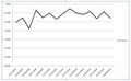 |
I see a def improvement, an upward trend. You are on the right track:-) |
I hope that my customers does not see this chart, i need to work!! ;)
manyt thanks Prash! |
|
|
|
06/29/2010 12:56:02 PM · #53 |
Originally posted by PGerst:
So, you want a DPC statistician? Ok ... if you'd like to know more, I'll take a gander at your scores. If there is something specific you'd like to know, I can tune in on it better.
Paul |
My 755 data points should give about as statistically certain a result as possible.
It would probably be interesting to try some less chronological breakdowns and trends within them, such as:
-Editing ruleset (Basic/Minimal vs Advanced/Expert)
-Challenge Type: Open/Member/FreeStudy
-Topic Type: Specific (e.g. color or object) vs. Interpretive (emotions and concepts
-Season (dark vs. light halves of the year, from equinox to equinox)
-Camera used |
|
|
|
06/29/2010 01:09:05 PM · #54 |
Originally posted by GiorgioBaruffi:
Originally posted by Prash:
Originally posted by GiorgioBaruffi:
here my simple chart...
can you help me to read it? ;-)
|
I see a def improvement, an upward trend. You are on the right track:-) |
I hope that my customers does not see this chart, i need to work!! ;)
manyt thanks Prash! |
Heh. I know you are kidding. But I am sure you know these charts are mostly for fun, and relevant only on DPC. Most of us (EXCLUDING me) are great photographers in real life.. please carry on:-)
|
|
|
|
06/29/2010 01:10:56 PM · #55 |
Originally posted by GeneralE:
Originally posted by PGerst:
So, you want a DPC statistician? Ok ... if you'd like to know more, I'll take a gander at your scores. If there is something specific you'd like to know, I can tune in on it better.
Paul |
My 755 data points should give about as statistically certain a result as possible.
It would probably be interesting to try some less chronological breakdowns and trends within them, such as:
-Editing ruleset (Basic/Minimal vs Advanced/Expert)
-Challenge Type: Open/Member/FreeStudy
-Topic Type: Specific (e.g. color or object) vs. Interpretive (emotions and concepts
-Season (dark vs. light halves of the year, from equinox to equinox)
-Camera used |
Great points about these categories! 755 points. Wowie!!!:-)
I will see what I can do with your data sometime soon...
|
|
|
|
06/29/2010 01:19:28 PM · #56 |
|
|
|
06/29/2010 04:38:30 PM · #57 |
Good news. Made a perl script to grab the scores if you paste the source code into a text file[1].
GeneralE, your one is quite interesting. You're fairly consistent with your scores, but your percentile finishing is all over the place! Which is kinda interesting.
The histogram barriers go from 0-10, 10-20, etc up to 90-100.
GeneralE: linkie.
Yo_Spiff: linkie.
Prash: linkie.
------
[1]
To use the perl script: Look at the source for someone's profile, and select the part of it that starts with "d[0]=new Array(" (including that part) up to the "var challengeList = new imageList" (not including that part). Put it in a file called test.html, run the linked perl script, ensuring test.pl and test.html are in the same page (perl needs to be installed on your computer). It makes a file called out.txt. Open it, copy the contents, delete columns A to H that's in GeneralE's excel file, and paste over the data on the linked file.
Message edited by author 2010-06-29 16:52:36.
|
|
|
|
06/29/2010 05:22:04 PM · #58 |
I went a little crazy and went ahead and did everyone who responded to the thread...
Hope ye don't mind (also hope I didn't leave anyone out, if I did lemme know and I'll add ye. Alias misspellings are an artifact of laziness. Sorry)
GeneralE
Prash
YoSpiff
reneekerr
GiorgioBaruffi
jasonlprice
djwoodheart
bassbone
PGerst
simms
SteveJ
jokersSoul
Art Roflmao
kirbic
coryboehne
And me :) NiallOTuama
I'll draw two conclusions...
1) People who seem to do well seem to go in sparingly.
2) A small increast in score (in highs) give you a big jump in percentile.
Message edited by author 2010-06-29 17:27:39.
|
|
|
|
06/29/2010 06:16:20 PM · #59 |
You rock man!!! You deserve a special award.:-)
|
|
|
|
06/29/2010 06:22:02 PM · #60 |
Originally posted by NiallOTuama:
I went a little crazy and went ahead and did everyone who responded to the thread...
Hope ye don't mind (also hope I didn't leave anyone out, if I did lemme know and I'll add ye. Alias misspellings are an artifact of laziness. Sorry)
I'll draw two conclusions...
1) People who seem to do well seem to go in sparingly.
2) A small increast in score (in highs) give you a big jump in percentile. |
I get the first two graphs - actual score and actual percentile per challenge, but I don't really know what you are graphing in the last three - I see no units on the axis to describe what these mean. |
|
|
|
06/29/2010 06:22:58 PM · #61 |
Originally posted by Prash:
You rock man!!! You deserve a special award.:-) |
Heh. Either that or I should get a hobby.
|
|
|
|
06/29/2010 06:29:36 PM · #62 |
Originally posted by bassbone:
I get the first two graphs - actual score and actual percentile per challenge, but I don't really know what you are graphing in the last three - I see no units on the axis to describe what these mean. |
That's a good point. I should have explained them.
I reckon you should ignore the last one. It's not really anything.
The third and fourth are histograms. Basically they represent the percentage of your entries that were within the ranges. So in your one at the 6th bar is just under 0.5. This means that just under half of the time your score rated between 5 and 6, and nearly another half of the time it was between 6 and 7... well done!
It's like the summaries of scores after a competition... but done for a set of your results instead of a set of votes on your picture.
They're labelled poorly. Sorry about that. I should have specified the range. Oh. I remember why I didn't now. When I typed in like 5-6 in Excel it changed it to the 6th of May, and I coudln't get it off.
Guess I have to do them again.
And yes. I'm joking. :D
|
|
|
|
06/29/2010 07:10:10 PM · #63 |
I'm good.....not THAT good! :)
Originally posted by NiallOTuama:
>> After performing principal component analysis I have identified 3 components
Hah. For a second I thought you said you did ICA and for a split second thought you isolated each voter, and was like "whoah!" |
|
|
|
|
06/29/2010 07:12:27 PM · #64 |
I considered it. Right now, I'm working on the distributions themselves, rather than the mean, since the mean is often misleading. I've captured the number of votes for each, so at least I have a few more output variables. It just makes PCR (not PCA) more interesting... :)
Originally posted by GeneralE:
Originally posted by PGerst:
So, you want a DPC statistician? Ok ... if you'd like to know more, I'll take a gander at your scores. If there is something specific you'd like to know, I can tune in on it better.
Paul |
My 755 data points should give about as statistically certain a result as possible.
It would probably be interesting to try some less chronological breakdowns and trends within them, such as:
-Editing ruleset (Basic/Minimal vs Advanced/Expert)
-Challenge Type: Open/Member/FreeStudy
-Topic Type: Specific (e.g. color or object) vs. Interpretive (emotions and concepts
-Season (dark vs. light halves of the year, from equinox to equinox)
-Camera used |
|
|
|
|
06/29/2010 07:53:27 PM · #65 |
Excel tells me that my trendline has gone from 5.48 to 5.72. Should I be excited now? ;-)
I should check how much better it would have been without hubby's butt pic dragging me down LOL |
|
|
|
06/29/2010 08:23:05 PM · #66 |
Thanks. I wish I knew a scripting language. I only know the language for Matlab. I like it especially because of the way the data is laid out in a matrix format. I hear python is pretty similar.
Anyway, I looked a few different variables, free studies, large and small participant counts, technical vs creativity, etc.
I found the following:
1) Scores steadily improved as technical ability has improved
2) Higher scores for challenges where I spent time thinking about how I was going to set something up and how I was going to be creative.
Its pretty interesting that those two things, which came out from the analysis, are the same two things that DPC voters look for. :)
Originally posted by NiallOTuama:
I'll draw two conclusions...
1) People who seem to do well seem to go in sparingly.
2) A small increast in score (in highs) give you a big jump in percentile. |
|
|
|
|
06/29/2010 08:49:40 PM · #67 |
Originally posted by Prash:
Originally posted by Yo_Spiff:
Looks like a fairly normal score distribution, with general upward tendency. Not sure of the point you are making, but I'll play. Give me a few minutes... |
Thanks Steve. I am not trying to make a point. I am only trying to understand the chart, thought it would be interesting to see how this one compares to that of someone who has been improving consistently:-) |
It can be difficult to tell if the scores are trending up or down. If you add a trending line to that graph, it will give you an idea of how the progress is moving up or down.
|
|
|
|
07/08/2010 09:10:39 AM · #68 |
don't really know how to use excel so hopefully i did this correctly. if i did, then i'm glad my scores are trending upwards
 |
|
|
|
07/08/2010 10:07:28 AM · #69 |
I updated my chart with the last two challenge results and finally figured out how to add that trendline to a graph. That does make it easier to see progress. The polynomial trendline seemed to be the most appropriate type for this sort of data.

Can someone tell me how to adjust the vertical scale being used in the chart? For instance, if I want the scale to use 3 through 8, in order to show fluctuations in more detail. Updated, thanks!
Message edited by author 2010-07-08 10:17:06. |
|
|
|
07/08/2010 10:09:54 AM · #70 |
Originally posted by Yo_Spiff:
Can someone tell me how to adjust the vertical scale being used in the chart? For instance, if I want the scale to use 3 through 8, in order to show fluctuations in more detail. |
In excel, click using the right mouse button on the axis you want to change. It will come up with a drop down list - select Format Axis. Select the Scale tab and then type in the Minimum and Maximum you want displayed. |
|
|
|
07/08/2010 10:10:24 AM · #71 |
Danke! That makes a difference. Not sure which is really a more accurate visual representation. I guess since the voting average compress the 1-10 scale to about half that range, setting my range at 3-8 covers all my challenge scores and probably represents a reasonable picture of performance in DPC terms.
Message edited by author 2010-07-08 10:16:35. |
|
|
|
07/08/2010 12:57:03 PM · #72 |
Originally posted by Cuttooth:
don't really know how to use excel so hopefully i did this correctly. if i did, then i'm glad my scores are trending upwards
|
Unless you got the left/right confused? ;-) Just kidding... WTG!!! |
|
|
|
07/08/2010 01:48:19 PM · #73 |
Originally posted by Yo_Spiff:
I updated my chart with the last two challenge results and finally figured out how to add that trendline to a graph. That does make it easier to see progress. The polynomial trendline seemed to be the most appropriate type for this sort of data. |
ugh! when i use the polynomial trendline it shows i'm regressing. soon i'll be back to where i began

Message edited by author 2010-07-08 13:49:30. |
|
|
|
07/08/2010 01:56:27 PM · #74 |
| This flexiblity of the graphs with the various trendlines and scale ranges just shows how a visual representation can be very misleading, often showing what you want people to perceive. People in marketing and advertising take advantage of it. |
|
Home -
Challenges -
Community -
League -
Photos -
Cameras -
Lenses -
Learn -
Help -
Terms of Use -
Privacy -
Top ^
DPChallenge, and website content and design, Copyright © 2001-2025 Challenging Technologies, LLC.
All digital photo copyrights belong to the photographers and may not be used without permission.
Current Server Time: 10/14/2025 12:55:19 AM EDT.


