| Author | Thread |
|
|
07/10/2009 07:51:27 PM · #1 |
This was my entry in to the last month's free study.
Apart from the circle thing being too centered, what was wrong with this image, I thought I could have scored higher.
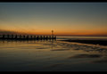
If some one can suggest a different crop, I have lots of shots of this same scene...you can see boats and the oil rigs all lighten up at sea. |
|
|
|
07/10/2009 07:58:49 PM · #2 |
|
Well, it's a bit dark IMO, also, there really isn't much going on, it's a bit flat overall. Maybe try messing with colors. I would crop it in closer, maybe putting the circle at the end of the pier on the right third line. (using the rule of thirds. |
|
|
|
07/10/2009 08:00:22 PM · #3 |
|
I think it would have scored a lot higher if it weren't as dark. |
|
|
|
07/10/2009 08:19:13 PM · #4 |
 dd1989 your image has a good deal of promise. Just for fun I played with it: dd1989 your image has a good deal of promise. Just for fun I played with it:

Here's what I did - bearing in mind that this is "quick and dirty". You can make this lots better by just playing around with the sliders and tools in Photoshop.
Removed what appears to be sensor dust in the lower left quadrant of image.
First a different crop. Getting rid of that bar across the top was a must. Then the old rule of thirds, that is, split the composition one third and two thirds - if possible both horizontal and vertical. In this case it was an easy choice using the round thing as a guide.
because this was quick n dirty, I just used the automatic levels selection. For real, use Levels and play carefully. then over to Selective colors, Move the sliders around in each color until you get something that pops.
then stop.
this was such a perfectly seen shot, I could not resist giving my imput. You have a good eye.
|
|
|
|
07/10/2009 08:19:40 PM · #5 |
As posted last night. Horizon tilted toward the right and with the pier being so close to the horizon line and taking up half the picture it really accelerates the illusion that the horizon is tilted even more. I also agree with the other comments that the image in general is dark. There seems to be no separation between sky and sea. IMO the sky is the the subject in this shot along with the incoming tide on the beach. If the sky would have had more of a color punch and reflecting on the glassy wet sand as the tide rolls out your photograph would have score higher.
my 2 cents.

Message edited by author 2009-07-10 20:42:55. |
|
|
|
07/10/2009 08:33:38 PM · #6 |

Endless opportunities :) |
|
|
|
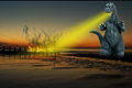
07/10/2009 08:35:32 PM · #7 |
Needed something more drastic...
 |
|
|
|
07/10/2009 08:37:17 PM · #8 |
Originally posted by FocusPoint:
Endless opportunities :) |
... this reminds me of a poster from the 70's with the classic colors in the sky.. I love it.
i really like this... I think what probably happened is first of all, there's nothing "wrong" with it... here on DPC, people tend to vote higher for an image that appears to be really polished.. Not to be confused with really processed, but polished.. It's a fine line, one I'm still trying to figure out myself.. Either you go to far, or not far enough.. In the case of your image, to me it appears un-finished..If you were going for a high vote, something like what FocusPointhas done I think would have made a huge difference in your score..
And, keep in mind, that round thingy in the center is a bit of a distraction.. off to the side though, it seems quite interesting.. Funny how that works..
Message edited by author 2009-07-10 20:39:38. |
|
|
|
07/10/2009 09:21:21 PM · #9 |
|
These re-edits really improved the image, and I'm sure it would score higher with them. But in my view, the troubles started with a weak subject. |
|
|
|
07/11/2009 12:23:37 AM · #10 |
needs more fire!
Originally posted by Art Roflmao:
Needed something more drastic...
|
|
|
|
|
07/11/2009 02:58:35 AM · #11 |
Most of the above assessments are right on... especially Dr. Confuser's.
A problem with low light subjects out-of-camera is that the camera's automated determination of a proper white balance under those conditions is often incorrect. It leaves them with a muddy yellow overtone like yours has. That is why most folk's reprocessing of your image generally looks better.
Don't know if you take your photographs in RAW format or not, but you should. In most RAW conversion applications white balance (or more precisely 'color temperature') is the first adjustment available to apply to an image. A white balance (color temperature) adjustment during RAW conversion would work wonders with your image. Still would not help with the "weak subject" issue, though. :) |
|
|
|
07/11/2009 07:55:24 AM · #12 |
If you had the opportunity to re-shoot, you might want to also change the point of view. If you lower your camera, the pier would be higher in the water, possibly placing it along the horizon line. This would also lessen the amount of dead space on the right - the shadow or black spot in the water as the water would be less emphasized. I only suggest this because the water is out of focus - not the nice blur of long exposure but rather just out of focus (this also detracts, imho).
Alternatively, raise your camera higher so the water is emphasized then play with different exposure times to either get it in focus (probably almost impossible) or get a nice long exposure silkiness. Right now, the image 'feels' like it is shot at eye level. At least for me, uninteresting.
Two of the most important (and often overlooked) things on a pre-shoot list: timing and point of view. Timing is sometimes luck of the draw your first time at a location. Point of view can always be controlled and modified. One of the things I always do when shooting sunsets is to pretend or visualize the scene as if the colors weren't there. Would the composition still be interesting? If not, what can I do to improve it (particularly important when Godzilla isn't available). Sometimes its just a matter of stepping to the left a few feet or getting down on my knees or climbing a tree. A different point of view can often make a world of difference. |
|
|
|
07/11/2009 09:26:13 AM · #13 |
I don't find myself objecting to the symmetricality of the image at all. I tend to like symmetrical, color-field type landscapes, and shoot quite a few of them myself. Earlier comments about the color-balance issues are spot-on; the original looks muddy and imprecise. A useful first step is to run autolevels on the image for a starting point, and that's what I did here. Sometimes autolevels gives weird results, but in this case it worked nicely to clarify everything.
From there I did an Orton effect, adding extreme gaussian blur and extreme sharpening layers and fading/blending them together. I also added a blue gradient in the sky, and this is what I came up with: I think it's quite a pleasing image, ethereal and dreamy.
R. |
|
|
|
07/11/2009 09:35:23 AM · #14 |
Originally posted by Bear_Music:
... From there I did an Orton effect, adding extreme gaussian blur and extreme sharpening layers and fading/blending them together. I also added a blue gradient in the sky, and this is what I came up with: I think it's quite a pleasing image, ethereal and dreamy.
R. |
You got me curious (I had never heard of the "Orton" effect, and I loved what I read it. I'm off to try it now! |
|
|
|
07/11/2009 10:48:38 AM · #15 |
Ok
Thanks for all the comments.
I do have some more angles of this shot, and all my photos are in RAW so I can play around a lot.
I really like what some of you have done, but I'm just too *scared* to play around too much with photoshop/Lightroom, I feel as if I am creating a photograph that didn't actually exist. I often feel as if the line between getting the colours perfect and making it look ridiculous is just too fine.
Here are some of the shots I took that morning, I have them all in RAW and full size if any one wants one uploaded larger.
Obviously there is a *lot* of detail in some of the photos, you can see the ships and things out at sea.


|
|
|
|
07/11/2009 11:33:24 AM · #16 |
post processing is part of the game--don't be afraid of it!
My standard basic editing is levels, curves, hue/sat. I then flatten the image in a new layer (CTRL ALT SHIFT N, CTRL ALT SHIFT E) and then apply unsharpen mask.
|
|
|
|
07/11/2009 01:57:29 PM · #17 |
|
OK, I'll be more adventurous next time with editing! |
|
Home -
Challenges -
Community -
League -
Photos -
Cameras -
Lenses -
Learn -
Help -
Terms of Use -
Privacy -
Top ^
DPChallenge, and website content and design, Copyright © 2001-2026 Challenging Technologies, LLC.
All digital photo copyrights belong to the photographers and may not be used without permission.
Current Server Time: 07/19/2026 12:28:00 PM EDT.


