| Author | Thread |
|
|
05/22/2009 02:35:55 PM · #1 |
pictures or no pictures on the photo business card?
|
|
|
|
05/22/2009 02:37:25 PM · #2 |
| Pictures are a must according to most of the people I've spoken with. I have text on one side and Pictures on the other. |
|
|
|
05/22/2009 02:37:45 PM · #3 |
I would suggest pics. Show your work!
|
|
|
|
05/22/2009 02:47:11 PM · #4 |
sometimes those cards look cheesy with pics, like you made it at home
but maybe I will see what pics could possibly work |
|
|
|
05/22/2009 02:59:43 PM · #5 |
| Keep in mind that you are given very little real estate on a business card, so make sure you use all of it the best you can to showcase your work. At my state PPA convention this last weekend there was an "American Psycho" like conversation at lunch about business cards and just about everyone at the table used both sides and images on their card. |
|
|
|
05/22/2009 03:12:56 PM · #6 |
I say to definitely use a photo that says what your photography is about.
I like the fine art side of my business card...
 simple, clean and conveys (IMO) the idea of fine art. simple, clean and conveys (IMO) the idea of fine art.
I like the idea of my sports photography side, the idea of the film strip with sports images as well as the extreme pose of my main subject. But I'm not quite happy about this side overall. Something isn't quite right.

I believe that, if done right, a business card for photographers will have much more impact and better communicate your message than text alone.
Message edited by author 2009-05-22 15:14:03. |
|
|
|
05/22/2009 03:25:17 PM · #7 |
I've been printing my cards 3-up on ordinary 4x6 prints and trimming them out by hand. It's a little work, but very low up-front investment, you can easily update the photo, or have different versions for different styles (portrait, wedding, landscape, etc.). Also, people will have a sample of what your prints look like.
 |
|
|
|
05/22/2009 03:30:01 PM · #8 |
Originally posted by GeneralE:
...but very low up-front investment... |
Not necessarily a low up-front investment, but at $150.00 for 5000 two-sided business cards it was a pretty good value. |
|
|
|
05/22/2009 03:32:45 PM · #9 |
Here are mine:
 - The one I usually print - The one I usually print
 - Back up idea, have not printed yet. - Back up idea, have not printed yet. |
|
|
|
05/22/2009 03:37:29 PM · #10 |
Originally posted by Dirt_Diver:
Here are mine:
- The one I usually print
- Back up idea, have not printed yet. |
Those look great. I like the reduced opacity photo. Again, having a photo on a photographer's business card says a lot about the type of photographic services you offer. |
|
|
|
05/22/2009 04:09:34 PM · #11 |
Originally posted by Dirt_Diver:
Here are mine:
- The one I usually print |
I think I'd move your name and the *photography* tagline just a bit up and left so they don't crowd the face so much, and to balance out the white space around it. Otherwise I like it, and the faded look is interesting -- I might have to play with something like that ... :-) |
|
|
|
05/22/2009 04:37:59 PM · #12 |
Here is mine that is in print right now
this is the front
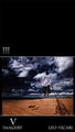
On the back are more pics and contact info plus my new website. I cannot show because it has a pic of my free study entry this month and it will give it away.
Will post later.
Message edited by author 2009-05-22 16:38:37. |
|
|
|
05/22/2009 10:36:01 PM · #13 |
Originally posted by GeneralE:
Originally posted by Dirt_Diver:
Here are mine:
- The one I usually print |
I think I'd move your name and the *photography* tagline just a bit up and left so they don't crowd the face so much, and to balance out the white space around it. Otherwise I like it, and the faded look is interesting -- I might have to play with something like that ... :-) |
The only reason I have it as close to the face is because when I printed them at vista print the preview has the text cut of so I had to adjust it. Other wise it would have been closer to the edge.
|
|
|
|
05/22/2009 10:41:51 PM · #14 |
Originally posted by LVicari:
Here is mine that is in print right now
this is the front
On the back are more pics and contact info plus my new website. I cannot show because it has a pic of my free study entry this month and it will give it away.
Will post later. |
I like the picture but I don't like the amount of black space above it, seems like it's missing something there. But as long as you are happy with it that's all that matters
|
|
|
|
05/23/2009 06:17:54 AM · #15 |
Picture would be my vote. Keep it simple and clean though.
Our current card - 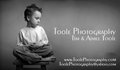 |
|
|
|
05/23/2009 06:35:13 AM · #16 |
Simple is nice......

|
|
|
|
06/07/2009 11:12:48 AM · #17 |
Here is the final copy of my card. Free Study is almost over, so I decided to post. I didn't end up using my Free Study entry.
 |
|
Home -
Challenges -
Community -
League -
Photos -
Cameras -
Lenses -
Learn -
Help -
Terms of Use -
Privacy -
Top ^
DPChallenge, and website content and design, Copyright © 2001-2025 Challenging Technologies, LLC.
All digital photo copyrights belong to the photographers and may not be used without permission.
Current Server Time: 08/12/2025 11:23:08 AM EDT.


