| Author | Thread |
|
|
04/25/2009 12:47:22 PM · #1 |
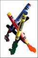
not griping by any means about scores. but i AM wondering if voters didn't get the idea behind the photo.... or it was something with the processing... or something else ??
all the comments were pretty positive. not much criticism i suppose i should say.
the idea was to put primary colored crayons into the jackets of other primary colors. the melted crayon ( wax ) is the color the actual crayon and the jackets it's wearing create when mixed - a secondary color... obviously. or at least i thought so :)
the setup was kinda tricky getting them all propped up and what not. lit with two canon speedlights. the shadows show how they were positioned.
any thoughts appreciated.
|
|
|
|
04/25/2009 12:56:21 PM · #2 |
I think the entry is very creative, and like the premise behind the shot. I dont like the strong shadows, and high contrast though... I would prefer if it was more evenly lit. Also, the colour in the melted wax seems a bit off... the green and the purple arent as vibrant as I would like.
That being said... I voted this a 6 because I saw it as an above average, and creative shot. If it was lit better, and didnt have the strong shadows, I would have given this a 7 or higher. |
|
|
|
04/25/2009 12:56:45 PM · #3 |
| I'm guilty of speed voting that challenge and to be honest, I completely overlooked the swapping of the crayons and the jackets. I've had a few of my own where think the careful subtlety of the shot was missed by speed voters. |
|
|
|
04/25/2009 08:40:27 PM · #4 |
that's sort of what i thought as a general reason.
i didn't think it was a BAD photo. not perfect. but i did think maybe the swap of the crayon skins was overlooked by many....
thanks !
Originally posted by Yo_Spiff:
I'm guilty of speed voting that challenge and to be honest, I completely overlooked the swapping of the crayons and the jackets. I've had a few of my own where think the careful subtlety of the shot was missed by speed voters. |
|
|
|
|
04/25/2009 08:42:06 PM · #5 |
so your dis-like of the harsh shadows. why ? i'm curious - not pissy :)
Originally posted by VitaminB:
I think the entry is very creative, and like the premise behind the shot. I dont like the strong shadows, and high contrast though... I would prefer if it was more evenly lit. Also, the colour in the melted wax seems a bit off... the green and the purple arent as vibrant as I would like.
That being said... I voted this a 6 because I saw it as an above average, and creative shot. If it was lit better, and didnt have the strong shadows, I would have given this a 7 or higher.
|
Message edited by author 2009-04-25 20:42:25.
|
|
|
|
04/25/2009 09:18:40 PM · #6 |
I didn't vote, so can't say if I'd have caught the switching right away, but I do suspect speed-voting may have caused some to miss the details that make the shot special.
I agree with the shadows. I find they make it a bit cluttered and don't allow the crayons to stand on their own as well as they might. But on the whole, I really enjoy the shot and the creativity behind it :) |
|
|
|
04/25/2009 10:46:41 PM · #7 |
| Left a comment. I didn't vote on this challenge but I liked the creativity. It did take me a moment to see the switch and that was partially due to the fact that the purple and the green appeared quite dark to me. |
|
|
|
04/25/2009 11:06:04 PM · #8 |
Originally posted by soup:
not griping by any means about scores. but i AM wondering if voters didn't get the idea behind the photo.... or it was something with the processing... or something else ?? |
I couldn't say because I thought it was very clever using primary colors and crayons to a great effect.
I thought this was kind of interesting though.
Avg (commenters): 7.0000
Avg (participants): 5.2292
Avg (non-participants): 5.7105
It would seem that those who took the time to comment got the point and rated it significantly higher than those who might not have (ie, speed voting).
Later,
Tom |
|
|
|
04/26/2009 05:57:54 PM · #9 |
Originally posted by soup:
so your dis-like of the harsh shadows. why ? i'm curious - not pissy :)
|
I just think they take a lot of attention away from the crayons themselves. Plus the contrast is so high that the colours seem a bit off.
How did you process the shot? Can you post the original? |
|
Home -
Challenges -
Community -
League -
Photos -
Cameras -
Lenses -
Learn -
Help -
Terms of Use -
Privacy -
Top ^
DPChallenge, and website content and design, Copyright © 2001-2025 Challenging Technologies, LLC.
All digital photo copyrights belong to the photographers and may not be used without permission.
Current Server Time: 10/13/2025 04:38:15 PM EDT.


