| Author | Thread |
|
|
04/15/2009 02:38:05 PM · #1 |
My entry into the Stock: Fitness challenge:
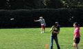
It was, of course, trashed for the blur ... here it is made into a billboard with added type, graphics, and photo.
 and with additional blur and with additional blur 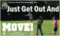
The presence of sharp images (type) in the foreground renders the blur of the background image largely irrelevant, as the eyes will focus on the sharp parts of the scene -- the message -- especially when it's probably going to be viewed briefly from a moving car. The sharp type and inset image also make the blurry BG appear similar to a DOF artifact.
The blurriness of the BG image is also helpful in making the image usable as stock without a model release.
I have far more experience in the graphic design field than photography, and I find that people often seem to limit the "possibilities" of an image, as to how they might be used in a context other than as a framed and matted print on their living room wall. |
|
|
|
04/15/2009 03:55:49 PM · #2 |
| I've never worked in graphic design or in the ad business, nor have I ever sold any of my images to a stock agency. But I have a question after reading your post: what are the general stipulations around editing stock photographs? I mean, if I were to buy a sharp stock image and want to use blurry like in your billboard below, do I have a right to edit the stock photographer's work, or do I have to pay extra for that? |
|
|
|
04/15/2009 04:13:46 PM · #3 |
Originally posted by GeneralE:
I find that people often seem to limit the "possibilities" of an image, as to how they might be used in a context other than as a framed and matted print on their living room wall. |
Most voters will always consider THIS site to be the context. It doesn't really matter how your image might look if you added type and a grunge layer, maybe another inset photo, and printed on an artsy cover stock. Your submission is the finished product, and you are responsible for making sure it looks finished. It's unrealistic to expect voters to use their imaginations to finish your entry for you. Shallow depth of field is a good way to suggest a professional photo since most typical "consumer" P&S cameras can't achieve that, but something usually has to be in sharp focus to give the eye a focal point. The type fills that role in your example, but the voters only saw an incomplete layout IMO. |
|
|
|
04/15/2009 04:13:51 PM · #4 |
I didn't see it addressed in the Shutterstock license, but I believe as long as it is being used in this type of circumstance, the designer would be allowed wide latitude in editing -- cropping, color shifts, flopping, etc. would all be part of creating the final ad.
What you couldn't do is modify the image, and then try to resell/license the image as a new work -- then it would be a "derivative" work. But as a component of an ad, in a magazine, etc. I think you can tweak away.
There are limitations in the license as to how it can be used though .... |
|
|
|
04/15/2009 04:16:04 PM · #5 |
Originally posted by scalvert:
Originally posted by GeneralE:
I find that people often seem to limit the "possibilities" of an image, as to how they might be used in a context other than as a framed and matted print on their living room wall. |
Most voters will always consider THIS site to be the context. |
Well sure, but the context we asked them to judge in was stock photography -- images to be used as components of an overall design, not destined to be framed prints. Don't we ask them to consider the challenge topic when voting? |
|
|
|
04/15/2009 04:19:51 PM · #6 |
Originally posted by GeneralE:
Well sure, but the context we asked them to judge in was stock photography -- images to be used as components of an overall design, not destined to be framed prints. Don't we ask them to consider the challenge topic when voting? |
I don't mean to pile on here, but  Scalvert is right on the money. People are going to vote on an image in this challenge based on what it looks like, not what it could look like. I know that may not be the way you think, but that's the reality of it. Scalvert is right on the money. People are going to vote on an image in this challenge based on what it looks like, not what it could look like. I know that may not be the way you think, but that's the reality of it. |
|
|
|
04/15/2009 04:29:28 PM · #7 |
Originally posted by GeneralE:
the context we asked them to judge in was stock photography -- images to be used as components of an overall design, not destined to be framed prints. Don't we ask them to consider the challenge topic when voting? |
A photo of "blank" texture could make an awesome fitness ad if you combined it with a nice logo and compelling typography, but the voters wouldn't necessarily envision that. All they'd see is blank texture, and that wouldn't meet the challenge. On this site, the challenge is always to submit an entry that can stand on its own. We don't vote on potential, and an image that could be corrected to look awesome won't score as high as one that was. |
|
|
|
04/15/2009 04:48:55 PM · #8 |
Originally posted by alanfreed:
People are going to vote on an image in this challenge based on what it looks like, not what it could look like. I know that may not be the way you think, but that's the reality of it. |
Like I said, I *expected* people to vote the way they did -- I am not "complaining" about the vote.
I am trying to encourage people to explore alternative ways of thinking about images, and to understand (if not agree with) how others may view them.
I thought this site was supposed to be about learning, with photography the specific topic. Exploring alternative ideas, styles, and interpretations has always seemed an important component of the learning processes to me -- repeatedly applying the same entrenched criteria and judgements to every image not so much so. |
|
|
|
04/15/2009 04:59:09 PM · #9 |
I am a little afraid to go against 2 members of the SC :), but it is my understanding that a "finished" stock photo is just an intermediate step in someone else's creative processes. The purpose of a stock is to be modified slightly and used for whatever.
In the case of the blank texture, that would not fit the challenge because there is nothing to identify it as a fitness photo. In  GeneralE's case, his photo could be used as fitness stock because of its subject matter. GeneralE's case, his photo could be used as fitness stock because of its subject matter.
I'm with GeneralE on this one.
My $.02 |
|
|
|
04/16/2009 12:09:39 PM · #10 |
My Dear GeneralE...Ahhh...I see your reckless and blatant use of fabulous blur (which you know I love and all the voters despise...haha!) has awarded you a brown ribbon!  Whiterook is going to be jealous now! Whiterook is going to be jealous now!
IMHO...your big mistake with this photo has nothing to do with all of these complicated issues, but rather because you broke a very important DPC rule...::lowers voice and whispers sacredly::...You forgot to level that horizon!
When the horizon is straight, Dear...all the world is well...;-P
|
|
|
|
04/16/2009 01:57:09 PM · #11 |
Originally posted by hihosilver:
IMHO...your big mistake with this photo has nothing to do with all of these complicated issues, but rather because you broke a very important DPC rule...::lowers voice and whispers sacredly::...You forgot to level that horizon!
When the horizon is straight, Dear...all the world is well...;-P |
Yes, but I believe the "horizon" is level, only those particular elements (edge of grass and hedge) are slanting away, so it is a matter of perspective rather than horizontality ... I think if you look at the people they are standing upright, not leaning over (well, they are leaning, but their overall alignment is vertical) ... |
|
|
|
04/16/2009 03:26:38 PM · #12 |
Originally posted by GeneralE:
Yes, but I believe the "horizon" is level, only those particular elements (edge of grass and hedge) are slanting away, so it is a matter of perspective rather than horizontality ... I think if you look at the people they are standing upright, not leaning over (well, they are leaning, but their overall alignment is vertical) ... |
Hmmm...yes, I do see the people do look vertical (even without using my ruler thingy in photoshop)...however, I would make the case that the horizontal lines of the hedge and the grass are far stronger and more readily apparent in the design, and the vertical alignment of the people more subtle. So, if I'm driving by in a car looking at this photo...I'd have to say the horizontal tilt would be more distracting to me than vertically tilted people.
You know...you'll just have to print it on a big billboard and I'll do a driveby test for you...;-) |
|
Home -
Challenges -
Community -
League -
Photos -
Cameras -
Lenses -
Learn -
Help -
Terms of Use -
Privacy -
Top ^
DPChallenge, and website content and design, Copyright © 2001-2025 Challenging Technologies, LLC.
All digital photo copyrights belong to the photographers and may not be used without permission.
Current Server Time: 12/09/2025 05:11:24 AM EST.


