| Author | Thread |
|
|
03/23/2009 12:16:08 AM · #1 |
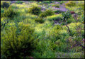
I'm trying my hand at landscapes (meadows in this case) and have posted two shots for feedback. Specifically, how could the composition be improved, and whether the pp'ing works - or doesn't. I'm experimenting with PS more, but want to keep it subtle.
For your consideration:
 and and 
Thank you all! |
|
|
|
03/23/2009 12:46:35 AM · #2 |
Quick impression of the first picture:
1) It feels top heavy. I'd prefer if the heaviest band of flowers was at the bottom. I know sometimes that isn't possible to arrange, but the top heavy feel does let the picture down a bit.
2) Two distracting bits: The plant growing up from the bottom of the frame. Either get it out of there or clone it. Also the patch of dirt in the middle. The tone is too different from the rest of the shot and immediately draws the eye. Clone it out.
3) The sky is either blown or homogenous overcast. Hardly ever a good thing even when it is only a sliver of the portrait. Depending on what the sky looked like, if you could have panned up to get the band of flowers at the bottom and preserved detail in the sky you might have a good shot. Of course it would be completely different than this one and perhaps isn't what you were looking to achieve. |
|
|
|
03/23/2009 12:55:22 AM · #3 |
Shooting at a different time of day, to get early or late light may help. The 2nd shot has no subject that grabs my attention. It's a pretty looking natural area, but there is nothing there like a particular tree, stream, or the like to get me to focus somewhere in the shot. Also, look for leading lines that you can use to draw the viewer into the shot.
|
|
|
|
03/23/2009 01:09:27 AM · #4 |
Fabulous observations,  DrAchoo! The sky was, in fact, blown out blah white overcast. But I tried cropping the whole thing out and it somehow looked funny. I'll try some cropping and some cloning out of the dirt and maybe that'll help. As for where the flowers grow, I guess they know enough to be out of picking reach :-) DrAchoo! The sky was, in fact, blown out blah white overcast. But I tried cropping the whole thing out and it somehow looked funny. I'll try some cropping and some cloning out of the dirt and maybe that'll help. As for where the flowers grow, I guess they know enough to be out of picking reach :-)
Thanks |
|
|
|
03/23/2009 01:11:54 AM · #5 |
Left you a couple of comments on your shots. If you want some really good tips for learning about landscape photography, you could try reading through this old thread although the example shots are gone, there is still some good information there.
Message edited by author 2009-03-23 01:15:12.
|
|
|
|
03/23/2009 01:27:13 AM · #6 |
Thank you MelonMusketeer and  Prism. I will certainly check out that thread. Prism. I will certainly check out that thread.
More than wanting to become a landscape photographer however, I'm trying to develop my eye in terms of what to look for (leading lines, points of focus, time of day, etc.), for different types of subjects. Obvious to a pro, but "duh" moments to me. Thank you all. I'll repost the first photo after playing with it a bit to see if it's any better; the second shot does not, as you say, have a visual "anchor".
The biggest challenge for me so far is to reconcile what my "eye" sees with what I capture in the camera. The camera does not have peripheral vision :-) |
|
|
|
03/23/2009 11:53:28 AM · #7 |
In the second shot, if you could have moved in enough to use one of the dead stumps for a frame or a leading line to the flowers, that would add interest. I am guessing that you were not allowed to be off the designated walkway.
The overcast made for the flatness that I mentioned because I didn't see shadows in the shot.
Keep shooting, and you will soon be getting some of those "wow" shots.
I am no expert, but I do love shooting outside.
|
|
|
|
03/23/2009 12:03:56 PM · #8 |
Originally posted by MelonMusketeer:
In the second shot, if you could have moved in enough to use one of the dead stumps for a frame or a leading line to the flowers, that would add interest. I am guessing that you were not allowed to be off the designated walkway.
The overcast made for the flatness that I mentioned because I didn't see shadows in the shot. |
Yes, it was overcast and late, not a lot of light. Which is why I chose these two shots - to experiment with the processing, see if I could take a blah or so-so shot and tweak it into a good or at least better shot.
Although Griffith Park is not Draconian about enforcing visitors to stay on the fire road, I was pretty fried by this time. It was my second hike in the same day for a shot I took for the upcoming Language challenge. Also, I have to be creative with my current limited equipment :-) |
|
|
|
03/23/2009 12:44:31 PM · #9 |
Originally posted by tanguera:
|
This muted light is actually a pretty good time to photograph such complex, detailed foliage scenes. YOu can process for a little more luminosity and color if you want:
R.
|
|
|
|
03/23/2009 12:54:06 PM · #10 |
Originally posted by Bear_Music:
Originally posted by tanguera:
|
This muted light is actually a pretty good time to photograph such complex, detailed foliage scenes. YOu can process for a little more luminosity and color if you want:
R. |
THAT's the look I was going for Bear_Music! I originally adjusted light levels, added some contrast, and was using dodge and burn to get the highlights I did, although maybe I could have gone farther. What steps did you take? |
|
|
|
03/23/2009 01:22:46 PM · #11 |
Originally posted by tanguera:
Originally posted by Bear_Music:
Originally posted by tanguera:
|
This muted light is actually a pretty good time to photograph such complex, detailed foliage scenes. YOu can process for a little more luminosity and color if you want:
R. |
THAT's the look I was going for Bear_Music! I originally adjusted light levels, added some contrast, and was using dodge and burn to get the highlights I did, although maybe I could have gone farther. What steps did you take? |
Curves for luminance, hue/sat for color, that's all I did...
R.
|
|
|
|
03/23/2009 01:33:33 PM · #12 |
Originally posted by Bear_Music:
Curves for luminance, hue/sat for color, that's all I did...
R. |
LOL! Guess I'm trying to reinvent the wheel :-) |
|
|
|
03/23/2009 01:37:56 PM · #13 |


I did a couple quick edits--potential crops that bring out some of the leading lines, etc. along with a bit of simple saturation, contrast, luminance.
I often find I need to crop to other than "normal frame" ratios to eliminate distractions, especially around the edges of the frame. Part of that comes, I think, from the fact that the view finder is not typically 100% of the frame, and partly because I guess I just want the frame to be what I want it to be. |
|
|
|
03/23/2009 01:51:49 PM · #14 |
Thank you chromeydome. Your results on the yellow meadow are very similar to those of bear_music.
Incorporating some of MelonMusketeer's observations, here's what I've come up with:

But I think the tighter crop across the bottom is also an improvement. |
|
Home -
Challenges -
Community -
League -
Photos -
Cameras -
Lenses -
Learn -
Help -
Terms of Use -
Privacy -
Top ^
DPChallenge, and website content and design, Copyright © 2001-2025 Challenging Technologies, LLC.
All digital photo copyrights belong to the photographers and may not be used without permission.
Current Server Time: 12/03/2025 12:05:20 PM EST.


