| Author | Thread |
|
|
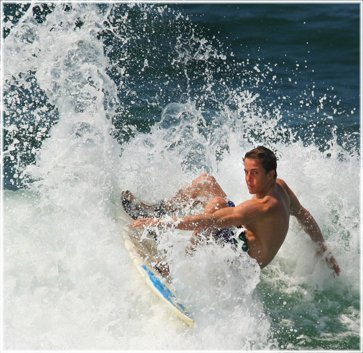
03/05/2009 07:44:11 PM · #1 |
Hi DPCers,
I am after some more feedback of what I can improve with this image.
Brutally honest critic welcome.
I want to know what I can improve on for next time & what post processing i can do to enhance it as i want to get it printed
Cheers
-Adrian
//www.dpchallenge.com/image.php?IMAGE_ID=767233
 |
|
|
|
03/05/2009 08:16:55 PM · #2 |
I think that this is a pretty good shot. You could play with the crop, but even at that I can't imagine that you would be able to do anything more with it. I think that it is good just like it is.
If you were to burn the shadows of the waves a little with a 5% or so burn you would probably get some cool depth in the splashes...? Or it might just screw it up.
Nice job |
|
|
|
03/05/2009 08:21:07 PM · #3 |
| I think it is pretty figgin good, so what ever Jason said, try that!! |
|
|
|
03/05/2009 08:25:22 PM · #4 |
| Wait for the surfer to shoot thru the tube. |
|
|
|
03/05/2009 08:26:51 PM · #5 |
| I have no idea what that means either, but it sounds good too!!!!!!!!!!!!!! |
|
|
|
03/05/2009 08:31:14 PM · #6 |
It seemed a little washed out to me, so I played with the middle lever of levels
 |
|
|
|
03/05/2009 08:33:14 PM · #7 |
| I liked it and wish it had finished higher than a few of the others. The only thing for this shot that I think would make it better would be if the entire spray of the wave was captured and not cut off. A bit more space may help as it feels like he is cramped in the frame. Thats all I got I like it. |
|
|
|
03/05/2009 08:37:51 PM · #8 |
I agree with the above, but to ad it may be my monitor but could kick the red down slightly just on his face...
Otherwise nothing I can pick apart so far, lighting, composition, aperture and shutter speed look like they all balanced out well. |
|
|
|
03/07/2009 09:25:40 PM · #9 |
| tone map it, or high-pass/overlay it to bring out the kickass droplets in the water. |
|
|
|
03/07/2009 10:00:28 PM · #10 |
 
I did a quick edit, mostly messing with high, mid, and low level contrast to bring out the great detail in the white water, and played with a quick monochrome conversion/yellow filter for fun, too. |
|
|
|
03/07/2009 10:01:33 PM · #11 |
sharpen, work with levels, work with curves, a bit with shadows/highlights, contrast.
im gonna go play with it a bit if you dont mind, its a great photo |
|
|
|
03/07/2009 10:06:48 PM · #12 |
| Might be my new monitor but I like his original better than the edits :) |
|
|
|
03/07/2009 10:10:01 PM · #13 |

Levels, saturation, sharpened. |
|
|
|
03/07/2009 10:18:29 PM · #14 |
|
|
|
03/07/2009 10:28:20 PM · #15 |
my first quick edit applied across the entire image was too much, too dark
so a quick re-re-edit using control points in nik viveza

brightened overall, but some selective contrast and such in the water area, and a bit of desat on the skin, face.
tried to be a little more true to the original, just enhancing the white water detail
Message edited by author 2009-03-07 22:35:08. |
|
|
|
03/08/2009 06:41:43 AM · #16 |
wow.. thanks for the feedback everyone! I have been away for the past couple of days and am totally excited with the comments and particularly the edits... Awesome. Will have to do a bit of a google to learn about some of these things (high-pass overlay, desaturation, etc)
thanks! |
|
|
|
03/08/2009 08:35:46 AM · #17 |
Personally I would probably have done a bit of d&b and some HDR or Lucis type filter, something like this:

|
|
|
|
03/08/2009 09:33:43 AM · #18 |
| Is it me, or does it look like the surfers head has been added on afterwards? |
|
|
|
03/08/2009 11:41:14 AM · #19 |
Yea, the head does seem either over processed or cut and pasted. I love the last version from  Mark-A. Mark-A. |
|
|
|
03/08/2009 01:10:57 PM · #20 |
I like the original the best, followed by  justine's edit. justine's edit. |
|
|
|
03/08/2009 01:46:36 PM · #21 |
Details in comments
R.
|
|
|
|
03/08/2009 04:23:20 PM · #22 |
"ripped" or "cut" muscles are terrible for art. they obscure the body's actual form and reflect arbitrary exercises rather than natural activities of the body. in order to improve this photo, I would have your model stop weightlifting immediately. his only exercise should be on the board. That way his muscles will reflect his activity.
Message edited by author 2009-03-08 16:23:42. |
|
|
|
03/08/2009 04:37:02 PM · #23 |
| I vote for Justine's edit! It brings out the brute force of the wave and adds punch to the image. |
|
|
|
03/08/2009 04:40:33 PM · #24 |
Originally posted by posthumous:
"ripped" or "cut" muscles are terrible for art. they obscure the body's actual form and reflect arbitrary exercises rather than natural activities of the body. in order to improve this photo, I would have your model stop weightlifting immediately. his only exercise should be on the board. That way his muscles will reflect his activity. |
ripped or cut muscles just piss me off in general.... guys with ripped or cut muscles and a full head of hair get an automatic 1 from me!! 
/sarcasm
|
|
|
|
03/08/2009 05:33:45 PM · #25 |
| i just realized my edit is probably really dark. sorry about that |
|
Home -
Challenges -
Community -
League -
Photos -
Cameras -
Lenses -
Learn -
Help -
Terms of Use -
Privacy -
Top ^
DPChallenge, and website content and design, Copyright © 2001-2025 Challenging Technologies, LLC.
All digital photo copyrights belong to the photographers and may not be used without permission.
Current Server Time: 12/03/2025 03:55:22 AM EST.


