| Author | Thread |
|
|
02/11/2009 01:13:20 PM · #26 |
Originally posted by Bear_Music:
Originally posted by yospiff:
May I join in with the same request on my own entry?
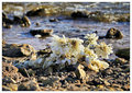
I knew the subject did not pop from the background a huge amount, but I also thought it conveyed a good story. I had anticipated a low 5, but it came in well under that, with few comments. I am curious if it was due to a lack of quickly absorbed visual impact, or if it was something else. Thanks.
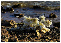 |
Couple things strike me here. Most importantly, the image is MUCH more meaningful after I read the photographer's comments. I'll grant that the story is *implied* in the image and the title, but it takes a fair amount of imagination and a little work to extract the scenario without the notes. I *think* if you'd titled it "She doesn't love me anymore!" you might have helped the viewers a bit more and scored a bit better, but I could be wrong.
Secondly, regarding the image itself, I find it to be annoyingly dense almost to the point of opacity, and I think a more washed-out rendition would have better served you on two fronts: it would have made the image itself come across a little less aggressively, and it would have better suited the mood of a washed-out relationship. Something like this maybe:
R. |
The flowers simply didn't pop out as the focal point. Bear's rendition helps this greatly, I feel.
I got the implied storyline, personally. And to be honest, I like the image in general. The DOF is great, and the bokeh is absolutely awesome, IMHO. |
|
|
|
02/11/2009 01:41:40 PM · #27 |
Can I play too?
 |
|
|
|
02/11/2009 01:46:16 PM · #28 |
Originally posted by yospiff:
May I join in with the same request on my own entry?
I knew the subject did not pop from the background a huge amount, but I also thought it conveyed a good story. I had anticipated a low 5, but it came in well under that, with few comments. I am curious if it was due to a lack of quickly absorbed visual impact, or if it was something else. Thanks.
|
I get the story, but for me I think the image lacked textural variation... the water, the rocks, the flowers, all show about the same amount of "busyness" throughout the frame which to me was a little offputting. For me it might have been more powerful as a wider landscape shot, with the flowers a smaller piece of the picture - that (I think) might have emphasized the fragility of the flowers (and the relationship) a bit more, and contextualized the 'discarded' angle. |
|
|
|
02/11/2009 01:51:11 PM · #29 |
Originally posted by eamurdock:
Can I play too?
|
Cluttered composition, soft image, appears noisy though that may be an illusion, and an unoriginal take on the challenge = low score. Personally, I'm bugged by the way the stack's tangent to the dome, and wish they were separated a bit, but others might think the juxtaposition is the one redeeming quality of the composition, I donno.
R
|
|
|
|
02/11/2009 01:59:27 PM · #30 |
Originally posted by yospiff:
May I join in with the same request on my own entry?
I knew the subject did not pop from the background a huge amount, but I also thought it conveyed a good story. I had anticipated a low 5, but it came in well under that, with few comments. I am curious if it was due to a lack of quickly absorbed visual impact, or if it was something else. Thanks.
|
So I took a shot at conveying the "end of relationship" mood a bit via a quick edit.....

|
|
|
|
02/11/2009 02:14:24 PM · #31 |
Originally posted by yospiff:
May I join in with the same request on my own entry?
I knew the subject did not pop from the background a huge amount, but I also thought it conveyed a good story. I had anticipated a low 5, but it came in well under that, with few comments. I am curious if it was due to a lack of quickly absorbed visual impact, or if it was something else. Thanks.
|
I appreciated the story and I totally got it from the photo, but in my opinion, there wasn't enough color contrast between the flowers and the background. The yellow cast hurts the image, and I think a handful of something delicate and pink might have come across better. I also think that a wider crop would have given it more of a feeling of something truly despairingly discarded - there's almost too much focus on the flowers as is. I used the same concept and storyboard for my Dirt entry way back when, and I thought the true challenge was to make the dirt beautiful. You have to remember, DPC likes pretty and colorful, even if the subject of the challenge doesn't lend itself to those things.

|
|
|
|
02/11/2009 02:17:26 PM · #32 |
|
|
|
02/11/2009 02:26:50 PM · #33 |
Originally posted by Rebecca:
in my opinion, there wasn't enough color contrast between the flowers and the background. The yellow cast hurts the image, and I think a handful of something delicate and pink might have come across better. |
A result of it being a found shot, I suppose. I played with curves and highlight/shadow quite a bit, but could not get the flowers to stand out from the background any better under basic rules. The yellow cast was because this was close to sundown, and I actually toned it down quite a bit from the original, which looked seriously unnatural, even though that is the way it was.
Message edited by author 2009-02-11 14:27:30. |
|
|
|
02/11/2009 02:27:35 PM · #34 |
Originally posted by Bear_Music:
Originally posted by eamurdock:
Can I play too?
|
Cluttered composition, soft image, appears noisy though that may be an illusion, and an unoriginal take on the challenge = low score. Personally, I'm bugged by the way the stack's tangent to the dome, and wish they were separated a bit, but others might think the juxtaposition is the one redeeming quality of the composition, I donno.
R |
Interesting. I see it as a collection of lines; horizontal along the bottom, and vertical along the side, and then layering in depth. I hadn't even seen the juxtaposition of the stack and the dome 'til you mentioned it, just the verticals. Not sure what I think of that aspect now that you mention it.
Thanks for the notes. |
|
|
|
02/11/2009 02:42:08 PM · #35 |
Originally posted by Bear_Music:
Originally posted by Adamsw216:
On that note... can I also post mine here for further critique???
 |
Came pretty close to top 20 so that's good :-) I only partly agree with Wendy on the pictures; they add great context to the image (breakup in a gallery?) but I agree the one behind him is overlit, it's hurting that it's so bright. Probably half a point right there in voting. I got no problem whatsoever with his shirt: how each of them is dressed is conveying personal information and I appreciate that. She's perhaps less of a free spirit than he, and perhaps this is at the core of their relationship issues? Who knows?
As Wendy says, the posing is terrific. The guy's clearly reaching out in pain, but it isn't overdone. Her drawn-in, slightly slumped, self-hug speaks volumes. I also appreciate that the top of her head is slightly truncated, I think that's important; it adds urgency and immediacy to the composition.
Mainly, what you need here is a better awareness of what's going on in the background when you set up shots like this; simply choosing a different wall or (if possible) sligthly redirecting the offending spotlight would have done wonders.
R. |
I concur: the eye is automatically drawn to the brightest element(s) of an image, and when that element is, distracting, uninteresting, etc. you might lose your viewer at the outset. Imagining for a moment that the wall behind the guy is featureless and gray, I would then also consider why he is so brightly lit. He is deliberately and properly oof. If he is deliberately highlighted to imply some positive aspect of him, or her thoughts for him, that might be okay, but it might not come across clearly. I think having her just slightly brighter than him would work well, as she is really "carrying" this image in terms of composition, emotion, story. But it is a good image, and well conceived.
Message edited by author 2009-02-11 14:42:58. |
|
|
|
02/11/2009 04:14:23 PM · #36 |
Originally posted by chromeydome:
Imagining for a moment that the wall behind the guy is featureless and gray, I would then also consider why he is so brightly lit. He is deliberately and properly oof. If he is deliberately highlighted to imply some positive aspect of him, or her thoughts for him, that might be okay, but it might not come across clearly. I think having her just slightly brighter than him would work well, as she is really "carrying" this image in terms of composition, emotion, story. But it is a good image, and well conceived. |
I think I have the opposite reaction: She dominates the image, but he's critical to it, even as he recedes from her consciousness, or as she recedes from him (it's ambiguous). I think BECAUSE he is OOF, it is essential that he BE lit that way, or we might lose him altogether as a significant participant in he drama.
R.
|
|
|
|
02/11/2009 04:19:40 PM · #37 |
I guess I found the wires and the large smoke stack detracting--they didn't seem to add anything to the picture in my mind. However, I did love the backlit smoke from the smaller stack. I would have liked it much simpler:
 |
|
|
|
02/11/2009 04:22:36 PM · #38 |
or possibly

|
|
|
|
02/11/2009 04:27:07 PM · #39 |
Originally posted by Bear_Music:
Originally posted by chromeydome:
Imagining for a moment that the wall behind the guy is featureless and gray, I would then also consider why he is so brightly lit. He is deliberately and properly oof. If he is deliberately highlighted to imply some positive aspect of him, or her thoughts for him, that might be okay, but it might not come across clearly. I think having her just slightly brighter than him would work well, as she is really "carrying" this image in terms of composition, emotion, story. But it is a good image, and well conceived. |
I think I have the opposite reaction: She dominates the image, but he's critical to it, even as he recedes from her consciousness, or as she recedes from him (it's ambiguous). I think BECAUSE he is OOF, it is essential that he BE lit that way, or we might lose him altogether as a significant participant in he drama.
R. |
Totally agree with you here Bear - In my mind the lighting on him and his OOF treatment render him almost surreal - I see him less as a figure sharing the same physical space and more as a 'thought bubble' of hers. I agree this effect would be increased by losing the picture in the BG, and maybe by moving away from the wall so it's a little darker and more obscure (though I assume the light on him was not easily mobile).
Thanks for your thoughts, Wendy - I personally really liked the wires; for me they energize the space considerably. I basically agree with you on the big smokestack... |
|
|
|
02/11/2009 04:36:58 PM · #40 |
This is a very good thread. I wish more threads like this happened, where we discussed why images work and don't work, not so much based on technique as on how the elements of them relate to each other.
R.
|
|
|
|
02/11/2009 05:14:26 PM · #41 |
Thank you so much for your feedback guys (keep it comin' if there's anything left!)
It made me smile when I was reading all of your interpretations. One thing I can say, is that the lighting that was used was, indeed, not mobile, and the pictures on the wall could not be removed. But I do agree that the wall (and/or what is on the wall) is rather unfortunate.
Edited for clarity.
Message edited by author 2009-02-11 17:37:45. |
|
|
|
02/11/2009 05:23:48 PM · #42 |
| I'm enjoying the thread immensely--and already planning on a similar one when the apple challenge is over! Thanks everyone! |
|
|
|
02/11/2009 05:32:36 PM · #43 |
Originally posted by Bear_Music:
This is a very good thread. I wish more threads like this happened, where we discussed why images work and don't work, not so much based on technique as on how the elements of them relate to each other.
R. |
Yup! I agree with all the comments about what make this a good image, and also wish that mat on the back wall wasn't so bright. In Advanced editing it would be easy to fix, but it's trickier under Basic.
I had a quick and crude go at toning it down using Curves -- someone better at color matching could probably do better with more time and patience.
 |
|
|
|
02/11/2009 06:06:48 PM · #44 |
Originally posted by Bear_Music:
Originally posted by chromeydome:
Imagining for a moment that the wall behind the guy is featureless and gray, I would then also consider why he is so brightly lit. He is deliberately and properly oof. If he is deliberately highlighted to imply some positive aspect of him, or her thoughts for him, that might be okay, but it might not come across clearly. I think having her just slightly brighter than him would work well, as she is really "carrying" this image in terms of composition, emotion, story. But it is a good image, and well conceived. |
I think I have the opposite reaction: She dominates the image, but he's critical to it, even as he recedes from her consciousness, or as she recedes from him (it's ambiguous). I think BECAUSE he is OOF, it is essential that he BE lit that way, or we might lose him altogether as a significant participant in he drama.
R. |
I don't think we are that far apart on this--I probably was unclear in my post. I was not suggesting much "darkening" or burning down of him--just a smidge so that, when combined with the darkening/removal of the bright picture behind him, he doesn't have hot spots (like his nose)--that would be enough, imo, no dramatic lightening or darkening anywhere (except that photo on the wall).
I agree, he is critical to this image, and his pose is perfect for the story. I also like the fact that he and the background are a bit lighter than the area behind her on the right--the top of her head going out of frame slightly avoids having a separator above her, and puts her right on the cusp between a light and dark place. That is one of the reasons I felt the lighting might be deliberately intended to imply some positive aspect of him, a sense of something good that could be lost (as opposed to a good-riddance loser sorta thing). Her position on the cusp here, along with her expression/emotion, suggest to me not a firm Ending just yet, but that horrible period of indecision for her, and helpless longing for him.
I like this image! :-)
|
|
|
|
02/11/2009 06:16:10 PM · #45 |
Originally posted by Bear_Music:
Originally posted by yospiff:
May I join in with the same request on my own entry?
|
Secondly, regarding the image itself, I find it to be annoyingly dense almost to the point of opacity, and I think a more washed-out rendition would have better served you on two fronts: it would have made the image itself come across a little less aggressively, and it would have better suited the mood of a washed-out relationship. Something like this maybe:
R. |
I understood where you were coming from with this one, but I agree that the photographers comments made more of an impact than a simple title could. I like the washed-out rendition that Robert edited because it feels less overwhelming, but I also like the sunset feel of your original... the end of the day seemed to compliment the story of the end of the relationship nicely for me. |
|
|
|
02/11/2009 06:20:08 PM · #46 |
vAwendy is the only one who gave me a new perspective to look at when she pm'd me about my entry and I wish we had talked earlier because as she told me she did not realize that the cross was on the side of the road I wish I'd have kept some of the road in it
I liked the side view better than having the full front but I still wish I had had some of the road.......opinions
or not because I only had two commments during the judging why would you comment now lol

and thank you Wendy for making me think further I wish we had talked before I submitted it lol.....I too wish to learn more |
|
|
|
02/11/2009 06:30:14 PM · #47 |
Originally posted by Pikkel:
vAwendy is the only one who gave me a new perspective to look at when she pm'd me about my entry and I wish we had talked earlier because as she told me she did not realize that the cross was on the side of the road I wish I'd have kept some of the road in it
I liked the side view better than having the full front but I still wish I had had some of the road.......opinions
or not because I only had two commments during the judging why would you comment now lol
and thank you Wendy for making me think further I wish we had talked before I submitted it lol.....I too wish to learn more |
I'm afraid this one isn't working very well at all. I didn't have any problem deducing that is was a roadside cross, probably marking the site on an accident I assumed, but just deducing it isn't enough. The angle is so unfortunate; it robs the cross completely of its iconic identity. And the image overall is just cluttered, it's just not really communicating anything other than "snapshot", which is never going to work very well on DPC.
I understand you like the side view better, probably because it's less obvious a solution, but maybe a little less of a side view, so the cross at least begins to be articulated? And, as has been suggested, work the road in somehow? And possibly an even lower angle, seeing if you can make the cross loom a bit? I donno...
R.
|
|
|
|
02/11/2009 07:03:07 PM · #48 |
| well I'm glad I'm takin snapshots maybe that is the problem |
|


