| Author | Thread |
|
|
12/10/2008 06:45:03 PM · #1 |
Can anyone help me put together a full page ad? The magazine needs it for a page in their magazine. I don't have anything good and I want to promote my business as much as I can. Anyone have any ideas?
|
|
|
|
12/10/2008 09:33:58 PM · #2 |
|
|
|
12/10/2008 09:42:59 PM · #3 |
Who do you want to appeal to? The younger generation or older folk?
ETA: I have this idea and I want to achieve it! But I want one of the photos from your website and it was like "no, you can't have that picture"...and it's not in your DPC portfolio. Sadness!
Message edited by author 2008-12-10 22:04:36. |
|
|
|
12/10/2008 11:09:39 PM · #4 |
What kind of magazine? Who is their target audience? Bride magazine and Sports Illustrated are very different targets so the ads would be very different.
If it's family oriented then push your family portraiture or perhaps sports T&I. If it's a childrens type magazine or aimed at younger families then baby/children portraiture might be a good thing.
There are several 'theories' (shall we call them that?) on how an ad should be laid out. It's based on how people read and see things. We read left to right, top to bottom. So the top left area should be there to get their attention and the lower right your logo/name/contact info.
Generally it's good to have a 'call to action' in an ad. "Call Today!" or "Limited Time Offer" type of thing. Give them a reason to contact you and do it now!
Then there is how you want the ad to look. I've seen photographers run ads without photos in them. Seems impressively stupid to me, but they don't think so I guess. Often one big pic is more attention getting, classy, high end than 10 smaller pics, but sometimes a bunch of smaller pics is what you want to show - a sequence or that you shoot studio and location perhaps.
I generally would tell you not to think like a consumer, but when it comes to ads you need to try and do that - would this ad appeal to the reader of the magazine? Would it get them to call you?
Then you have to decide what kind of response you expect to get. Did the ad work or not? Depends on what you expected. If you wanted to book 10 weddings and booked 9, yeah. booked 1? No. But was 10 an reasonable expectation? Who can say.
|
|
|
|
12/11/2008 02:06:42 AM · #5 |
OK, this is what I came up with:
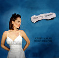
It's not very good, I did it in an hour and in the GIMP, I could make it tons better with time and Photoshop.
But I think you get the idea.
(I took a screenshot of the wedding picture, it's off your website, hope you don't mind...wish the model's head was angled just a bit more.)
ETA: Theoretically, the scrap of paper should be angled in the other direction, but I couldn't do it without much much pain.
ETA2: lol you could do a whole ad campaign with that type of idea...the scrap of paper and the lady against the plain color background. I know you have a "be original" in your profile...
Message edited by author 2008-12-11 02:33:51. |
|
|
|
12/11/2008 02:08:30 AM · #6 |
Originally posted by Jessi:
OK, this is what I came up with:
It's not very good, I did it in an hour and in the GIMP, I could make it tons better with time and Photoshop.
But I think you get the idea.
(I took a screenshot of the wedding picture, it's off your website, hope you don't mind...wish the model's head was angled just a bit more.) |
I think that is a pretty nice start... |
|
|
|
12/11/2008 07:02:16 AM · #7 |
Yes I think that is a pretty good start I like it.
The ad itself will be stuck in the middle of the magazine. The magazine will be available to the public but it's a high school oriented magazine. Meaning it's generally all about high school sports and rising stars. For example this picture
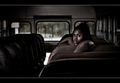
is of a high school senior that has a full scholarship to play football for Duke. This picture is on the cover of the magazine.
I am looking to advertise senior portraits, engagements photos, weddings, and so on... I'm still at home right now but later I will post what I gave them for this months ad. It's something I started to make but I wasn't happy with it. Then they needed something and I sent it to them, so to finish it up they added one of my pictures and some text. It works for now but again I'm not 100% happy with it.
Message edited by author 2008-12-11 07:13:43. |
|
|
|
12/11/2008 11:37:02 AM · #8 |
I'd offer to make a full-size one from originals for you (I love this kind of work, it's what I really want to do when I graduate) but it'd have to wait until January, I'm going home and my little mac only has the GIMP.
Now, if you don't mind waiting until January 10 or so...lol. |
|
|
|
12/11/2008 11:37:02 AM · #9 |
Seriously? I have a twin. Only explanation.
(stupid double posts)
Message edited by author 2008-12-11 11:37:34. |
|
|
|
12/11/2008 11:46:42 AM · #10 |
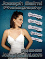
Okay here is what I came up with, what do you think?

|
|
|
|
12/11/2008 11:55:53 AM · #11 |
If you tilt all the papers the other way (with the highest corner being the top left), it will send the eye in towards the ad instead of out away from it. Could you move her over a little bit? She looks really cramped...
Other than that it looks pretty good...I would change the font you use for your business, it doesn't match the font on the papers...
Message edited by author 2008-12-11 11:57:51. |
|
|
|
12/11/2008 12:26:30 PM · #12 |
okay I changed the font and the papers but I could not mover her over because it's a PAIN THE ARSE, hahaha
I also changed the font on the papers to the same font as the site but it looks weird and I would have to have different font sizes which causes it to look funky. Here is what I came up with

|
|
|
|
12/11/2008 12:34:37 PM · #13 |
Originally posted by Dirt_Diver:
okay I changed the font and the papers but I could not mover her over because it's a PAIN THE ARSE, hahaha
I also changed the font on the papers to the same font as the site but it looks weird and I would have to have different font sizes which causes it to look funky. Here is what I came up with
|
you can tilt her or stretch the BG, scale her and then move her over with a stretched BG, put a frame on the page/image to stretch it some - lots of options!
|
|
|
|
12/11/2008 12:40:19 PM · #14 |
I'll see what I can do after lunch I'm starving hahaha
Thanks for the help guys
|
|
|
|
12/11/2008 02:02:11 PM · #15 |
I don't mean to be too critical, but here's what I think. Feel free to pick and choose.
- I would make the girl slightly smaller in the frame to leave more space for the text at the top.
- I would change the font of the text at the top and the bottom. Crazy fonts don't convey professionalism as much as simple fonts do. Maybe something along the lines of Arial, Franklin, or Verdana. I'd put the list in that font too.
- I would put "Joseph Salmi" on one line with "Photography" underneath it. I'd then space the letters out a bit (trick to make text as easy to read as possible), filling most of the horizontal space, but leaving decent margins on all four sides.
- I would keep the phone number on the right side, but I would make the website font the same size and make that aligned with the right too. I'd take off the "www." part, to save some space, and maybe capitalize the J and the S.
- Try putting the top and bottom writing in plain black or white (maybe with a slight border in the opposite color around each letter to make it stand out). Simplifying the font color could either make it look more professional or too boring, so go with how you feel on this one.
I hope that helps a bit! |
|
|
|
12/11/2008 02:19:45 PM · #16 |
.
Message edited by author 2008-12-11 14:21:18. |
|
|
|
12/11/2008 02:21:36 PM · #17 |
I agree...Also, if it's high school oriented, why would you have a photo of a woman in a wedding dress? Wouldn't you want to use an image of something that relates to high school kids instead of people in their 20's? I know it's an Ad for all of your photography but you could focus on something else and then also state what areas of photography you do.
Originally posted by Prof_Fate:
What kind of magazine? Who is their target audience? Bride magazine and Sports Illustrated are very different targets so the ads would be very different.
If it's family oriented then push your family portraiture or perhaps sports T&I. If it's a childrens type magazine or aimed at younger families then baby/children portraiture might be a good thing.
There are several 'theories' (shall we call them that?) on how an ad should be laid out. It's based on how people read and see things. We read left to right, top to bottom. So the top left area should be there to get their attention and the lower right your logo/name/contact info.
Generally it's good to have a 'call to action' in an ad. "Call Today!" or "Limited Time Offer" type of thing. Give them a reason to contact you and do it now!
Then there is how you want the ad to look. I've seen photographers run ads without photos in them. Seems impressively stupid to me, but they don't think so I guess. Often one big pic is more attention getting, classy, high end than 10 smaller pics, but sometimes a bunch of smaller pics is what you want to show - a sequence or that you shoot studio and location perhaps.
I generally would tell you not to think like a consumer, but when it comes to ads you need to try and do that - would this ad appeal to the reader of the magazine? Would it get them to call you?
Then you have to decide what kind of response you expect to get. Did the ad work or not? Depends on what you expected. If you wanted to book 10 weddings and booked 9, yeah. booked 1? No. But was 10 an reasonable expectation? Who can say. |
Message edited by author 2008-12-11 14:22:08. |
|
|
|
12/11/2008 03:03:18 PM · #18 |
Actually the girl in the photo is 16 and it's not a wedding dress, it's just a white dress. But I will look for a new photo. BBL
|
|
|
|
12/13/2008 11:40:16 AM · #19 |
okay here is what I came up with... I didn't think I had a better picture for the ad so I will have to shoot for the ad from now on.
|
|
|
|
12/13/2008 12:01:03 PM · #20 |
Try alternate-angling the the "torn paper" flyouts: let them overlap each other in a couple places. See how that looks. This looks to cut-and-dried to me; the teenagers will respond better to spontaneity than they will to formality.
R.
|
|
|
|
12/13/2008 12:34:23 PM · #21 |
| I find it wonderful, all the best, |
|
|
|
12/13/2008 12:37:16 PM · #22 |
The papers are going down, seems like you want your business to go down as well. That's not smart, you can better make them go upwards or mix them all togehter (might be stupid, but people will think that automatic, the mind totally playing games with them).
It's also too obvious that the papers look the same. Change some things in the papers individually, so they look different.
I also think the font is a bit too busy, especially with the papers and photo in the add. Might wanna keep it simple and in one color with a shadow.
Hope this helps! |
|
|
|
01/03/2009 10:41:26 PM · #23 |
I think I would change the image. Perhaps have more than one image. Right now you have more of a fashion shot or maybe a glamour shot. It doesn't really relate to much of what you are advertising. And the shot itself is pretty static. I think you need something with more youth and energy to it.
You might also weant to rethink the paper backgrounds advertising the services. It feels old school. Even the background itself feels too "dressed up" or formal. You need to generate some energy but also something the parents (who wioll probably be parting with the $$$) will buy. Maybe something a bit more Manga - you could retain the concept but use hard edged, angled backgrounds with some bold colors.
Right now it just feels too "old fashioned" to appeal to high schoolers.
Message edited by author 2009-01-03 22:52:10. |
|
|
|
01/03/2009 10:46:37 PM · #24 |
That's the challenge of senior photography. Who picks the photographer? The student or the parent?
90% of the time mom is the one that pays, so make sure you take pics mom will buy. Then take a few that the kid will like. Let the two of them fight over it amongst themselves - you just suggest they take both!
But first things first - you need someone to shoot. And it's usually the kids that see the images and care about the 'look' or want something like they've seen in a magazine or movie or the like.
|
|
Home -
Challenges -
Community -
League -
Photos -
Cameras -
Lenses -
Learn -
Help -
Terms of Use -
Privacy -
Top ^
DPChallenge, and website content and design, Copyright © 2001-2025 Challenging Technologies, LLC.
All digital photo copyrights belong to the photographers and may not be used without permission.
Current Server Time: 08/09/2025 01:47:36 PM EDT.


