| Author | Thread |
|
|
08/03/2008 11:46:24 PM · #1 |
New business "grand opening" event coming up and I need some advert to hand out.
There are 3 of us acting as co-owners and one of my jobs is all the graphic design. I'm not totally new to it, but I might as well be. It's not like riding a bike.
First off... graphic design is harder than it looks.
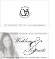
Second... I would love some critique on my logo and biz card. Be brutal... please. I wish I had more personality in my logo.
Is it obvious that my graphic design education stopped at typography? :)
biz card and logo
|
|
|
|
08/04/2008 12:07:40 AM · #2 |
| Actually I like them... your design is simple and effective. |
|
|
|
08/04/2008 12:12:15 AM · #3 |
| left a comment or two...Enzo |
|
|
|
08/07/2008 08:49:26 AM · #4 |
First impressions...no color? (mine don't have it either) Reason?
No email or website? Odd in this day and age not to see that on the card of a 'real' business
The back - on site nursing stands out to me. I see the line continues, but it's confusing.
Do you guys really do all this or is it a throw it out there and see what comes back kinda deal?
I don't see a tag line, as in "On-Site Photography Specialists" or "We come to you" or something.
I'd be tempted to make everything less centered - it's a bit too formal. Unless that's your style of portraiture.
|
|
|
|
08/07/2008 03:57:38 PM · #5 |
Originally posted by Prof_Fate:
First impressions...no color? (mine don't have it either) Reason?
No email or website? Odd in this day and age not to see that on the card of a 'real' business
The back - on site nursing stands out to me. I see the line continues, but it's confusing.
Do you guys really do all this or is it a throw it out there and see what comes back kinda deal?
I don't see a tag line, as in "On-Site Photography Specialists" or "We come to you" or something.
I'd be tempted to make everything less centered - it's a bit too formal. Unless that's your style of portraiture. |
Great comments, everybody!
Here is 2nd draft.
I don't know why I don't have color, to tell you the truth. Looks more formal to me, maybe?
The nursing home stuff is the only thing on there we haven't done. Just an idea thrown at us by our mom. Prolly should leave it off anyway. Really only had it on there to add sample text. :) Even on this next version, I'm sure we'll be changing the text a little, although we have at least some experience doing each of those. Again, I was just laying down a layout for now.
Tag line? Good idea.
Made the back a little more personal. Threw in our last bride... and I think we're getting closer.
Brochure is next and I'm REALLY going to need help there. |
|
Home -
Challenges -
Community -
League -
Photos -
Cameras -
Lenses -
Learn -
Help -
Terms of Use -
Privacy -
Top ^
DPChallenge, and website content and design, Copyright © 2001-2025 Challenging Technologies, LLC.
All digital photo copyrights belong to the photographers and may not be used without permission.
Current Server Time: 08/10/2025 09:12:53 AM EDT.


