| Author | Thread |
|
|
04/28/2008 03:50:38 PM · #1 |
Bumping this and changing all the text to avoid confusion - I am not complaining about my score - I don't care about the score particularly - but this picture looks really good on my huey calibrated laptop and did worse than I expected and got comments that said it is too dark.
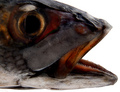
So if it does look dark on your monitor please let me know and also if any of the 5 edits below look better (ignoring the burning out a the edges of the fish).
Because I have a bright monitor I have a rule of thumb - I edit the picture until I like it, then brighten by 20 and increase contrast by 10, save for web and enter that - this seems to work okay for landscapes - but not for this picture.
In fact the entered picture above has already been adjusted in this way. The edit chosen by cpanioti is therefore brightened by more than +80 over how it looks good on my computer !!!!! If this is the case for a lot of people then clearly I have a serious problem with my monitor and or the calibration thingy.
It may of course just be that people don't like the picture or the subject or the arrangement but I thought the fish head looked vaguely architectural and I wanted an image that looked a bit like an illustration from an anatomy textbook, hence the flat on view and the white background. The shadow details on the forehead etc are mostly there because I burned them in, so if people voted it down because of the very directional light or the white background then that's fine, I like them.
So I'd be grateful if some people would take the time to say what score they gave the picture (or would have) and why. I promise not to come round and scratch your car even if you live close by. I'm just curious as to how badly the brightness of my monitor affects things.
If it's a light problem I'd be grateful if you could have a look at the 5 edits below and let me know if the light level is right on any of them.
[thumb]673851[/thumb] [thumb]673852[/thumb] [thumb]673854[/thumb] [thumb]673856[/thumb] [thumb]673857[/thumb]
I know there's some burning at the edges but i'm more interested in the overall light level.
Many thanks.
Message edited by author 2008-04-29 10:44:05. |
|
|
|
04/28/2008 04:13:01 PM · #2 |
| It's kinda neat--maybe those peeps don't have much gradation in the shadows. A bit of fill light to counter the harsh light in back might have made those foreground strutures stand out more, color wise. I'd have given it a 6 had I voted. I'm on a huey calibrated screen also. |
|
|
|
04/28/2008 04:39:23 PM · #3 |
| The lighting does cause some shadows. It's got some nice detail in it that I like. I'm preferring the next to the last edit, but, as you mentioned it would need some adjustments at the extremities. I think maybe the lighting would have been better in a different position in the first place. I would have given it a 5, possibly a 6, had I voted on that one. I think the average score was reasonable. Remember, a 5 on DPC is a darn good shot anywhere else. |
|
|
|
04/28/2008 04:40:05 PM · #4 |
| The eye area is rather dark though the rest seems to be exposed quite well. With any creature, the eye is the most important. If you wanted to emphasize the teeth then a closeup of the mouth area I think would present that better or at least a different angle that uses the teeth as a leading line. |
|
|
|
04/28/2008 05:18:11 PM · #5 |
edited
Message edited by author 2008-04-29 10:46:19. |
|
|
|
04/29/2008 11:19:11 AM · #6 |
| bump - cos i'd really like to know - how dark does this look on your monitor |
|
|
|
04/29/2008 11:31:17 AM · #7 |
On this monitor - an IBM ThinkPad Tablet PC they all look pretty good.
Original/1 - only real dark area is the eye and then it is dark in the middle where it should be so does not bother me or my impression of the photo at all.
002 - definitely lighter - highlights look better, nothing blown/burnt. The impression this leaves tends to be a bit stronger than 001.
003 - again, brighter but starts to get a bit distracting. Highlights are starting to get a bit too bright and some detail is lost that is present in first two. However, on the other side, the translucence around the mouth area looks more interesting.
004 - too bright. A lot of detail is lost. Definition of some parts of the fish against the background is lost.
005 - very bright and harsh looking along the top of the fish. A lot more definition against the background is lost.
Looking at all 5 side by side, my personal pick would be 002. Everything is clearly defined, luminance is good. |
|
|
|
04/29/2008 11:54:41 AM · #8 |
The fourth or fifth have the best detail in the shadows, but the fifth has lost detail in some bright areas (lower jaw for example). Raising contrast may have been your problem here; you already have a very high contrast image, and increasing the contrast means that the shadows just get deeper.
If you have to adjust brightness to avoid others feeling your images are too dark then the brightness of your monitor is too high. |
|
|
|
04/29/2008 12:09:01 PM · #9 |
| #'s 002 and 003 look the best to me on my NEC CRT screen. But to choos just one I would go for #002. |
|
|
|
04/29/2008 07:33:30 PM · #10 |
| As I move from 1 to 5 the highlight become more and more blown out. I wonder if the comment was made so that you would put more light on the subject. The feeling I get is the image has more light coming from behind than the front of the subject making the eye and top of the head look a little dark and losing some detail there. |
|
Home -
Challenges -
Community -
League -
Photos -
Cameras -
Lenses -
Learn -
Help -
Terms of Use -
Privacy -
Top ^
DPChallenge, and website content and design, Copyright © 2001-2025 Challenging Technologies, LLC.
All digital photo copyrights belong to the photographers and may not be used without permission.
Current Server Time: 10/14/2025 07:08:30 AM EDT.


