| Author | Thread |
|
|
01/02/2008 04:36:44 PM · #1 |
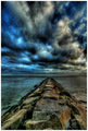
In case anyone's interested, here's the before & after of my Perspective entry "The Myth of Gravity":
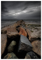 as entered as entered
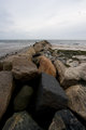 unprocessed except resize from a neutral RAW file (no adjustments at all) unprocessed except resize from a neutral RAW file (no adjustments at all)
Except for the tone mapping, there is virtually no processing on this image. I used a slight vignette, sharpened, resized, added a border. All the processing was done in Photomatix Pro. First time I ever done one quite like this.
For purposes of comparison, here's a shot taken a little more than a year earlier for the last "Perspective" challenge. The sky, of course, is much more dramatic. I also set the camera at knee height this time, to emphasize the rocks, rather than the eye-level it was at last time.
This year's finished at 6.5, last year's at 6.8 � but I like this year's better, myself. The other looks cartoonish to me now.
R.
Message edited by author 2008-01-02 16:37:08.
|
|
|
|
01/02/2008 04:57:49 PM · #2 |
That's pretty amazing!
Can we get the steps you used in Photomatix so we may attempt replications for our own less-fantastic shots?!
|
|
|
|
01/02/2008 05:07:37 PM · #3 |
Thanks for sharing!
I like the new one too .. it's more calm then the old one.
-N.
|
|
|
|
01/02/2008 05:15:18 PM · #4 |
| I really need to learn how to tone map... |
|
|
|
01/02/2008 05:31:10 PM · #5 |
The processing on the new one is amazing. Personally I prefer the composition of last year's version, but not enough to warrant the higher score.
|
|
|
|
01/02/2008 05:33:50 PM · #6 |
| I love the effect you got in the clouds, it makes them look like liquid. |
|
|
|
01/02/2008 07:58:58 PM · #7 |
Unfortunately, there's no way to "recapture" the tone mapping settings without recreating the whole thing, which I don't have the energy for. I don't write this stuff down :-( I just play with sliders until it looks right...
R.
|
|
|
|
01/02/2008 09:08:21 PM · #8 |
Originally posted by Bear_Music:
Unfortunately, there's no way to "recapture" the tone mapping settings without recreating the whole thing, which I don't have the energy for. I don't write this stuff down :-( I just play with sliders until it looks right...
R. |
Photomatrix doesn't allow you to save settings?
Hmmmmmmm....may rethink the purchase angle now.
|
|
|
|
01/02/2008 09:10:05 PM · #9 |
Hey Bear that first shot of yours that you entered is beautiful
|
|
|
|
01/02/2008 09:10:10 PM · #10 |
|
|
|
01/02/2008 09:11:49 PM · #11 |
| Could you explain the title, "Myth of Gravity", please. |
|
|
|
01/02/2008 09:59:50 PM · #12 |
Originally posted by DistantColours:
Could you explain the title, "Myth of Gravity", please. |
Beat me to it!
But aside from that, thanks for posting the original, Robert. So much comes from simply seeing what's possible. I'd bet most people would've tossed your original as blown out and not worth pursuing.
FWIW, to me also, your old one is cartoonish. I much prefer the new one.
|
|
|
|
01/02/2008 10:33:32 PM · #13 |
Originally posted by levyj413:
Originally posted by DistantColours:
Could you explain the title, "Myth of Gravity", please. |
Beat me to it!
But aside from that, thanks for posting the original, Robert. So much comes from simply seeing what's possible. I'd bet most people would've tossed your original as blown out and not worth pursuing. |
"The Myth of Gravity" just came to me. It relates to the solidity and mass of the stones, the brooding weight of the sky, and the bird hung between in defiance. I'm a poet, I do stuff like that...
As for the processing, FWIW I took the image with the end product in mind. That was the exposure I chose to work with, because it had full detail in the stones and nothing was totally blown in the histogram.
R.
|
|
|
|
01/03/2008 12:05:30 AM · #14 |
Originally posted by Man_Called_Horse:
Photomatrix doesn't allow you to save settings?
Hmmmmmmm....may rethink the purchase angle now. |
No, you can definitely save the settings. I have a few settings saved. But this one was very atypical, I was just noodling, I didn't save anything.
R.
|
|
|
|
01/03/2008 12:22:42 AM · #15 |
Originally posted by Bear_Music:
I was just noodling, I didn't save anything.
R. |
"noodling"...the technical term for creating art :) |
|
|
|
01/03/2008 01:09:47 AM · #16 |
Originally posted by Bear_Music:
This year's finished at 6.5, last year's at 6.8 � but I like this year's better, myself. The other looks cartoonish to me now.
R. |
Well if it helps I thought it was pretty bad back then. :) I wouldn't even say it's bad because it looks cartoonish because cartoonish can look great (just see Susi's work that has that aspect). To me the turn off is that it just looks like an effect was applied arbitrarily with little to no craftmanship involved. Your latest shot, while not cartoonish, simply feels like it was done by someone who is experienced in the tools he's using from start to finish.
ETA: Reading some of your comments on your old shot it seemed many thought it was overprocessed. I think that term gets used incorrectly often but there they were correct. To me overprocessed is when you push the image data so far that it has degraded badly. The heavy noise in the shot is a big indication of this.
Message edited by author 2008-01-03 01:13:01.
|
|
|
|
01/03/2008 10:48:14 AM · #17 |
Originally posted by yanko:
Well if it helps I thought it was pretty bad back then. :) I wouldn't even say it's bad because it looks cartoonish because cartoonish can look great (just see Susi's work that has that aspect). To me the turn off is that it just looks like an effect was applied arbitrarily with little to no craftmanship involved. Your latest shot, while not cartoonish, simply feels like it was done by someone who is experienced in the tools he's using from start to finish.
ETA: Reading some of your comments on your old shot it seemed many thought it was overprocessed. I think that term gets used incorrectly often but there they were correct. To me overprocessed is when you push the image data so far that it has degraded badly. The heavy noise in the shot is a big indication of this. |
Well, I'd be the first to agree. Cartoonish, clumsy, overdone, whatever adjective works for you � it isn't very good at all (the old one, I mean). I felt that way as soon as I saw it with fresh eyes on the voting page, and of my higher-scoring images it's the one that makes me cringe the most. All I can say is, that was done in the early days of my tone mapping voyage of discovery :-)
R.
|
|
|
|
01/03/2008 11:08:10 AM · #18 |
I've noticed that it's quite common with a new editing tool to push it to the limits , it seems to be part of the learning curve discovering how far you can go. But through that process the tools get mastered and that's when elegant use of the technique is learned. Bear your older shot is flashy and I think appeals to the uneducated (insofar as photography software goes) eye. Your latest shot is a very elegant image.
One day I'll master some tools too :D
|
|
|
|
01/03/2008 11:33:16 AM · #19 |
I definitely prefer this year's entry too, for many of the reasons that have already been said. What I find amazing is how you've taken what looks to be a really ordinary photograph and brought out all the drama, lighting and texture - without making it look overprocessed (which I think is the real knack, as Wildcard has just kind of said).
The worst part is I think I'd probably have just skimmed past that one and looked for another image! I too have to get my post processing skills up a LONG way as it seems that shooting the photo is only half of the story these days - in that you (one) can take an average photo and with good pp skills make it an outstanding photo, and conversely you can also take a good photo and make it terrible with bad pp skills! (or just not bring it out to its potential).
It's through people like you posting up various edits of photos that people like me get to learn what can be done with a naked photo - thanks :)
N |
|
|
|
01/03/2008 11:58:16 AM · #20 |
Originally posted by fastforward:
The worst part is I think I'd probably have just skimmed past that one and looked for another image! I too have to get my post processing skills up a LONG way as it seems that shooting the photo is only half of the story these days - in that you (one) can take an average photo and with good pp skills make it an outstanding photo, and conversely you can also take a good photo and make it terrible with bad pp skills! (or just not bring it out to its potential). |
To a large extent, "shooting the photo", at least in landscape work, has always been only half the story. It's been said before, but Ansel Adams' post processing is what makes his images sing. Straight prints from the negatives are often pretty banal, and anyway the negatives themselves (zone system negatives) represent a great deal of what we call PP work before the print is even made.
As for the "average photo" issue, the key is what the zone system people call "previsualization"; the ability to see the finished image before you click the shutter. And this comes from a deep awareness of the limitations/possibilities of your medium. So that the image looks "ordinary" in its pre-processing form is neither here nor there; the elements needed to construct the finished image are all present (full detail in shadows, no blown-out areas, composition as desired, in this case) and the photographer is on track.
It's always nice when you can capture a shot straight out of the camera that's in every way exactly what you were shooting for, and that's definitely a skill to work on and cherish. "Getting it right in camera" is very satisfying. But there's more to photography than that, or else photography becomes nothing more than the accurate recording of a moment snatched from time. For me the greatest satisfaction always comes from seeing with the mind's eye, and then using skills I have carefully developed to translate that seeing into a finished image that is fathful to my intentions at the time I captured it.
R.
Message edited by author 2008-01-03 11:59:15.
|
|
|
|
01/03/2008 12:23:12 PM · #21 |
Originally posted by Bear_Music:
It's always nice when you can capture a shot straight out of the camera that's in every way exactly what you were shooting for, and that's definitely a skill to work on and cherish. "Getting it right in camera" is very satisfying. |
That's very much the school of thought that I come from, but it's definitely not enough anymore. Photography has definitely moved on leaps and bounds and I'm still stuck being a pseudo purist whilst others are constructing fantastic images (and the whole studio/constructing photos thing is totally new to me and my inner d!ckhead grumbles about it all the time!).
Originally posted by Bear_Music:
But there's more to photography than that, or else photography becomes nothing more than the accurate recording of a moment snatched from time.
|
In a way that's the photography that I really enjoy the most - gritty snapshots in time - freezing reality if you will...but this site has shown me that there's just so many more creative options in the post processing phase to create almost magical images.
I need to develop an eye like you say...for the unnatural, or rather the possibilities...
N |
|
|
|
01/03/2008 12:34:18 PM · #22 |
Originally posted by fastforward:
Originally posted by Bear_Music:
But there's more to photography than that, or else photography becomes nothing more than the accurate recording of a moment snatched from time.
|
In a way that's the photography that I really enjoy the most - gritty snapshots in time - freezing reality if you will...but this site has shown me that there's just so many more creative options in the post processing phase to create almost magical images.
I need to develop an eye like you say...for the unnatural, or rather the possibilities... |
Here's the thing of it; I understand exactly what you're saying. There's a whole category of photography where PP for effect runs counter to the spirit of the thing. And I appreciate that sort of work and even do it sometimes.
But when you talk about an "eye for the unnatural", that I disagree with. What I accomplished with the "Myth of Gravity" image is what I was seeing, and it is not "unnatural", at least not to me. The sky was dark and heavy, the rocks dense and massive, the sea like heavy metal, the birds like transient ghosts between the two.
Don't take the "before" image as representative of what the scene "really" looked like; it represents a 2-stop overexposure, at least, and it was shot with the lowest possible contrast (which is my default setting on my camera). Open that image up in photoshop, adjust it until the sky is way darker, then add some contrast to pop the sky, and that's closer to what I was seeing. It was a dark and gloomy day.
What the tone mapping allows me to do is to keep detail and local-area contrast in the dark areas of the image, and that's the way the eye actually sees the scene. So I'd submit that in many ways the tone mapped version is closer to "reality" (whatever that is) than the overexposed, before image upon which it was built.
R.
|
|
|
|
01/03/2008 12:44:44 PM · #23 |
Gotcha! Thanks for the brilliant explanation.
N |
|
Home -
Challenges -
Community -
League -
Photos -
Cameras -
Lenses -
Learn -
Help -
Terms of Use -
Privacy -
Top ^
DPChallenge, and website content and design, Copyright © 2001-2025 Challenging Technologies, LLC.
All digital photo copyrights belong to the photographers and may not be used without permission.
Current Server Time: 10/14/2025 01:13:40 AM EDT.


