| Author | Thread |
|
|
12/07/2007 12:50:03 AM · #1 |
I think it's interesting that the top two shots in Alone in a Crowd are more than 0.5 points apart:
Now, in some cases, you can argue that they might have had votes from different people, but I don't think so in this case:
- each received nearly 300 votes
- it was a small challenge, so I'd bet most people voted nearly 100%, meaning there must've been a huge number of people who voted on both
|
|
|
|
12/07/2007 12:53:25 AM · #2 |
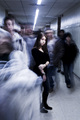
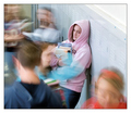
One had a girl...the other had a guy.
|
|
|
|
12/07/2007 12:54:21 AM · #3 |
| I'd argue that while they are both technically good, the blue ribbon has a certain dark moodiness that sets it apart. Also I think the eye contact with the subject adds a lot... It feels almost cinematic. I think that's the order I'd have put them in, with the added note that they're both terrific shots well worthy of their ribbons. |
|
|
|
12/07/2007 12:54:57 AM · #4 |
Originally posted by Judi:
One had a girl...the other had a guy. |
Umm... Pretty sure they're both girls.
Message edited by author 2007-12-07 00:55:38. |
|
|
|
12/07/2007 12:57:17 AM · #5 |
Originally posted by eamurdock:
Originally posted by Judi:
One had a girl...the other had a guy. |
Umm... Pretty sure they're both girls. |
Hehehehe....just checking that you were watching!!!!
|
|
|
|
12/07/2007 12:58:15 AM · #6 |
Originally posted by eamurdock:
I'd argue that while they are both technically good, the blue ribbon has a certain dark moodiness that sets it apart. Also I think the eye contact with the subject adds a lot... It feels almost cinematic. I think that's the order I'd have put them in, with the added note that they're both terrific shots well worthy of their ribbons. |
Exactly what he said...
The Dark shot just had more impact for me. |
|
|
|
12/07/2007 01:01:30 AM · #7 |
| The first shot, while in color, is closer to monochromatic in nature, which suits it well. I also think the very strong leading lines in the composition play a part in the higher score. I happen to have voted both the same (I think - I'll check in a minute) because by gosh, they had blur! They had motion! They had life to them! :-) |
|
|
|
12/07/2007 01:01:49 AM · #8 |
A pink hoodie doesn't scream "alone" quite like all black.
Also, the 1st has some strong compositional elements that draw your eye toward the subject, which the second is lacking.
Message edited by author 2007-12-07 01:03:15.
|
|
|
|
12/07/2007 01:02:54 AM · #9 |
I should've said that I agreed with the very high ratings for both and the relative ranking - I gave the winner a 10 and the second-place shot an 8.
Even during voting, I had a hard time articulating why I preferred the winner, though.
|
|
|
|
12/07/2007 01:13:26 AM · #10 |
You can't help but look at the girl in the first picture. Your eyes are drawn to her ... almost "slapped into place". There. In the second picture, your eyes have a chance to wander around a bit more. There isn't that "gravitational pull" to the subject.
As to why this is? Some thoughts: composition, focus, lighting, eye contact.
|
|
|
|
12/07/2007 01:20:01 AM · #11 |
The blue has better leading lines along with that riveting gaze. You can tell it's the bustling time between classes when everybody is trying to get somewhere. In the second one it seems that some of the important action is off camera. But.. I like them both.
|
|
|
|
12/07/2007 02:09:02 AM · #12 |
I will agree with the leading lines in the blue ribboner. Everything points to the main subject...lights on the ceiling, top of lockers, baseboards on floor, most of the motion blur, even the way she is holding her arm points my eyes to connect with hers. In the red ribboner, the attraction to the main subject just isn't as strong...not as many leading lines, the motion blur trails aren't as long, the color makes my eye want to bounce around the picture, and when I finally look at the subjects eyes I wonder "what is she looking at?" then I try to search that out.
Both are exceptional shots and by far the best of the challenge.
My $0.02
-drew |
|
|
|
12/07/2007 02:21:59 AM · #13 |
I think the emo girl can kick pink hoodie girl's ass. May not have anything to do with the scoring, but I'm just sayin. :P
On another note, I vote for Jeff ( levyj413) to head the new Challenge Forensics department. levyj413) to head the new Challenge Forensics department. |
|
|
|
12/07/2007 03:03:03 AM · #14 |
Part of the reason the Blue Ribbon shot works so well, aside from all the previously-mentioned factors such as leading lines, eye contact, etc is that it is shot at eye level. The Red Ribbon shot is from "above the crowd", whereas the Blue Ribbon shot is from "within the crowd". So the Blue is intensely personal (the eye contact and the composition both reinforce this) while the Red is somewhat more detached, more "observational" than "involved".
Consequently, there's a significantly higher emotional connection being made in the Blue shot, and this accounts for the difference in score.
R.
|
|
|
|
12/07/2007 06:53:06 AM · #15 |
I think the most interesting part of both photos is that one is from the viewpoint of a teacher (2nd place) and one is from the viewpoint of the student (1st place).
The student viewpoint is much darker, more focused on the one individual, a little more of a personal feeling. Its as if the student feels alone in their own tight world without awareness of other people.
The teacher viewpoint is lighter, more omniscient. Its as if the teacher notices a student feels alone, but is aware that other people are around. |
|
|
|
12/07/2007 07:28:57 AM · #16 |
Originally posted by PGerst:
I think the most interesting part of both photos is that one is from the viewpoint of a teacher (2nd place) and one is from the viewpoint of the student (1st place). |
That's interesting, I didn't realize that until I checked Jen's profile just now...
R.
|
|
|
|
12/07/2007 08:43:44 AM · #17 |
Originally posted by eamurdock:
I'd argue that while they are both technically good, the blue ribbon has a certain dark moodiness that sets it apart. Also I think the eye contact with the subject adds a lot... It feels almost cinematic. I think that's the order I'd have put them in, with the added note that they're both terrific shots well worthy of their ribbons. |
Agreed. I think in the second, the pink hoodie conveys happiness... so she could simply be taking a break while a hectic day goes on around her.
The black top on the blue ribbon one conveys depression and isolation in the crowded setting. Almost as if she's invisible to the world around her.
Imagine a party scene -- you have two photos each showing a person off to the side of the dance floor. One is having a drink and looks tired. The other is sullen and sheepishly watching the action. Same general principle, but the details convey different moods. IMO.
Both great ideas and both well executed -- however it just shows how important all aspects of the photo come together to give the theme.
|
|
|
|
12/07/2007 09:20:16 AM · #18 |
I agree with all of the above points about the blue. The black outfit contrasting sharply with the background, the arms framing the subject, and the sudden direct, eye level eye contact and expression on her face all make the blue much stronger.
The other one is good too, but I agree that she just looks tired or mentally not focused on anything going on around her.
Message edited by author 2007-12-07 09:21:11.
|
|
|
|
12/07/2007 10:32:25 AM · #19 |
| In the 2nd one the guys back of head view detracts and interferes with the subject. |
|
Home -
Challenges -
Community -
League -
Photos -
Cameras -
Lenses -
Learn -
Help -
Terms of Use -
Privacy -
Top ^
DPChallenge, and website content and design, Copyright © 2001-2025 Challenging Technologies, LLC.
All digital photo copyrights belong to the photographers and may not be used without permission.
Current Server Time: 09/10/2025 12:54:18 PM EDT.


