| Author | Thread |
|
|
11/26/2007 05:20:25 AM · #1 |
Please be honest even if it hurts me... :)
I received 6 comments on this photo and they tell me the photo is good...
I was expecting at least a 6 on it and got only a 5.5
The point here is what should make the photo better and what is wrong... please give your honest opinion, feel free to make any comment...
Thanks! |
|
|
|
11/26/2007 05:36:57 AM · #2 |
Originally posted by marcusvdt:
Please be honest even if it hurts me... :)
I received 6 comments on this photo and they tell me the photo is good...
I was expecting at least a 6 on it and got only a 5.5
The point here is what should make the photo better and what is wrong... please give your honest opinion, feel free to make any comment...
Thanks! |
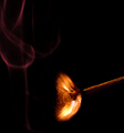
You have an almost perfect bell curve of scores, with exactly as many 5's as 6's, where an average vote on a scale of 10 is theoretically 5.5.
The image is technically competent and has a little bit of a "gee whiz" factor, which is, I think, the part your commenters are reacting to; they are seeing something we ordinarily cannot see.
But compositionally the image is lackluster, arbitrary, and from an "emotional" perspective there's really nothing there.
That's the closest I can come to a "reason" why you received a straight middle-of-the-road score; it seems to me exactly where the image belongs, pretty much.
R.
|
|
|
|
11/26/2007 05:42:34 AM · #3 |
Originally posted by Bear_Music:
Originally posted by marcusvdt:
Please be honest even if it hurts me... :)
I received 6 comments on this photo and they tell me the photo is good...
I was expecting at least a 6 on it and got only a 5.5
The point here is what should make the photo better and what is wrong... please give your honest opinion, feel free to make any comment...
Thanks! |
You have an almost perfect bell curve of scores, with exactly as many 5's as 6's, where an average vote on a scale of 10 is theoretically 5.5.
The image is technically competent and has a little bit of a "gee whiz" factor, which is, I think, the part your commenters are reacting to; they are seeing something we ordinarily cannot see.
But compositionally the image is lackluster, arbitrary, and from an "emotional" perspective there's really nothing there.
That's the closest I can come to a "reason" why you received a straight middle-of-the-road score; it seems to me exactly where the image belongs, pretty much.
R. |
Thanks!
Regarding the composition and emotional aspects, do you think a hand handling the match would make it better? Also, the smoke is good or it should be removed? |
|
|
|
11/26/2007 05:45:02 AM · #4 |
| The flame is the cool part - I would have focused on that. Placing the flame at the lower left and having the matchstick going up at an angle to the upper right may have brought more impact and not appeared to be quite so static |
|
|
|
11/26/2007 06:06:52 AM · #5 |
Originally posted by marcusvdt:
[quote=Bear_Music] [quote=marcusvdt]
Thanks!
Regarding the composition and emotional aspects, do you think a hand handling the match would make it better? Also, the smoke is good or it should be removed? |
The smoke is a distraction, at least insofar as it is used in this particular exposure. I can see the smoke being a strong part of a perfected image, but it would need to be stronger and more expressive than it is in this capture. This variant below is stronger compositionally, though I doubt shooting it this way would have bumped the score significantly.
As to the "emotional" content, it's worth noticing that the highest-scoring of the "bursting balloon" shots DID include a hand in the composition. So I'd say yeah, that's probably a way to go. At least the inclusion of a hand/fingers would bring scale to an otherwise ambivalently-scaled image.
R.
Message edited by author 2007-11-26 06:07:17.
|
|
|
|
11/26/2007 06:10:50 AM · #6 |
| I agree with Bear on this one - a human context may have helped you out a bit. Another thing is that the technicals would have been out of this world to score much better than you already did. The flame, the stick, and the sparks really need to be in sharp focus to really get that wow factor. |
|
|
|
11/26/2007 06:15:53 AM · #7 |
| I would have probably given it a 5. I know that the photo is quite impressive when you consider what it's a photo of and how hard it would have been to take, but I find it basically unimpressive to look at. I dont find the shape of the flame aesthetically pleasing and the fact that the smoke is so far from the flame is confusing. It's not a bad shot but I just dont think it has the impact to be a really good shot. |
|
|
|
11/26/2007 06:16:47 AM · #8 |
I think nothing wrong with the smoke, but too many streaks on the sparks because they are too fast. I think what voter wanted to see in this challenge is, no motion blur or streak like this, rather clean stopped-motion with clean edges clean sharp subject frozen in time.
my 2 cents
|
|
|
|
11/26/2007 06:46:13 AM · #9 |
| Just no wow factor for me I'm afraid. I am a sucker for a pretty picture and this just doesnt excite me. |
|
|
|
11/26/2007 09:02:26 AM · #10 |
I'm not even going to look at the other responses yet, so I can give you my impression without influence.
The composition does not seem to work for me. All that black space at the top right leads my eye away from the subject, as if I am looking for something else. It was clearly a difficult thing to catch, both for timing and low light. I would likely not do any better. The match also seems indistinct and slightly blurred. Here's a similar shot from a recent challenge that I had liked enough to place in my favorites:

Hope that helped some. I've had a few of my own "masterpieces" that bombed in a challenge, leaving me scratching my head over them.
Message edited by author 2007-11-26 09:03:14. |
|
|
|
11/26/2007 02:48:37 PM · #11 |
Tks, everybody.
My conclusion is that for the same subject and idea to be better, I'd need to remove the smoke, cropping it to make the match appear on the full frame. Also, more light on the wood part of the match would help. Also I'd need to get a crispier focus on the flame. I set the focus to the head of the match. The focus, together with the not so fast shutter speed, made the flame a little bit blurred.
The only thing that I would not be able to fix with my camera is the speed, since it goes up to 1/2000 and I found out that this is not enough to get an explosion look. Judging by the photo, I think a shutter speed of 1/8000 would be enough. |
|
Home -
Challenges -
Community -
League -
Photos -
Cameras -
Lenses -
Learn -
Help -
Terms of Use -
Privacy -
Top ^
DPChallenge, and website content and design, Copyright © 2001-2025 Challenging Technologies, LLC.
All digital photo copyrights belong to the photographers and may not be used without permission.
Current Server Time: 09/10/2025 02:28:29 PM EDT.


