| Author | Thread |
|
|
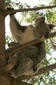
10/12/2007 10:45:54 PM · #1 |
I took this photo a few days ago. I was fighting the sun a little and now it is a little too dark. I have tried to adust it but am not getting it right. Could someone help me to get the creams a little whiter and bring out more detail. Please let me know what steps you use so I can replicate it on my larger file. Thanks for any help that can be given.
 |
|
|
|
10/12/2007 11:18:06 PM · #2 |
| I don't have time now, but I'd like to give it a try. |
|
|
|
10/12/2007 11:36:09 PM · #3 |
Here is what I thought it should look like.
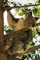
I added a very small amount of neat image, then:
added a brightness (-65)/contrast (-5) adjustment layer
-masked the bears and the tree out of the layer
added a levels adjustment layer and took the lights to 220
added a curves adjustment layer (183,223) and (60,50) curve
...and viola...done.
|
|
|
|
10/12/2007 11:50:01 PM · #4 |
Here's my quick take on it:
Use shadow/highlight adjustment to mute the highlights and free up the shadows. Play with all 3 sliders on each setting to fine-tune.
Then use image/adjustment/match color, check the "neutralize" box, and fine tune intensity and luminance.
Finally, use hue/saturation to desat blue and cyan, both of which got amped up in the BG when the neutralized match color was used.
R.
|
|
|
|
10/13/2007 12:10:59 AM · #5 |
Originally posted by ericwoo:
Here is what I thought it should look like.
I added a very small amount of neat image, then:
added a brightness (-65)/contrast (-5) adjustment layer
-masked the bears and the tree out of the layer
added a levels adjustment layer and took the lights to 220
added a curves adjustment layer (183,223) and (60,50) curve
...and viola...done. |
I like the detail in the darker areas but I still find the lighter areas are a bit to creamy in colour. I will try to see if I can at least achieve the detail. |
|
|
|
10/13/2007 12:11:58 AM · #6 |
Originally posted by Bear_Music:
Here's my quick take on it:
Use shadow/highlight adjustment to mute the highlights and free up the shadows. Play with all 3 sliders on each setting to fine-tune.
Then use image/adjustment/match color, check the "neutralize" box, and fine tune intensity and luminance.
Finally, use hue/saturation to desat blue and cyan, both of which got amped up in the BG when the neutralized match color was used.
R. |
This has come up really well. This is the finish I wante to achieve. I will follow your steps and see how I go. Thanks. I will post my finished product later. |
|
|
|
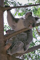
10/14/2007 02:16:23 AM · #7 |
Well here's my effort. Used suggestions given by Bear_Music. I'm happy with the result.
 |
|
|
|
10/14/2007 03:16:18 AM · #8 |
That's good! Better than mine, got a little more life and contrast into the shadows. Good job!
R.
|
|
|
|
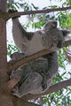
10/14/2007 04:12:39 AM · #9 |

Highlight/Shadows
levels
curves (eyedropper - choose darkest point, lightest point and midtone)
contrast/brightness
burn/dodge.
Steph
|
|
|
|
10/14/2007 06:52:22 AM · #10 |
| This is good too Atsxus. Only thing I'm not really keen on is the catch light in the eye. It' amazing how you can get such similar effects using different techniques. |
|
Home -
Challenges -
Community -
League -
Photos -
Cameras -
Lenses -
Learn -
Help -
Terms of Use -
Privacy -
Top ^
DPChallenge, and website content and design, Copyright © 2001-2025 Challenging Technologies, LLC.
All digital photo copyrights belong to the photographers and may not be used without permission.
Current Server Time: 08/28/2025 11:30:21 AM EDT.


