| Author | Thread |
|
|
10/06/2007 09:10:25 AM · #1 |
I think they are too grainy.....are they?
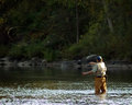
Small competition, "why we love Central NY" can't reshoot cuz it had to be photographed last weekend...looked ok on camera
[thumb]596116[/thumb] [thumb]596117[/thumb]original
[thumb]596118[/thumb] [thumb]596119[/thumb]
[thumb]596121[/thumb]
Thanks for the imput....salvageable or skip the competition... |
|
|
|
10/06/2007 09:41:46 AM · #2 |
| They look a tad grainy to me......but if there is no entry fee, why not enter, you never know. Good luck! |
|
|
|
10/06/2007 09:52:49 AM · #3 |
Go for it! :)
I'd go with this one. I think it strikes the best balance betwen the fisherman and the scenery. Although, it would help the ones with more scenery if the guy was facing ionto the picture, rather than out of the frame when he's close to the edge.
[thumb]596121[/thumb] |
|
|
|
10/06/2007 09:58:22 AM · #4 |
Thank you both....
now I'll try to tweak it abit and maybe decrease some of the noise...
|
|
|
|
10/06/2007 10:07:59 AM · #5 |
I like one of these the best.
If you want to show scenery, then the left one. It has stronger colors and is less noisy.
If you want to stress the sctivities you can do, then the right one.
You can see the line beautifully. If you work on levels and curves you can improve it even more.
I actually like that the fisher man looks into the scenery and is focused on fishing.
Originally posted by dassilem:
I think they are too grainy.....are they?
Small competition, "why we love Central NY" can't reshoot cuz it had to be photographed last weekend...looked ok on camera. In this one if you burn the background you can hid the noise.
[thumb]596118[/thumb] [thumb]596119[/thumb]
Thanks for the imput....salvageable or skip the competition... |
|
|
|
|
10/06/2007 11:04:59 AM · #6 |
Thank you...
the scenery one I added a glaussen blur to fix some of the noise....I'm trying to steer away from simply scenery, as I fear everyone will be putting in 'fall color' photos...so I wanted to do something different. I too like the fisherman looking away....plus it is not someone I know so he probably wouldn't have appreciated me yelling to him to turn around while he was fishing.. heheheh
thanks for the input!!!! |
|
|
|
10/06/2007 11:10:30 AM · #7 |
I like the two where the fisherman is the primary focus. I also think that it better meets the theme than straight scenery.
Good luck and keep us posted. |
|
|
|
10/06/2007 01:23:00 PM · #8 |
I like this one the best:
[thumb]596119[/thumb]
It is a great action shot and the loop of the line as he casts it is just great. Since he is facing away from the camera, the point is the fun activity and not who this is.
Some of the other photos do appear a little grainy, and will likely be worse in a larger size. I agree with you that the fisherman will probably be a little different from the fall foliage shots you will be competing against. It shows one of the activities that would bring you to this place.
Message edited by author 2007-10-06 13:24:04. |
|
|
|
10/06/2007 03:01:07 PM · #9 |
Originally posted by HeiSch:
I like one of these the best.
If you want to show scenery, then the left one. It has stronger colors and is less noisy.
If you want to stress the sctivities you can do, then the right one.
You can see the line beautifully. If you work on levels and curves you can improve it even more.
I actually like that the fisher man looks into the scenery and is focused on fishing.
Originally posted by dassilem:
I think they are too grainy.....are they?
Small competition, "why we love Central NY" can't reshoot cuz it had to be photographed last weekend...looked ok on camera. In this one if you burn the background you can hid the noise.
[thumb]596118[/thumb] [thumb]596119[/thumb]
Thanks for the imput....salvageable or skip the competition... |
|
Yup, I like the one on the right... As Heini stated work the levels a bit. Kind of Dark on my (calibrated) monitor... I played with it a bit and somewhere around 14, 88, 238 on a Levels adjustment layer brought out the background just enough to be colorful and really brought the fishing line out... |
|
|
|
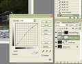
10/07/2007 01:12:50 PM · #10 |
Sorry Melissa, should have been clearer on that levels thing. Just simply playing with Levels (RGB Channel) even just adjusting the Mids (sliding left) brings out enough of the background/color to enhance the setting.
This is Levels only, I would further do a light noise reduction and then a light USM.
[thumb]596629[/thumb]
ED:Spelling
Message edited by author 2007-10-07 13:23:10. |
|
|
|
10/07/2007 03:31:50 PM · #11 |
I really like this one...
[thumb]596119[/thumb]
the fishing line is crisp and it's simple. I think it captures the idea of the competition perfectly! :0)
do you own neatimage or something like it? You could always try noise> reduce noise in PS. hope you don't mind my edit :0)
|
|
|
|
10/08/2007 11:32:51 AM · #12 |
thanks.....your version looks great!!
Andy, my version improved with your explanation....
I'm back to thinking it has hope! |
|
|
|
10/08/2007 03:40:50 PM · #13 |
| Grain always looks cool in black and white... ;-) |
|
|
|
10/08/2007 03:52:32 PM · #14 |
I think both of these could do well:
[thumb]596119[/thumb] [thumb]596121[/thumb]
Good luck!
I know it won't help for this competition, but have you seen this thread? More chances to shoot the lovely Central NY scenery! |
|
Home -
Challenges -
Community -
League -
Photos -
Cameras -
Lenses -
Learn -
Help -
Terms of Use -
Privacy -
Top ^
DPChallenge, and website content and design, Copyright © 2001-2025 Challenging Technologies, LLC.
All digital photo copyrights belong to the photographers and may not be used without permission.
Current Server Time: 09/10/2025 07:08:55 PM EDT.


